Checkout pages are crucial for all WooCommerce stores as the customers complete their purchases on them. That is why merchants design checkout page, for it to be functional.
Apart from that, you should focus on the appearance of your checkout page. Improving your eCommerce shop will help you encourage more people to make purchases. It is one of the best ways to grow your business and become successful.
Approximately 7 out of 10 people simply leave your website after adding items to their cart and it is almost to the finish line!
What can convince your customers strongly so that they can come back to you? If you are facing a lower conversion rate at your WooCommerce store, I have something that can bring a smile to your face.
Any Guesses?
Here, I am going to share some of the best ways to create a unique design checkout page for higher conversion rates.
So, let us understand briefly.
In This Blog, We Will Talk About…
- What Is A Checkout Page?
- Why Should You Design A Checkout Page?
- 11 Ways To Create Unique Design Checkout Page For Higher Conversion
- Navigate Seamlessly With Ultra-Modern & Clean Layouts
- Personalized WooCheckouts For Every Product
- Build Trust With Security Seals
- Add Order Bumps
- If No Upsell, Then Downsell
- Customize WooCommerce Checkout Pages
- Flexible Payments On Your WooCommerce Checkout Pages
- Optimize The Design Checkout Page For Mobile Marvel
- Enable Guest Checkout
- Use A Progress Indicator
- Add Data Validation And Notification
- How To Style Your eCommerce Store With Woocommerce Converting Checkout Pages?
- How To Evaluate Your Design Checkout Page?
- Final Words…
What Is A Checkout Page?
By definition, a checkout page is a place where customers put in their details after selecting the products of their choice. It is a page related to payment and shipping/billing details on an eCommerce store.
The Checkout page will record the following information about the customers
- Name
- Address
- Phone Number
- Email address
- Shipping Method
- Payment Method
- The option to confirm the mentioned details
This is one of the significant pages of your WooCommerce store, after the shop page. But why do we need to design checkout page for a higher conversion rate? Cart Abandonment is the answer, that you’re looking at…
Why Should You Design A Checkout Page?
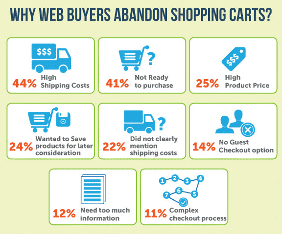
Let’s talk about Cart Abandonment, it is a common challenge faced by almost all eCommerce stores, this can happen at various stages of the checkout process. Some common reasons for cart abandonment include unexpected costs, complicated checkout processes, concerns about security, or simply a change of mind.
Businesses and WooCommerce stores often analyze and implement strategies to reduce cart abandonment rates, such as
- optimizing the checkout process
- offering transparent pricing
- providing multiple payment options, and
- using email marketing to retarget and remind customers about their abandoned carts.
The goal is to improve the overall user experience and encourage customers to complete their purchases.
Want To Know More About Cart Abandonment?
11 Ways To Design Checkout Page For Higher Conversion
We have now established why it is important to design checkout page. Consider the checkout page to be the last scene of the movie, where everything comes together.
So let’s talk about the tips to make this page less complex and more engaging for your customers. The perfect UX design checkout page acts like a cherry on a sundae – the final touch that makes everything perfect.
1. Navigate Seamlessly With Ultra-Modern & Clean Layouts
There is no thumb rule to design checkout page. It entirely depends on what kind of products and services you are selling.
The best checkout pages for high-conversion are simple. They are made with a minimalist checkout design which has fewer diversions and is streamlined.
Avoid complexities while you design the checkout page, such as additional promotions or other recommendations. Don’t put multiple buttons and misaligned texts. As it deviates the minds of your customers and tends them to click on the back button.
Put a cart summary on the right side of the page to provide the best user experience. You can mention item details, item quantity, the total number of items, shipping charges, total savings, etc. on your cart summary.
This adds customer retention, frequent purchases, and customer loyalty to your eCommerce website.
Always highlight the benefits you are providing, a customized design checkout page helps you to do this. So that your prospects can choose you over others. Such as faster checkout, personalized shopping, free shipping, offers, discounts, etc.
You can even give something in return for subscribing and registering, such as early bird offers, etc. Your ultimate motto should be new accounts rather than checking out as a guest.
So, why not make that option more appealing?
2. Personalized WooCheckouts For Every Product
An online store consists of multiple products that belong to different domains and categories, so it is also important to have a customized checkout page for every product.
One design doesn’t fit everywhere. For high-converting checkout pages, create a separate design checkout page for every product you choose, giving a fantastic look irrespective of the product quantity. For instance, to differentiate the WooCommerce checkout pages, you can build them with different colors.
Create, Sell, And Manage Gift Cards On Your WooCommerce Store
3. Build Trust With Security Seals
If you cannot earn customer’s trust, then you will definitely lose the battle. Baymard Institute found that 18% of American shoppers abandon checkout because they don’t trust the website with their credit card information.
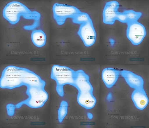
Source: Quicksprout
Display the badgers and security seals transparently on your website. In case you have SSL certification, just put it on your WooCommerce checkout page. If your store has a policy regarding purchase, return or exchange then display it. It will build customer trust.
In case a customer faces any problem during checkout or has any queries, provide a live chat option on your checkout page. You can also provide the contact details such as phone number and email address.
4. Add Order Bumps
Save your sales bumps from getting spanked. Why not try these order bumps for your customers before experiencing the down sales torture?
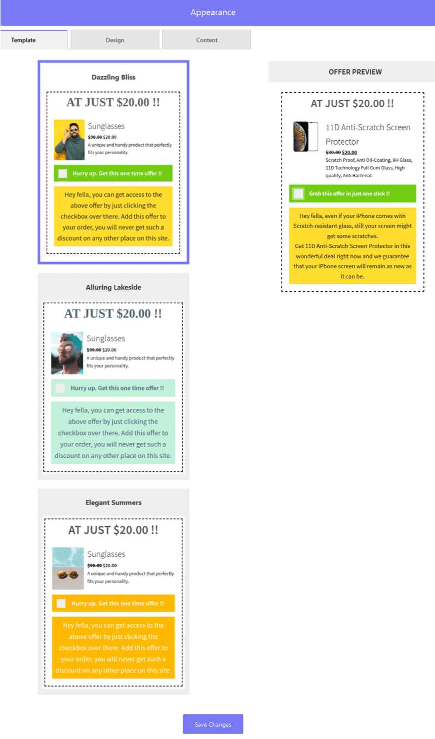
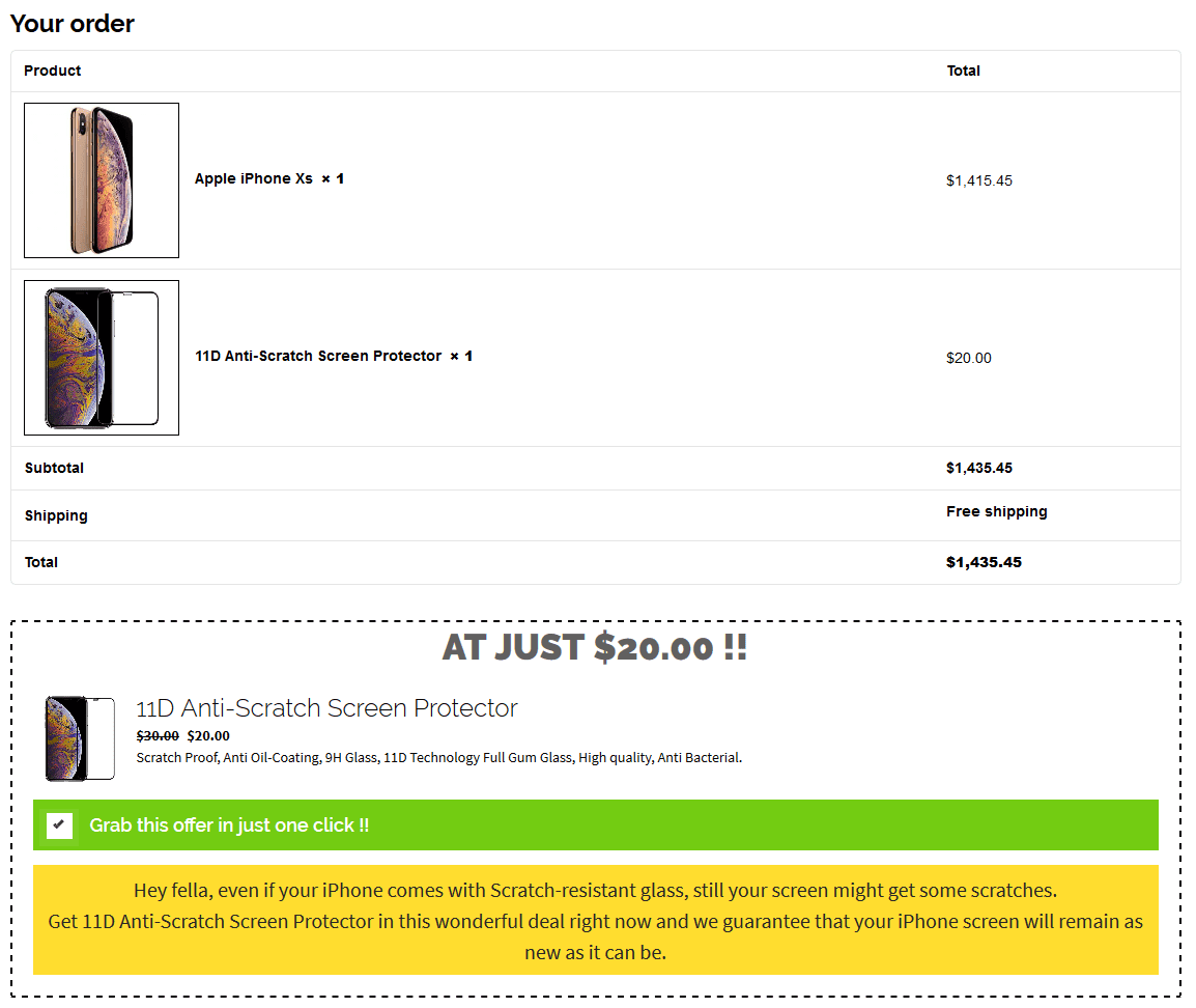
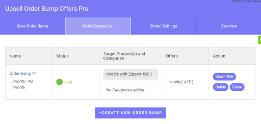
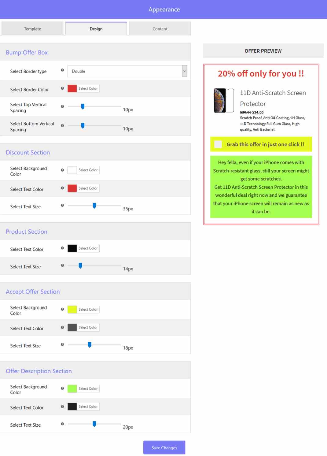
Order Bumps are a great way to promote the products at the time of checkout. Add relevant offers as order bumps in order to get the perfect WooCommerce checkouts.
Add additional products to your WooCommerce checkout page to boost your sales and make successful purchases. It is yet another strategy to upsell your products and services at the same checkout page.
5. If No Upsell, Then Downsell
If your customer declines the upsell offer, then it doesn’t mean that your order is lost. Make a try on a down-sell of a “lite” version or a shorter subscription period. This will give your customer a feeling of upselling for less. This lets you make more money on an order regardless if it isn’t quite as you expected.
6. Customize WooCommerce Checkout Pages
High-converting WooCommerce checkout pages are customizable to a great extent. Choose different templates for different orders and products. You can show your coding skills to add custom code to the checkout pages.
You can set design templates for the unique design checkout page to choose from. Customize your template as much as you want – add product title, description, image, and testimonials.
Not only this. You can even edit the colors of the fonts, logo, etc. If you are a good coder, then add custom CSS and custom JS.
Set Up WooCommerce Subscriptions On Your eCommerce Store
7. Flexible Payments On Your WooCommerce Checkout Pages
Suppose a customer wants to buy a product with his favorite card, but the store owner has not provided that card option. What will happen?
The customer will definitely skip the checkout and go to another store where the option is available.
In order to avoid such a situation include the payment options on your WooCommerce checkout page. These options include credit cards, cash on delivery, wallets, bank transfers, EMI options, etc. You can put credit card logos on your eCommerce website.
8. Optimize The Design Checkout Page For Mobile Marvel
According to the transaction, 79% of the customers order online using a mobile device. Design your WooCommerce checkout pages in such a manner that they can be compatible with mobile small screens.
To provide the best user experience on mobile devices, optimize your page speed. Reduce your page loading time. So that your customers can easily proceed to checkout without facing hurdles.
9. Create Checkout Page With Guest Checkout
It’s crucial to emphasize: avoid compelling customers to register before completing checkout. This extra step slows them down and prompts second thoughts. Provide a smoother experience by always offering guest checkout options, allowing customers to proceed with just their email address.
This is important to design checkout page that supports this feature. Why? Because half of the customers abandon their carts if they find the checkout time-consuming.
10. Use A Progress Indicator
Incorporating a progress indicator, like a step-by-step guide or progress bar, keeps your customers informed about where they are in the checkout process, it also makes the checkout page more attractive.
This visual guide provides a clear direction, allowing customers to gauge how many more steps are left to complete their purchase. A design checkout page also helps customers to be less overwhelmed. Not only does it simplify the checkout process in their eyes, but it also motivates them to proceed seamlessly until the final step.
Here is an example of the use of a progress indicator,
11. Add Data Validation And Notification
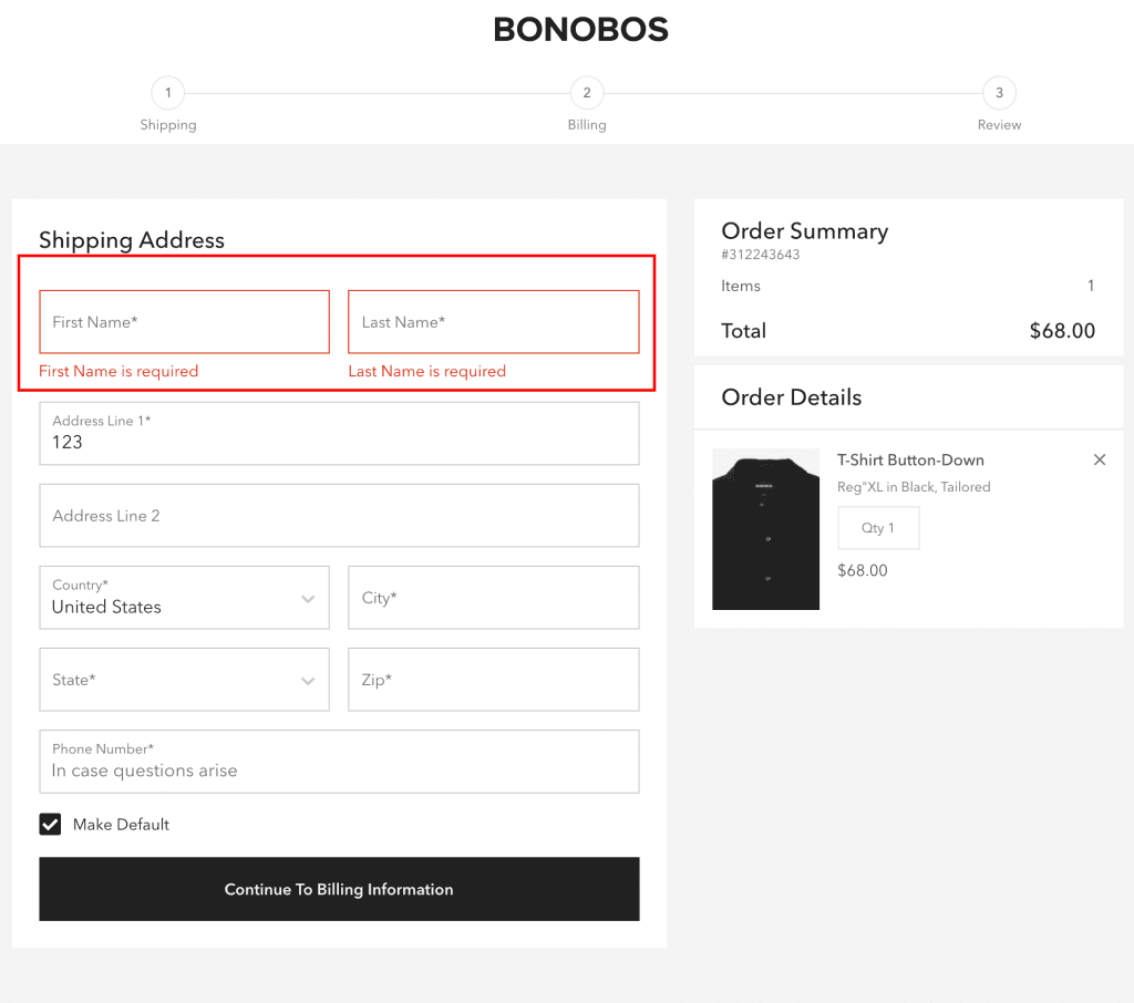
Integrate data validation to the UX design checkout page. This will help you to identify errors in customer information entered during checkout. When customers input inaccurate data, such as an invalid email or credit card number, present clear error messages guiding them in rectifying mistakes.
Similarly, upon a successful order placement, showcase a notification confirming the purchase. This not only reassures customers about the completion of their transaction but also eliminates any lingering uncertainty.
Example of WooCommerce stores adding data validation & notification,
How To Style Your eCommerce Store With WooCommerce Converting Checkout Pages?
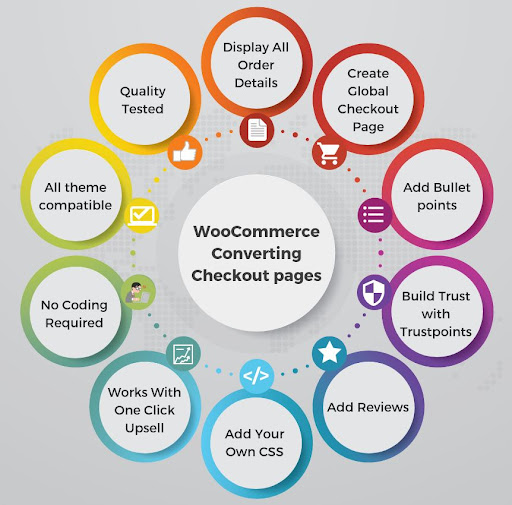
Create the most important pages of your eCommerce website based on the products you sell and get more sales with the WooCommerce converting checkout page. Provide the best upselling offers to your customers with a high degree of customization without hiring the developers.
Here are some ways in which you can do so:
-
Display Entire Order Details
You can show the complete information of the orders including the order number, taxes, shipping info, and discounts on the extreme right side of the page. Additionally, provide the continue shopping option on the checkout page, save cart option, and add to Wishlist for the user’s excellent shopping experience.
-
Create Global Checkout Pages
Create a global design checkout page that can be used for all checkouts.
-
Add Bullet Points
Point out some of the best features of your products by displaying them in bullet points. In this manner, you can precisely elaborate on the details of your products and services.
-
Use Trust Points
You can set and update all your security, privacy, shipping, and guarantee-related texts with your “Trust Points” settings.
-
Add Reviews
People always check the product reviews before buying the product. Approximately, 78% of consumers refuse to purchase when they don’t find any product reviews. Show some of the best product reviews on your WooCommerce checkout page along with its feature image. You can include your product ratings as well.
-
Add Your Own CSS
Coders head up! Simply add your code. You can add custom CSS and JS to your WooCommerce checkout page. However, it’s completely optional.
-
Works With One Click Upsell
A plus point for all those who are using one-click upsells in their online stores. If you want to boost your sales and revenue. It works with that. WooCommerce store owners can use one-click upsell on their checkout page.
-
No Coding Required
You will not need to hire technical employees for the sake of adding additional code. The WooCommerce checkout page-building process is very simple and obstacle-free.
-
Works With Any Theme
WooCommerce converting checkout pages works with any WordPress theme. You can create checkout pages with your preferred WordPress theme.
-
Quality Tested By Experts
With WooCommerce checkout pages, you will not need any further assistance. They provide unbeatable and bug-free functionality which is truly made for modern marketers.
Better UX Design Could Yield Conversion Rates Up To 400%…
How To Evaluate Your Design Checkout Page?
Evaluating the design checkout page, helps you secure the smooth and seamless running of your online store. You can evaluate your page by checking the following criteria,
- A/B User Testing: Get real users to interact and provide feedback, how what is working and what is not working.
- Track Conversion: Track and Analyze conversion rates and user behavior.
- Mobile Responsiveness: Test on various devices, especially mobile.
- Clear Call-To-Action ( CTAs): Make sure buttons are visible and compelling.
- Load Time Optimization: Ensure fast page loading for a smoother experience.
- Trust and Security: Display trust indicators prominently.
- Form Simplification: Simplify input processes and consider auto-fill.
- Guest Checkout Option: Provide an option for quick guest checkout.
Final Words
These were some of the tactics that I have discussed with which you can increase your conversion rates of WooCommerce checkout pages. There are also other various methods to do so.
It is not a very difficult task. It needs your hard work and extra effort. Precisely analyze your checkout process. Think where you are lacking and implement the things accordingly.
Provide an incredible shopping experience to your customers. It will definitely increase your sales and increase customer retention.




By default, a checkout page has a selected number of fields to acquire basic information from customers. For a small business, it may be enough to continue doing business with the standard fields on the checkout pages. You may find it a limitation when you aim to acquire more information from prospective customers to know about them and their custom requirements. Adding options to cater to such a need are called custom checkout fields.
—
Regards,
Sourav Basak
Namaste UI
Thanks Sourav, for sharing value with us. Keep reading and stay safe!