With the ever-rising technology and automation, eCommerce is also surging. eCommerce Checkout Flow is a crucial aspect in increasing conversions. We will learn about the same in the following blog!
“In 2023, global retail e-commerce sales reached an estimated 5.8 trillion U.S. dollars. Projections indicate a 39 percent growth in this figure over the coming years, with expectations to surpass eight trillion dollars by 2027.”
If you are engaged in the eCommerce business, you may have observed that, even if analytics reveal high traffic and visitors have their carts loaded with products, still your revenue is below expectations.
High Traffic Could Be Reasoned Out With Window Shopping but What Is It With Cart Abandonment?
Why do visitors abandon their online shopping cart so massively?
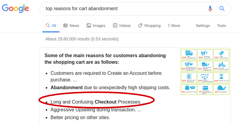
If you ask Google, here’s what you get:
Well! There are many reasons for online cart abandonment. Some are inevitable, while others are avoidable and eStore owners can prevent them by using proper strategies.
I once added two books to my shopping cart, and a moment later, before I could finish the checkout, my roommate broke the news of our college holiday commencement. Then and there, I skipped the order and started booking home tickets.
Sometimes, people abandon their shopping carts just because they are moody. And there’s nothing you can do about it.
But:
Not all reasons for cart abandonment are fate-based. Some are based on mistakes. A leaky eCommerce checkout flow design of your eCommerce store is one of the major reasons that lead to cart abandonment and eventually low revenue.
Once a visitor adds anything to their cart — it’s a clear indication that they could become a potential buyer.
Table of Contents
- What Is Checkout Flow in eCommerce?
- eCommerce Checkout Flow: The Top Risk for Cart Abandonment
- Major Steps In An eCommerce Checkout
- How Do You Optimize the Checkout Flow?
- Technical Enhancements For Efficient Checkout Flow
- Bonus Tip: Filling The Gap Of Cart Abandonment With Email Marketing Automation
- Conclusion
What Is Checkout Flow in eCommerce?
eCommerce checkout is the final touch to your website’s purchase process.
During checkout, both the ends involved in the business check their pockets and pass on information to each other.
Two remarkable things happen during the eCommerce checkout process; visitors turn into buyers and a shift in product ownership occurs.
Visitors turning into buyers is simply a conversion. And this conversion is the only thing that makes money for the business.
eCommerce Checkout Flow: The Top Risk for Cart Abandonment
There are several reasons for online cart abandonment. Here’s a list of major reasons:
- Ineffective pre-checkout process.
- An unexpected rise in overall cost (after adding shipping and other costs).
- Experimenting for future purchases.
- Payment security isn’t trustworthy.
- Website checkout crashed or incident of error.
- The buyer found a better price somewhere else.
- No cash on delivery(COD) is available.
- The site requires you to create an account.
- Too long/complicated checkout process.
Approximately 80.68% of retail buyers abandon purchases after adding items to their cart.
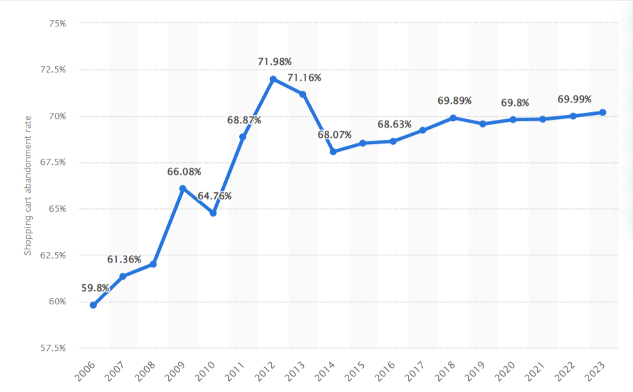
[Source: Statista]
Here’s the provided text converted into an HTML ordered list:
- Checkout flow is a fundamental process of online purchases: Any shortcoming to this process is a fault in the overall purchase process and affects the entire mechanism of your online selling.
- A poor checkout flow will ruin the experience of every user: Every buyer must follow the checkout flow to buy the product and so if you employ a poor checkout, it will be a common irritation to each of them.
- A poor eCommerce checkout flow will impact every product purchase: Every product that you sell on your website will have to follow the steps in the checkout flow in order to complete the purchase process. Hence, a poor checkout will risk ALL the products.
- Checkout is concerned with money and hence your buyers are seriously cautious about it: Your buyers are very concerned during making payment and hence a shaggy non-impressive and long checkout will demotivate them to complete the purchase. As a result, they will abandon it even if they have an impulsive desire for the product you are offering.
So, don’t take the risk. Design an impressive, simple, and trustful checkout flow for your eStore.
But, before jumping straight to the guidelines of checkout design, let’s first understand the checkout flow better.
Major Steps In An eCommerce Checkout Flow
“A checkout flow is a series of steps that a customer needs to follow in order to pay for the product they want to buy.”
Let’s go through each step of the checkout flow briefly.
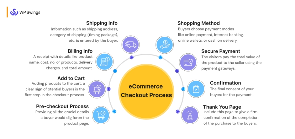
Checkout flow begins with an “Add to Cart” click and ends after payment (or Thank You page). Each of these steps must be designed for a seamless journey for the buyers, keeping the buyers motivated to purchase.
A seller targets two things in the checkout flow process:
- Obtain customer information such as name, email, shipping address, phone number, gender, etc. for running personalized ads, promotional outreach, or convenience in future orders.
- Make customers pay for the product they choose and collect their payment information.
Ideally, the checkout flows should involve the following steps:
1. Pre-checkout Process
As much as the checkout process is important, so is the pre-checkout stage. You should always begin by encouraging decision-making on the product page itself.
Providing all the crucial information a buyer would dig for on the product page plays an important role in helping your customers arrive at the decision sooner.
2. Add to Cart
Adding products to the cart — a clear sign of potential buyers, the first step in the eCommerce checkout process.
Visitors with buying intentions add their chosen products to the cart. They are serious about the purchase, unlike other browsing users.
As a store owner, affix your eyes upon them. They are the ones who will hand over their money to you.
3. Billing Info
In this step, the store owner produces a well-published and organized receipt with information such as product name, cost, number of products, etc. along with delivery charges and the total amount.
It is important to maintain transparency on both sides.
Want to Allow Your Users to Download Your Posts and Products in PDF Format?
4. Shipping Info
In this step, information such as shipping address, category of shipping (timing package), etc. is entered by the buyer.
This information is used for delivery purposes.
5. Shopping Method
Buyers choose the mode of payment in this step. They can choose any of the options such as online payment, internet banking, online wallets(like Paytm and Amazon Pay), or cash on delivery which is available on your website checkout and based on their convenience.
6. Secure Payment
Buyers who don’t opt for COD (cash on delivery) undergo this stage.
This is the most critical stage of the checkout flow. Here, the prospect pays to transfer the total cost value of the product to the seller using the payment gateways.
Visitors add their card details, verify the purchase through OTP(One-Time Password), and then click for payment ensuring secure online payments.
Setup Seamless Payment For Your WooCommerce with Our Wallet Plugin?
7. Confirmation
This step takes the final consent of your buyers for the payment.
This confirmation is very necessary as it avoids jerks in the buyer’s mindset.
Even if the customers are ready to pay, that doesn’t give you the right to pull out money from their wallets.
Let them do it for you with no compulsion.
8. Thank You Page
Checkout flow without a “Thank you page” is shutting the door on the buyer’s nose.
Technically, buying/selling products can be accomplished without this, hence few refer to it as optional. But for me (and for an effective checkout flow), a “Thank you page” is mandatory and must not be ignored.
It’s a good practice to include the “Thank you page” in the checkout flow. It gives a firm confirmation of the completion of the purchase to the buyers.
This page reflects your gratitude to the customers for buying your product from your eStore which is crucial for personal bonding in the mid-professional expedition.
We have come up with a checkout plugin, which will help you with the direct eCommerce checkout process:
The WooCommerce Direct Checkout plugin helps to lessen the steps inside the WooCommerce checkout procedure. You can streamline the checkout procedure by skipping the shopping cart page. The Add to Cart option is added to each product to redirect customers to the checkout page. It can boost shoppers to shop faster. You will grow your sales by reducing cart abandonment.
- Single-click skips the cart and diverts users to the checkout page.
- Decreases cart abandonment.
- Enables the Add to Cart button on each product page.
- Avoid reloading the checkout page.
- Remove irrelevant fields from the checkout page.
- Quick buy functionality.
How Do You Optimize the eCommerce Checkout Flow?
About 28% of cart abandonment is just because of the lengthy or tricky eCommerce checkout process during purchase.
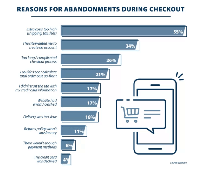
[Source: Baymard]
Are you willing to take this risk?
I hope not and if that’s the case, then pay special attention to designing an effective UX-centric checkout flow for your eCommerce store.
As discussed earlier, the end of the checkout flow is where you actually earn money. Therefore, it must be flawless. It must be smooth and convincing for your visitors.
(Note: This article displays a lot of examples and screenshots from eCommerce giants such as Amazon and Walmart but the strategies discussed here stand true for all online stores.)
Although a product page is not a part of the checkout flow, it is still crucial. Because a good product page layout drives visitors in the checkout flow.
Forget your checkout process, even a shaggy product page may fail to build interest among buyers for your product.
Amazon and Walmart are top eCommerce websites and their product pages, as you can observe, are well crafted — visuals, as well as written specifications, are clear and compelling.
In my personal opinion, Amazon uses a much simpler layout and looks more convincing whereas Walmart uses a multi-panel layout and looks a little chaotic at first instant.
I hope this clears the majority of the checkout basics for your readers.
Let’s dive straight to the main designing strategies that we need for a powerful checkout flow:
1. Make your “Add to Cart” Page Eye-catching
Don’t make your visitors struggle to start purchasing.
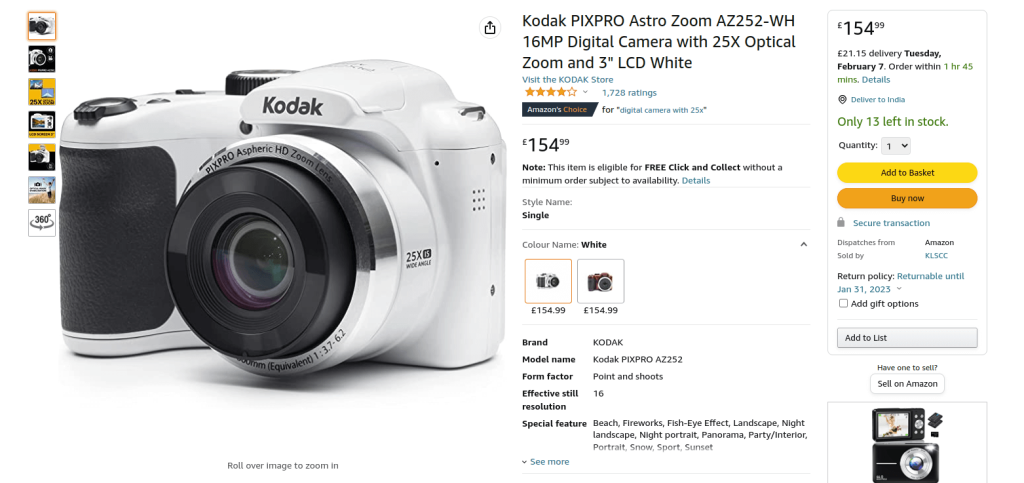
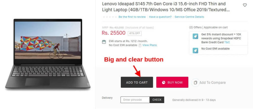
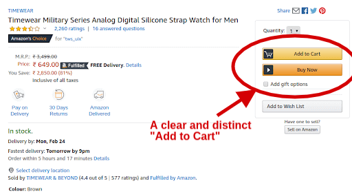
Once your customers like something, they want it quickly. Make your “Add to Cart” button look distinct and clearly noticeable.
Here are some examples of how Snapdeal and Amazon display their “Add to Cart” button:
This is not all.
Once the users click and add any product to their cart, there must be a way to directly access the cart anytime during browsing.
Allowing your users to manage their cart willingly is a good practice.
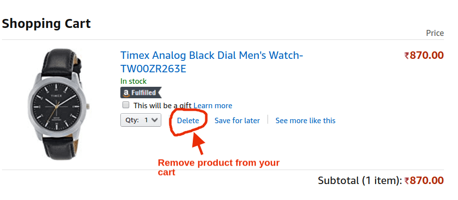
Sometimes products get accidentally added to their carts and sometimes their minds change. For all such cases, users must have the liberty to remove products from their carts. Don’t enforce your ways, only motivate buyers.
Amazon and all other eCommerce websites provide the facility of removing products from the cart.
Here’s an example from Amazon:
Keeping an empty cart prevents users from having frequent reminder emails. It also helps them to distinguish between their interested and not-interested products.
2. Preparing a Transparent Billing Page
Don’t fool your customers in any way. Avoid playing tricks on them.
No matter how smart you are, your customers will sense it somehow. It risks your profit in the long run.
Customers do understand it but it still works just because psychology wins over understanding and also it’s so popular that customers tend to ignore it.
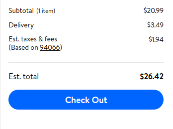
Here’s how Walmart prepares its billing page.
During my purchase shown above, I was expecting the total at $24 but it comes out to be a little extra over $26.
Mind, at the first instant, assumes values after the decimal point(.) as insignificant but in reality, they do matter.
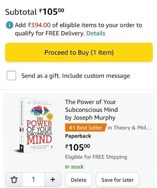
A billing page must be designed to provide all details regarding the pricing in the fairest way possible. It must clearly tell the product name, and quantity along with their prices, delivery charges, tax amount, discount — if any, and finally, the clean total amount to be paid.
A good billing page is also capable of exciting people to buy more. The Amazon billing page, as shown above, provides free delivery for above 394 Rs of purchase — a valid and well-celebrated technique for tempting customers to buy more.
Try Using WooCommerce RMA Plugin For Assuring Exchange And Cancellation
3. Guest eCommerce Checkout Flow and Hassle-Free Account Creation Options
Customers are diverse in nature — some create an account keenly, some want to create an account with the least effort while some don’t want to create an account at all but still want to buy.
Optimize your checkout page for all.
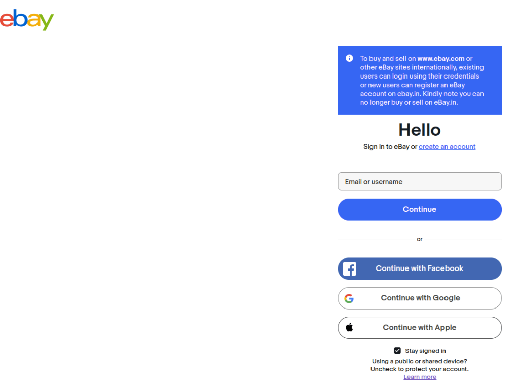
As shown above, eBay provides a direct login through email or phone number for dedicated buyers whereas, for buyers in a rush, it provides a login option through Facebook and Google accounts.
There are pros and cons for logging in through social media or Google accounts which is a completely separate topic for discussion but, the thing is, a good checkout flow is always ready with every option that their customers may find helpful.
Creating an account and retaining credentials is a mental burden.
It’s not just you, there are thousands of other vendors and websites demanding account creation in return for their services.
Who should decide whether to create an account or not? You or your customers?
Why not leave it to them and their choice?
Compelling your users to create an account leads to 37% of cart abandonment.
A considerable loss. Right?
Providing them a way to complete the purchase without creating an account — you would have had 37 more sales on every 100 cart abandoners.
It’s possible through guest checkout.
Many tech giants follow this process like eBay and Amazon guest checkout.
Guest checkout is a way of making payments without having to create an account. A customer purchasing through guest checkout just needs to provide their email for shipping-related notifications, and their shipping address. All this information is available to the store owner but no account is created using them.
Allowing your visitors to buy without creating an account displays your generosity, which may impress your customers, encouraging them to create their account in the future.
4. Prioritize Payment Security for eCommerce Checkout Flow
Payment is the most critical stage during purchase. Here, your buyers are cautious and hence you must ensure that your payment page is perfectly safe and secure.
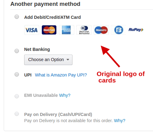
Design the payment page with the original logo of the payment gateway cards. Using the brand logos of companies like Visa, MasterCard, RuPay, etc. brings confidence in your buyers.
Use the word “Secure Pay” rather than simply “Pay” in the click bar. This keeps reminding your buyers that the payment is secure.
This is how Flipkart assures its buyers of payment security.
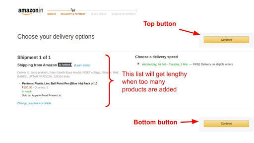
5. Use the Double “Place your Order/Continue” Click Button on the Billing Page
A billing page may become lengthy when too many products are on the purchase list. A single “Place order” button can do the task but it’s the best practice to include two “Place order” buttons — one at the top and another at the bottom. This prevents your users from scrolling back to the top after checking the list.
6. Don’t Confuse Your Buyers During eCommerce Checkout Flow
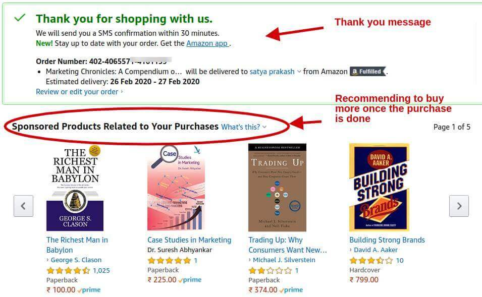
Upsells and cross-sells are a great way to boost revenue but don’t upsell or cross-sell in the middle of the payment process as this may deviate your buyers.
These marketing techniques are majorly used on product pages or cart pages but the “Thank you page” can be a great opportunity to implement these.
Here’s how Amazon uses marketing on its “Thank you” page:
7. Provide an Overview of eCommerce Checkout Flow Steps
Buyers are anxious once they have a specific product in mind to purchase. Don’t keep your buyers in darkness.
Providing an overview of how far your buyers are from the ownership of the product by depicting it through pictorial steps gives them a satellite-like view of their purchase process.
Completing each step gives them a sense of achievement.
Here’s how Amazon does it:
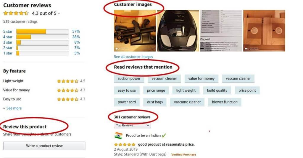
8. Don’t Eliminate Reviews and Star Ratings in Your eCommerce Checkout Flow
Adding reviews and star ratings is the best way of giving quality assurance of your product. About 91% of your buyers check reviews before they complete the purchase.
Don’t eliminate reviews from the checkout flow. Place them in the most suitable step. The best place to do so, in my opinion, is the billing page (apart from the product page).
9. Optimize the eCommerce Checkout Flow for Mobile Users
Your buyers, in general, spend their time more on mobile phones than on laptops or desktops, and therefore chances of making an eCommerce sale on mobile phones are more and are constantly rising. M-commerce is crucial and must not be underestimated.
Mobile commerce sales are projected to exceed $510 billion in 2023 and $710 billion in 2025. Therefore, it becomes crucial to keep the checkout flow well-optimized for mobile phones as well.
Keep your eCommerce perfect with perfect M-commerce, particularly the checkout flow.
The dimension of the screen, the loading speed, scroll length, etc. all need to be checked and confirmed, to ensure its adaptability in mobile phones.
M-commerce is a completely separate point of discussion and is strictly important for your overall eCommerce business growth.
Here’s a great article on ‘How To Make Your eCommerce Store Mobile-Friendly?‘
Some Stunning Real-Life Examples
Let us take a glance at some best checkout pages of companies:
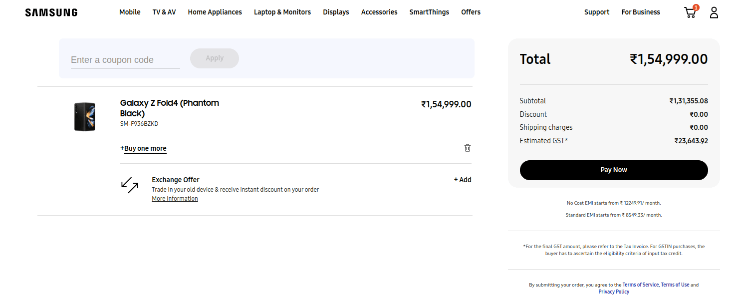
1. Samsung
The Samsung checkout page is an excellent example of a brand in the technology space.
It delivers multiple payment options, prominently shows trust seals, modifies a cart section, offers a place for the promo code, and has wishlist capabilities.
Everything on this page is well designed and accounts for the buyers’ mentality in the eCommerce electronics space.
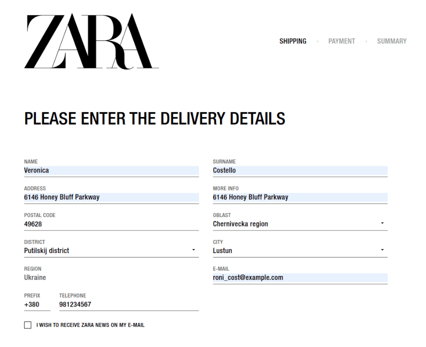
2. Zara
Zara is a fashion label known for its trend pieces and millennial-forward collections.
Zara’s checkout page has a fixed number of form fields and a GMaps drop-down option.
The drop-down location charting option lets customers quickly offer their details, but it even makes it easier for delivery partners to locate the address.
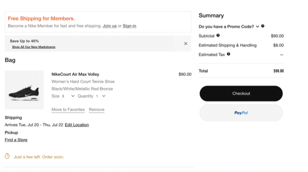
3. Nike
Nike is a sports and lifestyle brand associated with the world’s great athletes.
The Nike checkout page is one of the best layouts available, with a multi-page process that accounts for all the necessary details while also keeping customers motivated with a great picture of their order.
Sometimes people change their minds, and the edit cart option allows them to edit their cart from the checkout page, you will not only make things convenient for them but also be able to bag an increased order value.
Technical Enhancements For Efficient eCommerce Checkout Flow
Here are some plugin-based enhancements that you can add for a smoother eCommerce checkout process:
1. WordPress PDF Generator
Using the PDF Generator plugin, you can significantly impact the decision-making process. You can easily circulate all the necessary product information over different channels. Converting your live WooCommerce product pages into shareable PDF files. This will boost your decision-making stage.
2. Simplify Your Returns, Refunds, and Exchanges
Using the WooCommerce RMA plugin, you can build an easy interface for returns, exchanges, and cancellations on your online store. This will be a reassuring factor for your customers.
3. Use of Checkout Bots
Now this one is an interesting concept. Having an active chatbot while checking out will help your customers get the answers they need right at the moment.
4. Integration Of A Wallet System
Implementing a wallet system in your online store can optimize the eCommerce checkout flow by offering faster transactions through stored payment information. Customers can make purchases with just a few clicks or taps, which eventually reduces cart abandonment rates due to simplified processes.
A wallet system enhances the user experience, fosters customer loyalty, and drives increased sales for eCommerce businesses.
5. Post-Checkout Offers
While a thank you page is important, you want to sound welcoming to your converted customers. Believe me, they are the most precious contributors to the revenue of your business. Using these offers, you can save your customers from further product hunting.
Adding relevant categories and an easier one-click checkout process gives a relaxing shopping experience.
Are You Looking To Start Upselling Effectively On Your Store?
Bonus Tip: Filling The Gap Of Cart Abandonment With Email Marketing Automation
In the above discussion, we have gone through the design guidelines of an eCommerce checkout flow for online stores.
But by no means cart abandonment can be eliminated completely. So, even after employing the best checkout flow for your online store, adopt cart abandonment recovery strategies as well, to maximize the revenue.
Now:
There are several abandoned cart recovery strategies but the most effective of them is sending recovery emails to the cart abandoners.
It is cost-effective and the automation technique makes it a really simple and quick process.
All you have to do is customize a ready-made email template with an engaging subject line to feed up the contact list of cart abandoners and set the frequency of the emails that have to be sent. And rest will happen on its own, automatically, if you use an automation plugin.
Every time any cart is abandoned, a series of set emails will be sent with a fixed frequency and time.
For instance, you can manage and integrate your WooCommerce store by utilizing the HubSpot for WooCommerce plugin. HubSpot delivers an entire stack of software for marketing, sales, and customer service, with absolutely free CRM.
Wrapping Up
The above-discussed guidelines for best checkout flow design is a MUST-FOLLOW rule for the growth of your eCommerce store/website.
If you have noticed during your schooling days,
It hurts more when you fail an exam after serious preparation than when you fail without preparation.
Similarly in the eCommerce world, losing your potential buyers is more disheartening than losing window shoppers.
A single bump in the checkout flow or a little complication may ruin the buyer’s mood leading to the cancellation of the order or cart abandonment.
A well-designed checkout flow prevents you from losing the winning game.
Above all, perfection is a journey and not a destination. There is always room for improvement. The points shared in this article for designing checkout flow are not the end of it. You can add your own ways and test them if it works out, share them with the world. Because sharing knowledge is wisdom.
Feel free to write a comment or connect with our support team to get all your queries answered.







This is fantastic! Please continue with this great work.
Many thanks. Your feedback was more than helpful.
This article contains some of the best information on this subject. I found this easy to understand and interesting to read. Due to this article, I have become aware of Designing An eCommerce Checkout Flow.