Imagine walking through a festive holiday market 🎄. Suddenly, a beautifully decorated stall catches your eye 🤩! Is it the sparkling lights? Maybe the tempting holiday discount signs? Or perhaps the warm, inviting atmosphere that draws you in 🤔.
Now, think of that stall as an eCommerce website during the holiday season. Would you shop at a website that’s cluttered, confusing, and overwhelming? Or one that’s clear, visually appealing, and instantly tells you what’s on offer for the holidays?
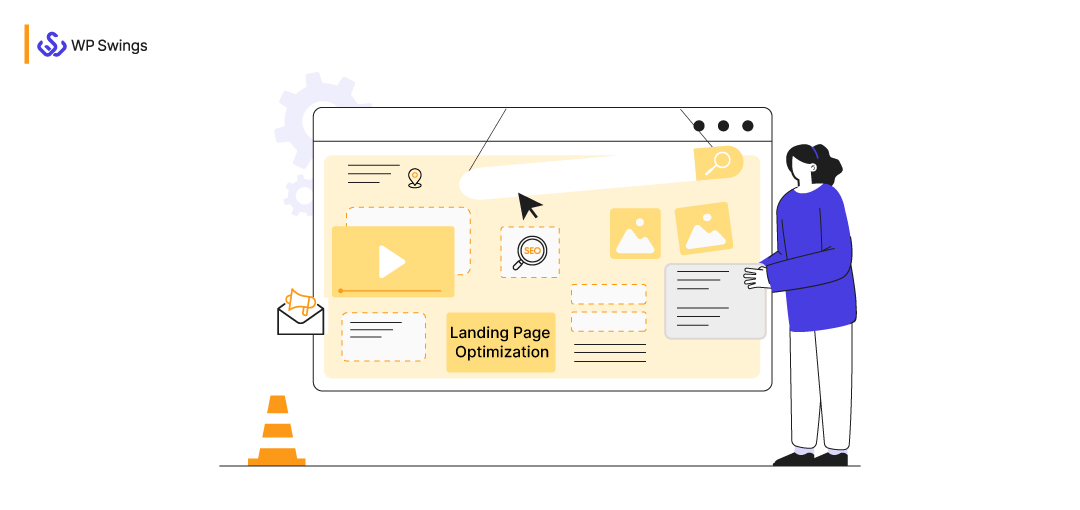
This is where landing page optimization becomes crucial, especially during the holiday season. A well optimized landing page ensures your eCommerce store stands out amidst the festive rush, turning casual browsers into happy customers. Let’s dive into how you can craft holiday-specific landing pages that deliver results.
What we are going to discuss here:
What is an eCommerce Landing Page For Holidays?
During the holiday season, an eCommerce landing page becomes one of the most essential parts of any sales funnel. It serves as the bridge between the moment a potential customer engages with your festive marketing campaign and their decision to purchase holiday gifts from your store.
In simple terms, a holiday-themed eCommerce landing page is a specially designed web page created for seasonal marketing purposes. When a visitor clicks on your holiday ad, email promotion, or social media campaign, they “land” on this page.
The primary objective of these Facebook landing pages is to guide visitors toward completing a specific action—whether that’s purchasing holiday items, redeeming special offers, or signing up for exclusive seasonal deals. An optimized holiday landing page can make all the difference in converting traffic into loyal customers during this high-demand period.
What Is eCommerce Landing Page Optimization for Holidays?
Landing page optimization is the process of improving various elements on your landing page using data and feedback to boost conversions. Whether your holiday landing page promotes physical products, SaaS, or other service-based businesses, it must focus on one clear action such as making a purchase through a sales landing page or booking a product walkthrough via a strategic demo page. When it comes to holiday eCommerce, optimizing your landing page means fine-tuning it to attract and convert seasonal shoppers effectively.
Here’s how it works: Before your holiday landing page goes live, collect insights. Surveys and customer feedback can help you understand what your audience wants during the festive season—exclusive discounts, holiday gift guides, or fast shipping options.
Once your page is live, continuously monitor its performance. Use data like click-through rates and conversion rates to make informed adjustments. Keep in mind, though, that landing page optimization is an ongoing process, and results improve with consistent effort.
How to Calculate Your Holiday Landing Page Conversion Rate
Calculating your landing page conversion rate during the holidays is straightforward. You’ll need these parameters
- Total number of visitors to your holiday landing page over a specific period (e.g., 15 or 30 days).
- Total number of conversions during that same period (e.g., purchases, signups, or other actions).
Subtract the total number of visitors to your landing page from the total number of conversions for a certain period. To calculate the percentage, multiply the response by 100.
What’s a Good Landing Page Conversion Rate for Holidays?
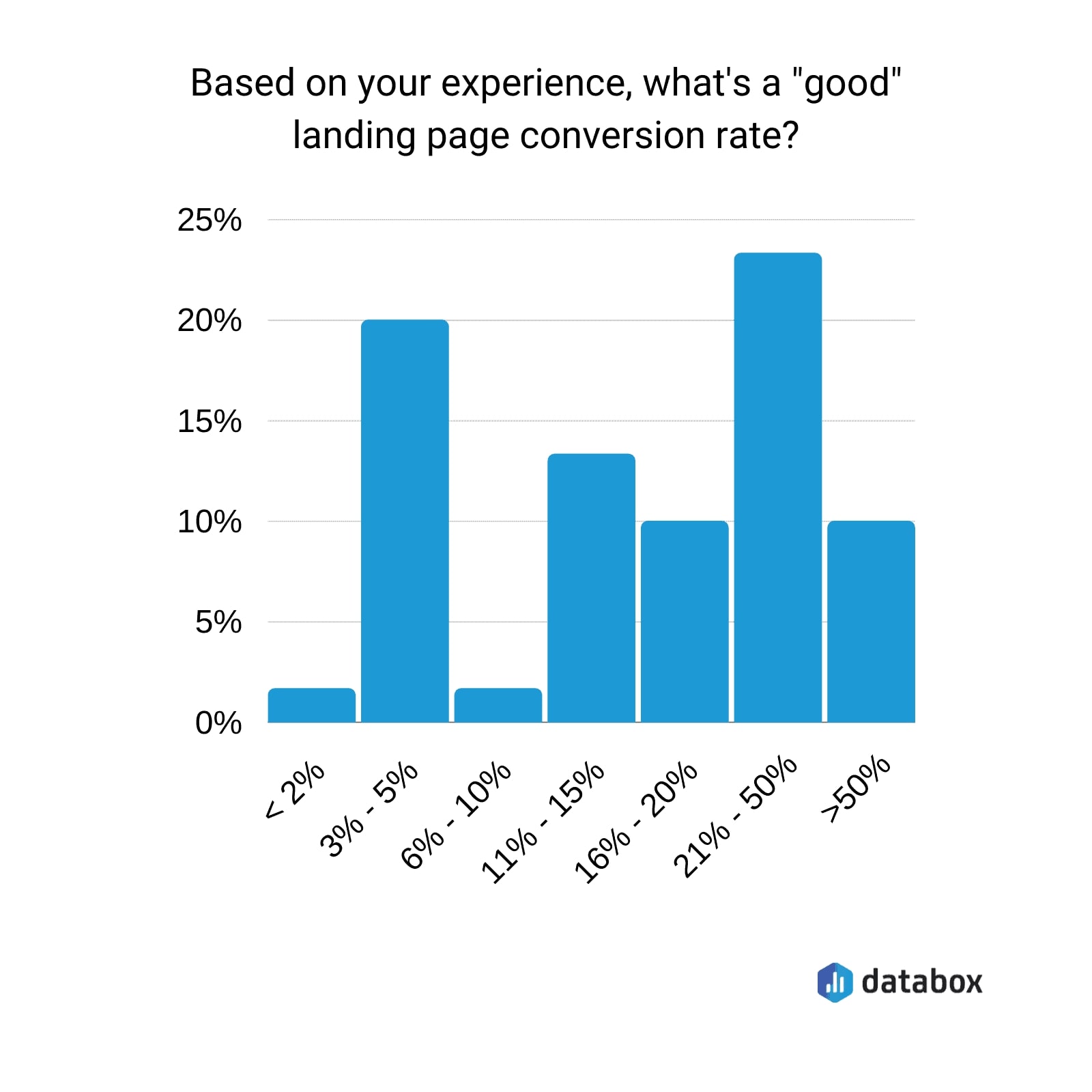
When it comes to holiday eCommerce, understanding what qualifies as a “good” landing page conversion rate can help set realistic goals. Based on industry surveys:
- 23% of experts agree that a solid landing page conversion rate falls between 21% and 50%.
- 20% believe a reasonable rate is between 3% and 5%.
- 14% suggest a conversion rate of 11% to 15% is good, while 10% see 15% to 20% as a benchmark.
- Interestingly, another 10% have observed exceptionally high conversion rates of 50% or more in some cases.
However, before you compare your landing page’s conversion rate, keep in mind that it varies by industry.
Why Is My Landing Page Not Converting?
Landing pages fail to convert for a variety of reasons, but the root cause is frequently an incorrect assumption about what the prospect wants. Conversion rates will suffer if you can’t foresee the wants, needs, or expectations of your website visitors.
Following are a few of the reasons:
- Obscure design
- Poor headlines
- Ad copy and landing page copy inconsistencies
- Indistinct calls to action (CTAs)
- Distractions from the main goal of the landing page
Please do understand that until you start collecting data after landing page optimization is done, you won’t know why you didn’t get results.
Must-try Best Practices For Holiday Landing Page Optimization
A well-optimized holiday landing page not only captures your visitors’ attention but also converts them into loyal customers.
Here are some of the top landing page optimization strategies to make your holiday campaigns a success:
1. Limit the Clutter — Make It a Festive Vibe
An effective landing page should be clean, visually appealing, and easy to navigate. The key is to draw attention to your call to action (CTA) while maintaining a festive holiday theme.
Tips for a clutter-free holiday landing page:
- Straightforward, concise headlines
- Clear and visible CTA (more below)
- Deleting the website’s navigation links
- Relevant, high-quality images
- Brief descriptions of the products
Remember that a visitor might decide in a matter of seconds whether to stay on your site or go. This implies that people won’t likely sit down and read the entire page, especially if there is a lot of text.
Don’t add content only for the sake of adding content; stick to the value proposition.
2. Smooth Checkout
The checkout process is one of the biggest deterrents for potential customers. That is why having a simple, quick checkout is crucial in landing page optimization. Accepting numerous payment methods and enabling automatic account creation will provide good landing page speed and a faster checkout process.
Visitors decide in seconds whether to stay or leave your page. Make it easy for them to focus on the value you’re offering without overwhelming them with excessive content.
3. Mobile Optimization
Negative mobile experiences make customers less likely to make a purchase.
Customers won’t be wowed by a mobile-unfriendly website. Even worse, without mobile optimization, Google will not give your site a high ranking. Even the best SEO in the world won’t be able to reverse your poor Google rating!
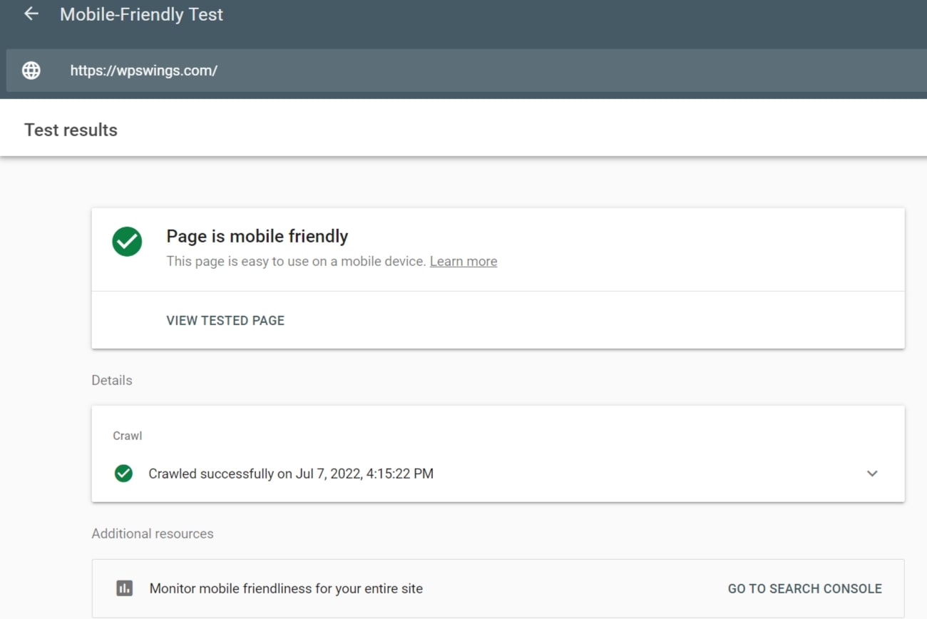
All eCommerce sites should prioritize mobile optimization. Checking your website with Google’s mobile-friendly test is the most effective way to achieve
You may use Google’s tool to get specific, doable advice on how to make your site seem better on mobile devices. This score is influenced by a wide range of factors, including font size, load times, HTML usage, and a lot more.
Increasing the size of your navigation buttons or deleting some of your huge visuals could suffice for mobile optimization. You can get guidance directly from the source by utilizing Google’s free tool.
Want to Know Some Mobile Marketing Strategies?
4. Live Chat — Contact Forms
The days of useless live chat, where you could easily tell you were speaking to a machine that hardly spoke your language, let alone could boost your mood and guide you toward the best purchase, are Looooooong gone.
The majority of the 24/7 live chat apps today are powered by chatbots, which are excellent landing page optimization tools for businesses.
Chatbots go beyond simply speeding up information access and serving as more interesting links to influence consumers to make the best possible purchasing decisions.
While some clients might not have the time to talk on the phone or use live chat. Customers frequently only want to leave a message.
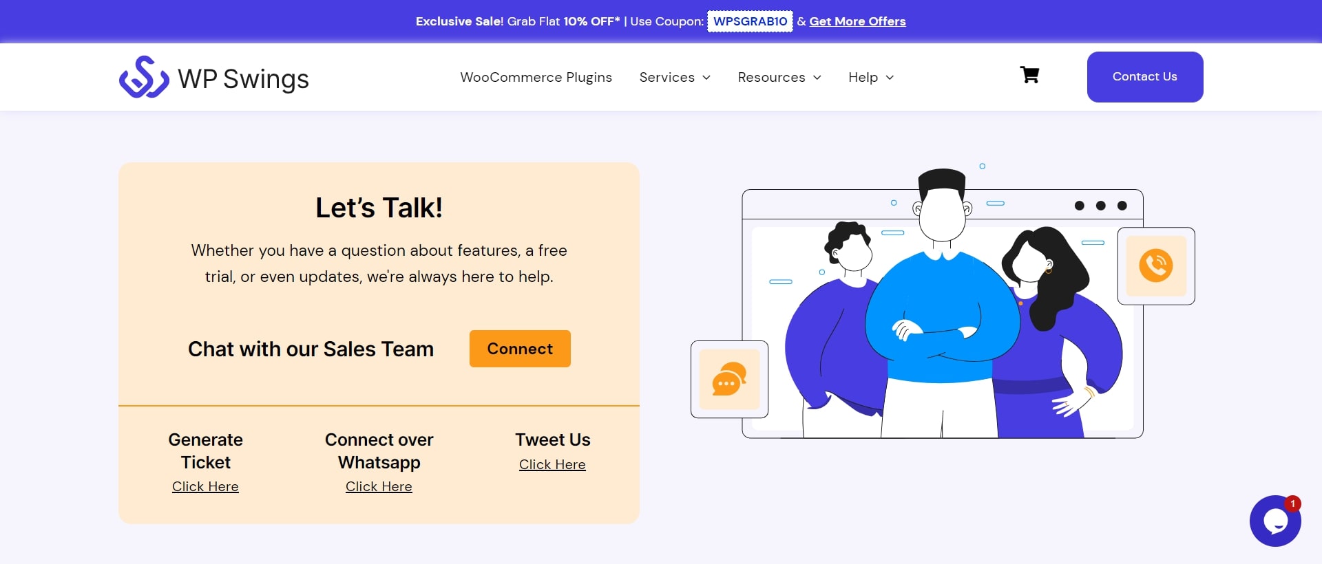
This is where we also require a crisp and beautiful contact form on your website to make it simple for users to contact you like the one shown below.
The finest contact form plugin for WordPress is WPForms. You can quickly add a contact form to your website in landing page optimization.
5. Optimal Page Load
No one likes a slow website! Studies have found that a delay in page load time of just one second can result in a 7% loss in conversions, an 11% drop in page views, and a 16% drop in customer satisfaction.
Use Google’s Page Speed tools to examine your page performance if your mobile page isn’t converting as well.
Resize or compress the images if possible; this can increase page speed. Try to keep your time under 2.5 seconds.
If your website is not mobile-friendly and responsive. Time to make it RIGHT NOW!
Having delayed input might also lead to a bad customer experience. When a user clicks on an element on the page, don’t make them wait for the page to reply.
Users may experience serious problems as a result of visual stability, particularly if input button positions vary.
6. Use Urgency While Landing Page Optimization
Today, one of the most powerful marketing strategies is Limited time offers. Why? Users find it tougher to disregard the offer since scarcity gives an offer more urgency.
Episerver has conducted a survey that found that only 17% of visitors to eCommerce sites make a purchase. How can you persuade those 83% to purchase? Making it a priority.
Customers may not purchase your goods right away, even if they enjoy it. They can opt to consider it further or keep contrasting it with their rivals. A missed sale or an abandoned cart could result from hesitation.
Make sure you are proving your value to those potential clients. Encourage immediate action from your customers with free content upgrades. Popular choices include PDFs, exclusive discounts, or downloadable content.
Make sure you’re giving people a reason to act right away. Create a sense of urgency by providing discounts, free shipping, or limited-time deals. A browsing session will become a client conversion when such urgency is there.
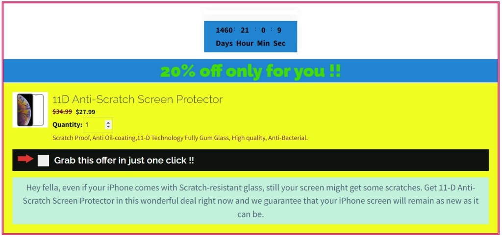
A countdown clock or an expiration date might be added to a coupon. Your audience will be more willing to try your goods if you create a little suspense in the scene.
Don’t forget to request an email or social media sharing in return. A point of contact can be noted, allowing for follow-up. What function does that point of contact serve? Read on!
One Click Upsell Offers With Timers
7. Social Proof To Your Landing Page
If other individuals use or praise a product, consumers are more likely to purchase it themselves. Social proof is a notion that can be added to your landing page in a variety of ways to increase conversions.
Customer testimonials are the most prevalent kind of social proof.
Persuading your clients for video testimonials can act as an advantage.
Social media updates aid in developing a deep connection with your audience. The sincere opinion of a real consumer counts for a lot. Keep social proof in the spotlight.
A picture speaks a thousand words.
Customers react most favorably to content that shows the product in action. An advertisement has considerably lower chances of being followed up on by a potential customer than a social media sharing. So, do pay attention when your best buddy talks to you about a product.
The primary source of unpaid traffic to any website is search engines. SEO landing page optimization raises your search engine ranking, which increases visitors to your site and increases conversion rates.
The top WordPress SEO plugin available is All in One SEO for WordPress. It enables simple SEO optimization of your WordPress website.
One of your landing pages serves as your homepage, in which case it should — at the absolute least — appear when someone searches for the name of your business.
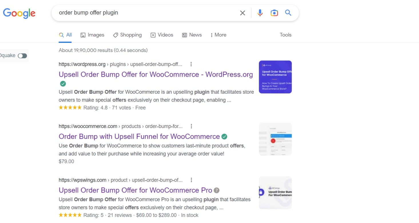
You can also achieve rankings for keywords associated with your industry. For instance, WordPress, WooCommerce, and WP Swings are the top organic results when searching for “order bump offer plugin” on Google:
To choose the most appropriate terms for your landing page, use tools like Uber Suggest.
9. Learn To Follow Up
Occasionally, a customer will express confusion or annoyance with your checkout. Many times, they lost focus on what they were doing. You must follow up when a customer abandons their cart on your eCommerce site.
Think of a method to take follow-ups with visitors if you want to increase the conversion rate of your landing page. All you need is a unique pitch, as well as a means of delivering it. In other words, you require abandoned cart software plus a landing page email magnet.
Additionally, offer superior client service
Make sure your customers are aware of the excellent customer service your eCommerce business provides. Show them the same warranties that well-known retailers have come to offer. That entails helpful customer service representatives and a grateful attitude toward loyal clients.
Strategies To Collect Leads And Boost Your Sales!
10. Include A Clear CTA
Visitors should be aware of your offer’s details and how to benefit from it as soon as they arrive on your page.
Include a clear, visible CTA to do this.
Landing pages should only contain one CTA, as opposed to other pages on your website. Giving customers just one option instead of letting them weigh their options makes it much easier for them to make a decision. This makes it great for conversions by moving visitors into the sales funnel more swiftly and without interruptions.
The CTA must be clearly visible, simple to find, and targeted at particular clients. You can achieve this by:
- Putting your CTA above the digital fold and at the top of the page
- Distributing several buttons over the page for a single CTA
- For button text, use active voice (i.e. Sign up for Free)
- Make something seem urgent or exclusive (i.e. Claim Your Offer Now)
Landing pages are excellent for testing, as we’ve already said. For your CTA, this is especially true. The smallest adjustments can have a big impact. Test various CTA components, such as button wording, button positioning, button color, etc., on a regular basis.
Examples of High Converting eCommerce Landing Pages
There is no exact science for what makes the ideal eCommerce landing page because there are so many distinct components. As a result, as we’ve discussed throughout this essay, it’s vital to continually test to determine what will convert visitors to your landing page.
We can offer you some starting point inspiration if you need it. Few landing page optimization examples of highly effective eCommerce landing pages have been gathered and examined. Let’s look at it.
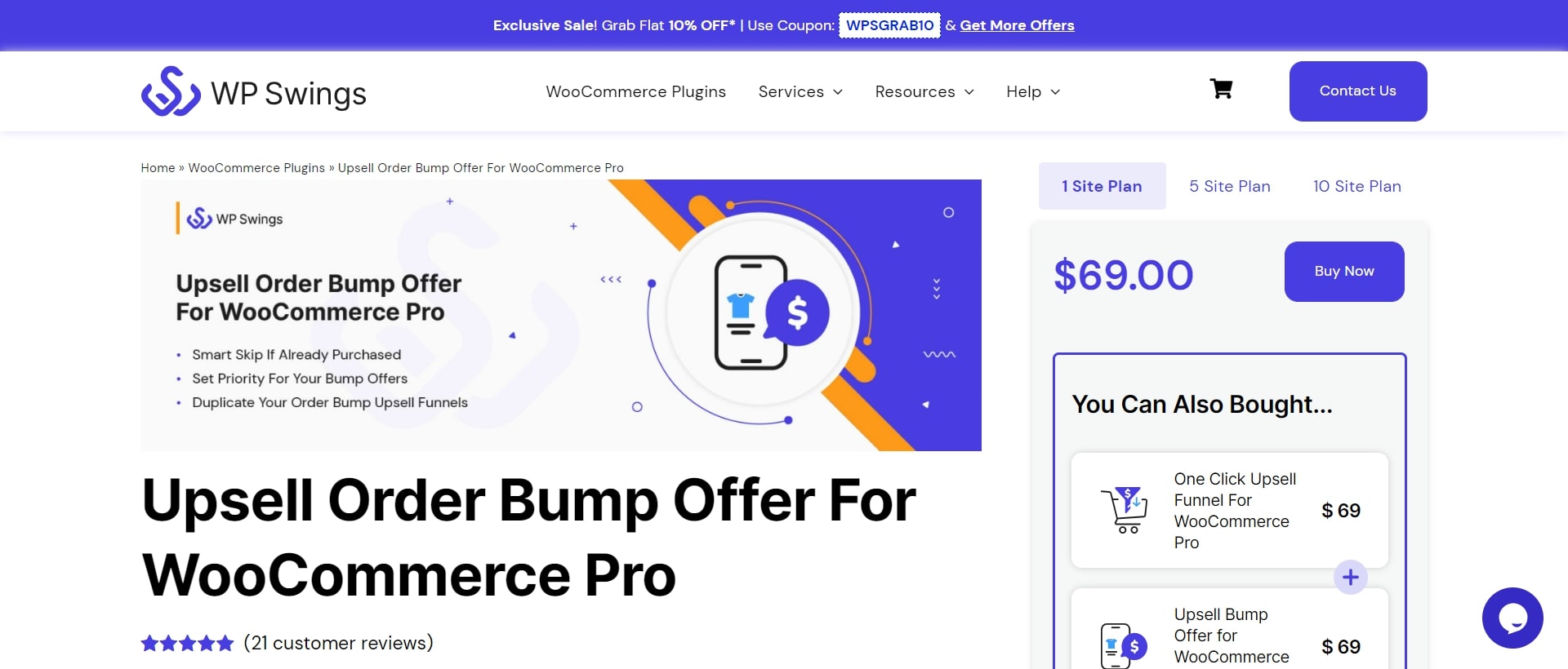
WP Swings
The landing pages for WP Swings take their products that are already widely known for and offer a new perspective. Instead of focusing on the technical specifications of the plugin, the content focuses on the brand’s mission of boosting SALE.
Highlights:
- A value proposition with a client-centered approach
- A timely and pertinent message regarding making offers
- Contrasting font, background, and image tones
- Includes opportunity to bundle
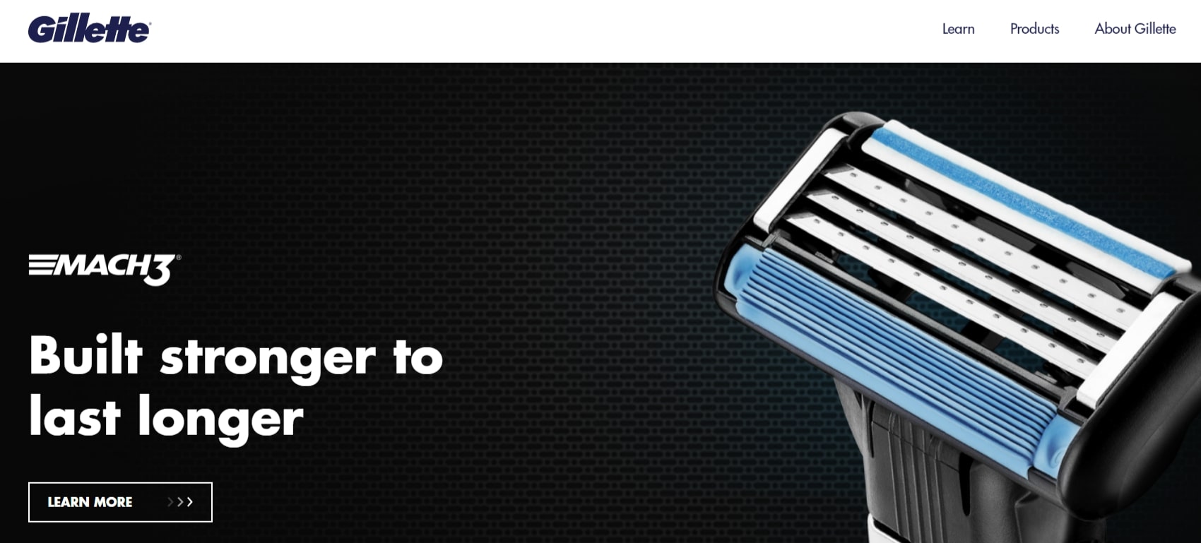
Gillette
Gillette draws attention to their goods with a simple, minimalist style. The brand can communicate the deal in only a few words, and audiences can understand value propositions like free shipping and cancellation.
Highlights:
- Simple CTA without unnecessary filler, strong header
- Benefit-focused material that uses buzzwords like “Free”
- Icons draw attention to and serve to explain the underlying text
Time to Start Your Holiday Landing Page Optimization
Landing pages are a crucial part of online marketing, especially during the festive season. If your goal is to boost holiday sales, promote special seasonal offers, or grow your email list with festive campaigns, optimizing your landing page is the first step.
By now, you should have a good understanding of how to improve your holiday landing page’s conversion rate. Remember, it’s essential to monitor how visitors interact with your page. Test every change you make and use the insights to refine your strategy.
This holiday season, don’t leave conversions to chance. Start optimizing your landing page today and set the stage for increased sales and happy customers!

