


One of the most crucial website metrics is bounce rate. If you have an eCommerce store, not tracking it could be expensive for your business. The fact that a high bounce rate does not necessarily indicate danger may confuse many marketers.
It can be a sign that your website has serious user experience (UX) problems or that your content isn’t interesting enough. Alternatively, a high bounce rate may occasionally indicate that your visitors found what they were looking for, which indicates the success of your content.
A “bounce” in Google Analytics happens when a visitor enters your website and leaves without reading any pages. By dividing the total number of page entries or sessions by the number of one-page visits to your site, you may get your bounce rate.
There are many issues that can be resolved on your website with responsive mobile design. It results in making your website mobile friendly and even enhances how it appears on both large and small screens, and lengthens the time visitors. Further, it may aid in raising your search engine ranks.
Read on to learn why mobile responsive design is crucial for your business website as well as the advantages of responsive design that you should be aware of before spending money on a revamp.
Table of Contents
What Does Mobile Responsive Design Mean?

A mobile responsive design is built so that it automatically adjusts its elements and information to fit the screen size being used to view it. It intercepts graphics from becoming wider than the screen and which makes it much easier for visitors operating mobile devices to view your information.
The foremost purpose of responsive design, as emphasized by a professional Web Designing Company, is to stop the senseless resizing, zooming, or scrolling that occurs on websites that are not mobile friendly. These responsive sites are frequently incredibly challenging to navigate, and it could even cost you potential consumers who give up after becoming upset trying to figure something out.
A specialized mobile website for smartphone users is no longer necessary thanks to responsive website design. Now you can develop only one website that adjusts up or down automatically to match the device it’s being viewed on rather than creating many websites for various screen sizes. By embracing custom web design principles, websites can cater to the dynamic needs of users across various devices, ultimately improving user retention and conversion rates
Benefits of Mobile Responsive Web Design
To help you understand why you should invest in a responsive website, let’s examine each of these six advantages.
-
Lower Maintenance Needs
Planning, creating, building, and updating a separate desktop and mobile site needs more testing and support to maintain it which takes a lot of time and effort. With the help of eCommerce Testing Services, it becomes easier to ensure both versions function smoothly. It would be easier to incorporate these measures into a single responsive design size that fits all strategy means less hassle for designers, business owners, and consumers. Less time spent on maintenance signifies the additional time to focus on further essential chores such as marketing and the creation of content. Opting for a custom web design can further streamline this process by tailoring the user experience to specific business needs while still supporting responsive functionality
-
Reduces Duplicate Content Issues
If you are having a responsive design that works for both desktop and mobile versions, then it would be a benefit as it helps in the removal of any potential duplicate content issues that can lower the ranking of your website in search results.
Also, any SEO work you conduct to rank your desktop website is immediately transferred to your mobile version, minimizing duplication.
-
Lower Bounce Rates
The user experience is considerably better on a mobile responsive design due to its being responsive and optimized for mobile design. As a result, it is more possible that the visitors will stay for a while and check out various parts of your website. In contrast, it is much more difficult to keep a visitor interested in a non-responsive website, which increases the likelihood that they will leave.
When you are an eCommerce store owner… you must be aware of your user experience…
-
-
-
Create Content Without Any Hassle
-
-
If you are offering an adaptive design for mobile and desktop versions of your website, it should be having diverse content for each one.
Google can penalize you for content duplication if you don’t offer distinct content for your mobile version compared to your desktop version. Using various writing tools like a free content creation and a humanizer can also help refine and differentiate content to avoid duplication issues.
With a responsive website, you will just require to create content onetime, maintain it, and monitor its development once.
As a result, although responsive web development needs more work, you won’t have to worry about managing many website iterations.
I hope you are aware of the term Wiki creation… Are You?
-
-
-
Increases Social Media Connectivity
-
-
If your business has a social media account linked to your website then your audience will preferably be redirected toward your website.
The visitors can quickly study your direct marketing channel when your website is mobile friendly and responsive.
Your website should seamlessly link to your social media profiles, which results in more traffic and generates more leads.
-
-
-
Improved Browsing Experience
-
-
First impressions always matter a lot, therefore whether a user is accessing your website from a desktop or a mobile, you will like them to have an invariably favorable experience. On their initial visit, users are more likely to give up and visit another website if they have to often zoom in, out, and squeeze their screens. Implementing automated testing can help ensure your site works smoothly across all devices.
Why Responsive Design Is Important for Business
Mobile responsive design websites are the path to the future for many key reasons. The following are the main justifications for responsive design:
Increasing Mobile Usage
In the battle for internet dominance mobile dramatically surpassed desktops as the main method of accessing the internet worldwide.
Consequently, a growing percentage of individuals prefer using mobile phones for convenience’s sake than use computers to browse the web, shop, or conduct searches. A 2023 survey found that:
-
-
- Mobile devices account for 60.04% of website traffic.
- Mobile devices are used by 92.1% of internet users to access the web.
- Mobile internet usage worldwide is 4.32 billion.
- With 69.13% of all internet traffic coming from mobile devices, Africa leads the world.
- By 2025, there will be more than 1 billion 5G connections globally.
-
Sadly, many companies still design their websites for desktop users only rather than for mobile users as they still lack this knowledge. This results in a bad user experience for mobile visitors repels potential customers and sends them right to your rival’s competitor and their mobile responsive design website that is designed for smaller displays.
Better UX
UX is a primary priority when it comes to mobile devices and apps.
A responsive design provides a better user experience overall, especially for users on mobile devices. Since designing for mobile is the most challenging thing, it should be done first and after this, once the issues are resolved, designing for the desktop is considerably easier. This is particularly relevant as mobile devices have more severe restrictions, such as bandwidth, screen size, and interactivity.
A mobile responsive design strategy focuses more on the adaptive design process to ensure that content looks exceptional regardless of the device being used to view it.
Do you know why Maximalist Web Design has finally decided to re-emergence?
The kind of site is also important. If it’s an online store, users must be able to quickly navigate and buy the products and if it’s social media, users must be able to readily communicate with one another.
What characteristics, then, contribute to a better user experience?
-
-
- A visual hierarchy is the most crucial component of a web that is highlighted.
- Extra-large touch targets are necessary to interact with hyperlinks and buttons because fingers are less accurate than mouse buttons or icons.
- No mouseover hovers provide an engaging experience, desktop designers frequently use “hover over” elements. Although haptic touch (3D touch) is supported by the iPhone and other devices, the bulk of mobile users hasn’t taken to it.
- No huge visuals as images can still be utilized on mobile devices, landscape photographs, and intricate graphic presentations have less impact on a smaller screen.
-
Faster Load Times
There were days when a page would take 10 minutes to load just one image is gone now. Users now want a speedy load time from the website. If they choose another page, it ought to load right away.
Slow-loading pages can have a detrimental effect on conversion rates because speed kills the time. Page speed matters, according to research:
-
-
- If a website takes longer than 4 seconds to load, 1 in 4 users will leave
- 46% of visitors don’t return to unsatisfactory websites
- 64% of customers who had a bad experience will buy somewhere else the following time
- Customer satisfaction decreased by 1 second by 16%
-
Even if a one-second page response delay results in a drop in conversion rate, that would lead to a loss of revenue for a business. Speed is important when dealing with impatient users. The load time of a mobile responsive design would be to speed up by compressing photos, decrease in the volume of requests, and visible content loaded first and accelerating server responsiveness.
Higher Conversion Rates and Lower Bounce Rates
Responsive design websites typically have lower bounce rates and higher conversion rates than static design websites. The users can easily browse and navigate any page thanks to the user-tailored web content, which helps in keeping them on the page for a long time.
When there are lower bounce rates and higher conversion rates it will automatically increase sales which will lead to more satisfied visitors. By just moving to a mobile-responsive website you can stand out from thousands of them.
Increases Sites Search Engine Optimization (SEO)
A responsive mobile design can assist you with SEO, as Google prefers mobile-friendly responsive sites first. In conjunction with other SEO aspects, responsiveness can significantly improve your ranking on search engines.
All the website’s responsiveness is taken into account by Google when choosing their place in the search engine rankings. This merely indicates that your website is not responsive and will be downgraded in the search engine results.
Are you aware of Top SEO Trends on which Content Marketing is revolving?
How to Make a Responsive Design
When designing a responsive layout, there are several factors to consider. A proper design system and order of content are needed for this approach.
A responsive design consists of three primary elements, which are as follows:
-
-
- A fluid grid
- Flexible text & images
- Media queries
-
Let’s understand each element further.
A Fluid Grid
In a responsive layout grid is an essential component.
Grids have been utilized by web designers to create websites from the start. The flexibility and scalability of the design will be guaranteed by the usage of a fluid layout grid for responsive sites. The spacing and proportion of the elements will be constant, and they can adapt to a certain screen width using percentages.
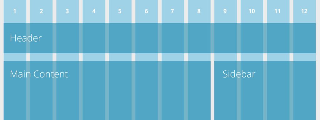
For responsive design, the following screen sizes are most typical:
Desktop
960 – 1219 px
Tablet (Portrait)
768 – 959 px
Mobile (Wide)
480 – 767 px
Mobile
479 px and less
Users will like their experience on your responsive website the most if it has a fluid layout grid.
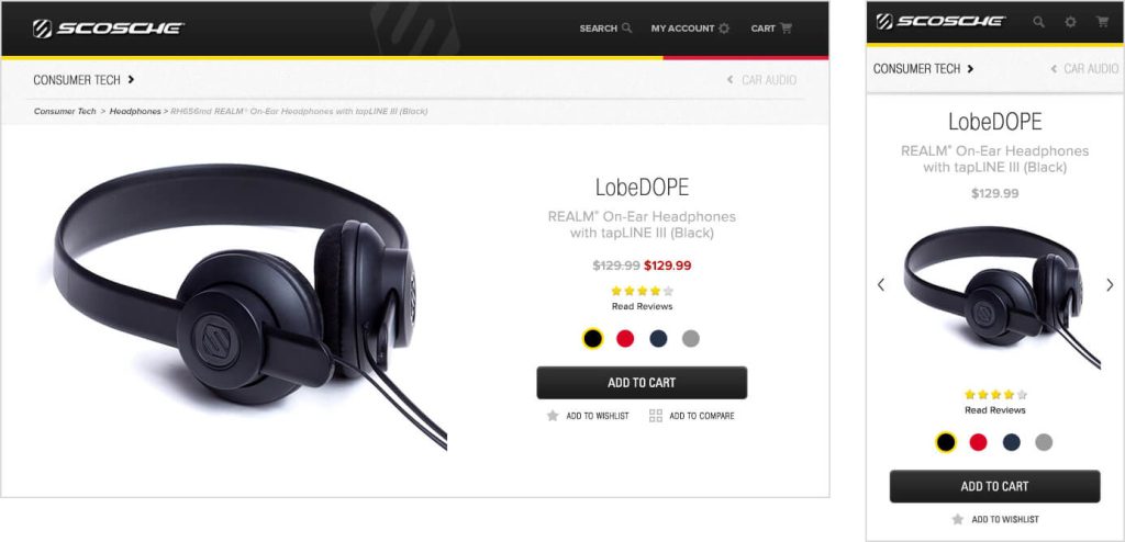
Flexible Text & Images
It depends on what device a user is browsing your site because the text appears differently on every device, but it should always be readable. In mobile responsive design, there is a chance to increase and decrease the font sizes and line height using an AI font generator, which significantly improves legibility
Flexible text and graphics can vary their width inside a website layout by following the content order with the mobile responsive CSS. Now, text may be read on any device, regardless of the end user. With the help of the flexible container, the text can be wrapped with an increase in font sizes on small devices.
Due to slower load time on browsers used on small devices, flexible pictures may prove to be more difficult. However, depending on the content that is vital to the mobile experience, these photos may be scaled, cropped, or even deleted. Utilizing an image upscaler can help restore details that may be lost when scaling images for mobile screens, ensuring visuals remain clear and engaging.
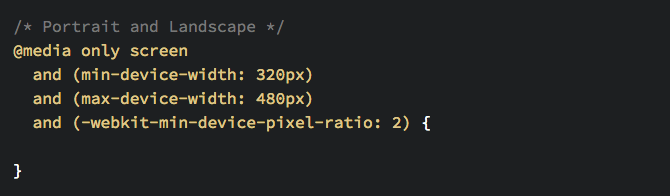
Media Queries
A media query is a code that is responsible for the flexible layout of responsive website design. It is a fundamental part of CSS which should be applied accordingly, depending on the aspects like screen size or resolution.
Media queries are entitled to considerable layouts of a design, which utilize the exact HTML and CSS-coded web page.
Examples of Responsive Website Design
We’ll look at some examples of responsive web design below from various fields so you can see and learn what works and what doesn’t.
New York Times

The NYT layout on a desktop is cluttered with image size and various rows and columns of content, much like a conventional newspaper. Every news category appears to have its particular column or row.
On mobile devices, it adheres to the single-column standard and modifies the menu such that it is presented in an accordion manner for user convenience.
Amazon
Because of the flawless fluidity of their user interface on all devices, Amazon is a world leader in eCommerce.
To fit more content into a smaller space, their tablet layout simply eliminates some of the white space and adds a scrollable section of icons.
Instead of using the various section link icons from their main webpage, their mobile layout condenses it into a single column and concentrates on important information, including recent purchase history.
YouTube

The flexible grid of videos that is appropriate for each user is the centerpiece of YouTube’s homepage layout. On tablets, there are just three columns in each row. Its design is condensed to a single column for mobile.
Additionally, the mobile version relocates the primary menu to the bottom of the screen, where smartphone users’ thumbs are more comfortable using it. This easy change enhances UX and navigation.
Best Practices for Responsive Web Design
These are five responsive design best practices that you absolutely must know if you want to ensure that your website is up to par and provides top-notch user experiences across all devices.
Plan Your Content Before You Design

It is similar to selecting a structure for painting before you have created a picture to design a website without a clear sense of its content networks. You must keep this in mind that how you will determine and arrange your content.
When the design and content are built together, they always succeed. It’s critical to organize your content clearly because both components contribute significantly to one another.
There is much more to the content structure than merely replicating and pasting text to decide where they will suit on a page. Rather, consider the content as the narrative you like to deliver to your audience.
Simply, prioritize the messages you want to convey on a list, and then think about how they link to each other. Use infographics or drawing design ideas from top-notch templates, to make dense amounts of information simple to understand. You can design your navigation bar to direct visitors via the website and assure that their time is seamless and enjoyable.
Add Call-To-Action Buttons
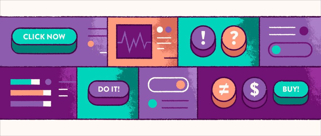
A call to action (CTA) is an essential part of every website. The users are referred to the next step by waypoints like links and buttons. If the CTAs are not clear, individuals can find a problem in understanding how and where they must make a purchase.
The CTA button’s color, size, and shape should be different from the rest part of the page. The most identifiable shapes of CTAs are circular, square, or rectangular. You should stick to standard forms when creating your CTA buttons rather than being overly creative. Lastly, just make sure that your buttons are finger-friendly for touchscreen devices because the size of your buttons has an effect on how users will click on them. Also, to decrease accidental clicks, leave plenty of space near important buttons and text links.
Start Your Design With Mobile in Mind
Mobile devices nowadays are getting more traffic on the internet and even getting more powerful to adept at running responsive web layouts.
In light of this, be careful to design your website with mobile phone users as the primary user demographic. The designing of your website should be done by keeping the mobile users in mind and providing them with the maximum width of available space. It also uploads high-resolution pictures that nevertheless load quickly and streamline navigation.
The website’s mobile version does not even have to contain a set width. Multiple themes, flexible mobile responsive CSS media queries, and frameworks that typically demand to code can all be used to create a mobile friendly website.
Responsive Pictures Keep You In a Fast Lane

Speed up your website by utilizing pictures that load rapidly on all kinds of platforms. You will require responsive pictures that will accelerate the loading time of your website’s web pages. The capability of a website to load rapidly is evolving into more essential aspects in SEO like user experiences, and bounce rate. Someone might quit the website if it’s taking too long to obtain their information somewhere that loads more quickly.
Responsive pictures are an excellent and powerful approach to increase the speed of load time of a site.
Power Your Layouts With Flexbox
Flexbox is a CSS3 layout module that makes sure your layout is seamlessly responsive across various devices. This is significant because Flexbox enables the web development of responsive pages without the need for cumbersome CSS attributes and code. Accordingly, it quickly develops well-liked design patterns such as equal-height modules and Z-pattern attribute lists as well as complicated layouts such as split screens, hero covers, and sidebars.
Conclusion
Compared to desktops and laptops, mobile devices are the preferred method of internet access today. Your website must therefore look fantastic and function flawlessly on tablets and smartphones in addition to desktops and laptops.
If your website’s design isn’t already responsive, it’s time to look for web design advice and redesign it so that it is.
About the Author: Sakshi Mishra


Thanks for sharing this content, very nice.