Creativity is flowing in nature. You can not control it. The current trend in web designing is restricting and also encourages strict adherence to severe simplicity. This in a way negatively affects your creative thinking. This is why Maximalist Web Design has finally decided to re-emergence. If you ask me, this was long due. Maximalism had to make a well-deserved return.
But what is the concept of Maximalism? Well, by now I hope each of us is well-versed in the minimalism approach. Maximalism is the exact opposite of it. In one word, it is a no-holds-barred approach. It can include getting loud, distinguish, and bold to add a visual flair to your website’s design.
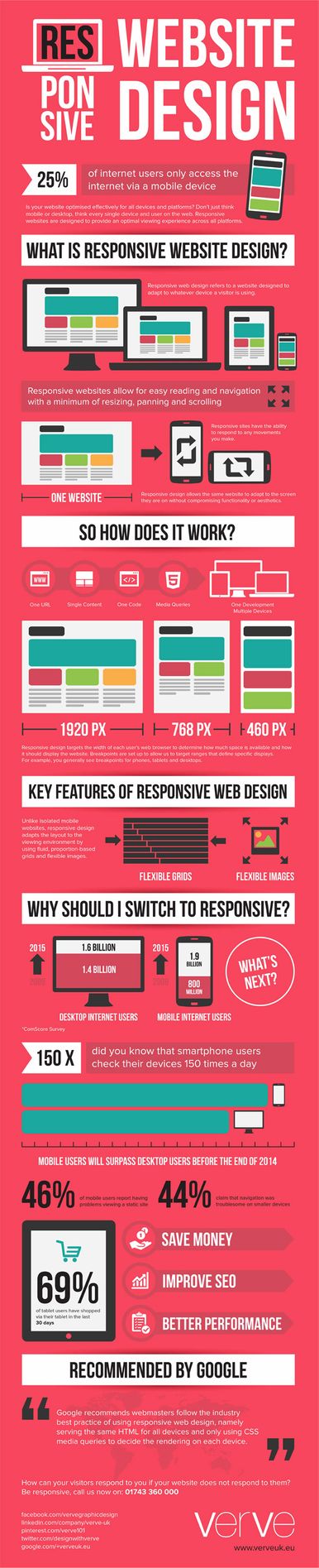
This enables the websites to be more responsive in nature. What are the benefits of a website being responsive? We have a perfect resource for this,
We can now jump right into the blog, as the readers are now accustomed to the concept.
Things that you’ll learn in this blog…
- Why Is the Maximalist Web Design Reemerging?
- Do’s and Don’ts for Maximalist Web Design
- Maximalist vs Minimalist – Pros and Cons
- Maximalist In Action
- Go Big or Go Home
(Jump to the section that interests you the most!)
Why Is the Maximalist Web Design Reemerging?
I guess the readers are already aware of the “less is more” statement. This is because a lot of websites were actively using and promoting this approach. But guess what is back or making a huge comeback? “The more, the better” is trending at the moment. If you’re learning how to apply these shifting design trends, a web designing course in Chandigarh can be a great way to build the right skills.
This approach gives individuals the freedom to experiment in an open environment.
Did You Know That You Can Now Enable WhatsApp on Your eCommerce Website?
But where did this trend come from? Well, maximalist web design is a trend that started between the end of the 20th century and the beginning of the 21st. Where minimalism promoted fewer elements and styles, maximalism glorified elements through a mixture of styles, colors, and tones. I guess you get the gist now.
Here’s an example of Maximalist Web Design:
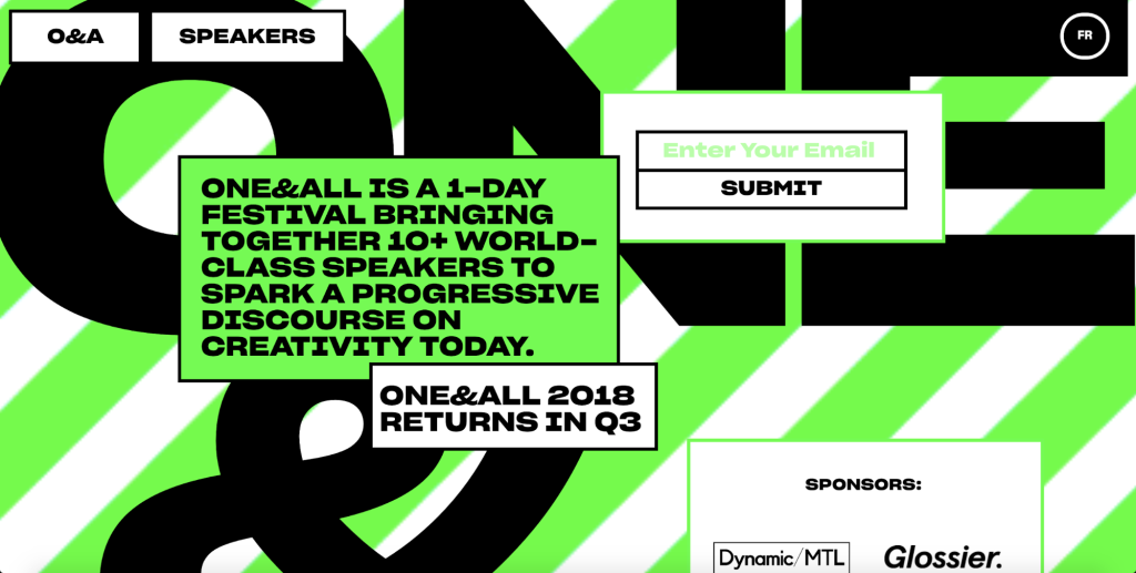
Source: Webflow Blogs
But why is the maximalist web design approach reemerging? The credit goes to the millennials and their freewheeling mindset. We have finally realized that all websites have started to look the same. Because all designers were busy using the minimalist or restrictive approach. This also resulted in a lack of originality and made the websites predictable.
The following are the characteristics of a well-made maximalist web design,
1. Use Of Contrasting Motifs And Colors:
The main idea behind this concept is to explore creativity. Now creativity can not be determined by following a single or particular motif or color, which is why the designer gets a chance to use contrasting elements. If you want to design the website to capture the interest of the visitors, it is also important to use the rule of thirds. For businesses aiming to launch large-scale digital platforms, collaborating with a professional news portal development company can ensure these creative design trends are implemented effectively
2. Incorporation Of Repeated Elements:
The designers are also at liberty to use repeated elements as well. The more conflicting the better. The trick for this approach is to go wherever your creativity is taking you, with no boundaries. For example, a dental web design could incorporate repeated elements such as tooth-shaped icons and a color scheme of white, blue, and green to create a cohesive and memorable design. Repeating these elements throughout the website can reinforce the brand and make it more visually appealing
3. Use Of Dense Text And Bold Colors:
The most noticeable and one of my favorite parts of maximalism is the use of bold and clashing color schemes. It makes the website look lively and adds a unique touch to it.
Some of the other features are listed below,
4. No or little white space
5. Layered images
6. Designers got the liberty of creating their own fantasies.
We can now move forward and explain the Process or The Dos and Don’ts of this particular approach to web design.
Do’s and Don’ts for Maximalist Web Design
While developing a website, successfully there are several steps to follow for the website to work. Similarly, for web designing, you must follow a set of dos and don’ts. We have listed the same in the following keeping in mind that businesses in Grantham can gain a competitive edge by investing in thoughtful Grantham web design, while cluttered or outdated designs often frustrate users and drive them away quickly.”
✅✅ DOs ✅✅
- Choose rich and bold colors
- Incorporate styles from different periods
- Think about exotic influences
- Add meaningful layers
- Do add multiple calls to action wherever feasible
- Explore different styles of fonts
❎❎DON’Ts❎❎
- Avoid forgetting about the textures
- Do not have a nanoscopic budget
- Be scared of clutter or clash of designs
- Steer clear of underestimating the power of a Good Copy
- Entirely depend on Photography
- Use excessive lines or graphics
- Fall into the trap of minimalism
Whether you’re leaning toward minimalism or diving deep into maximalism, the real challenge lies in execution. That’s why many brands choose to hire web designers with the skills to bring the vision to life while keeping performance and usability in mind.
Maximalist vs Minimalist – Pros and Cons
We are now well aware of the concept of maximalism, so we won’t any more time explain it again. But what is minimalism? Well, it is the exact opposite of maximalist web design. Here we follow the “less is more” concept.
Here is an example of a minimalist website for your better understanding,
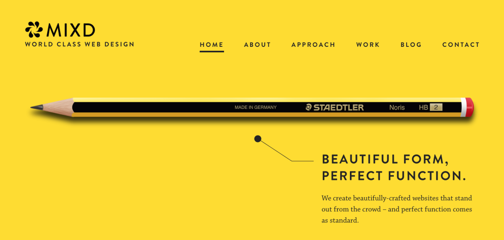
Source: Mixd
The designers are advised to achieve maximum impact using a minimum amount of elements, styles, and patterns.
The Key Features of Minimalism are,
- Unique But Uniform Fonts:
In the minimalist approach, typography and texts play a huge role. The designers are advised to use uniform fonts. The fonts should definitely be unique and should capture the attention of your users’ focus.
- Balanced & Neutral Color
The majority of Minimalist websites are designed with a monochromatic palette. Bright colors are also acceptable, but the designer should try to follow a particular color scheme. For example: If the designer chooses white and blue. Then he must stick to it.
- Use of White Space
In this approach, we try to use as much white space as we can, the end goal is to make the website look clean, by using as few elements as possible.
The famous battle between minimalist vs maximalist is becoming even more popular because of the re-emergence of the latter. We today have finally decided to address this issue, by providing the readers with factual information i.e pros and cons of the two approaches.
Let’s start with the Pros and Cons of Maximalist Web Design
PROS
- Unique
Maximalism is not just about using bold color schemes, but the main driving force behind this approach is to keep the creativity flowing. And flowing creativity makes your design unique and one-of-a-kind.
Almost anybody can use bold colors and different fonts, but not everybody has the caliber to create a unique design that can not be replicated.
- Spontaneous:
In the popular battle of maximalism vs minimalism. Minimalism is always on the calmer side and sometimes serious as well. On the other hand, minimalist web design is ready to break free of all constraints or boundaries. It shouts originality and imagination. It allows the designers to be spontaneous without being too worried about the outcome.
This approach usually speaks to the younger generation or the “youth” culture like fashion labels or music agencies.
- Loud & Direct:
When designing a website, it is very important to understand the brand’s vision and plan elements according to the decided vision. Maximalism helps the designer deliver a website that shouts the brand’s goals and vision because there are no restrictions of any kind.
CONS
- Crowded Text
As there are no boundaries, maximalism might come off as too much for some people. There are no doubt a lot of advantages of this particular approach but there are times when designers use a lot of elements just because they have creative liberty.
Some practice that can help your maximalist web design be unique and stand out, is when you use contrast to bring attention to different sections or structured visual hierarchy to your benefit.
- User- Interface Difficult
As elements and styles are abundant, it can be difficult for the users to navigate through the website. The designers should be aware of the fact that they can use any approach they want but the user face should at all times be easy to understand.
If the interface is problematic then the customer might not spend any time on your website which is something that we don’t encourage.
- Unusual Color Schemes
The color schemes that are used in this approach are not understood by a lot of individuals. They might find it unusual or weird to look at or even make them uncomfortable. It is difficult to keep everything organized and clean because the colors will clash with each other. Moreover, the users might also have a difficult time focusing on this kind of design.
We are now done with the Pros and Cons of Maximalist Web Design, regardless of the cons. This approach is making a comeback and all designers are more than happy for its re-emergence.
Let’s now cover the Pros and Cons of Minimalist Web Design
PROS
- Keep Things Uncomplicated
This particular approach only uses elements and designs that are actually necessary. The main focus is to use as little as possible. But this also ends up making the design repetitive or similar to other websites. And also a tad bit boring.
- Time-Saving
The Minimalism approach is no doubt time-saving in nature. As the designers are using only important elements, they end up saving a lot of time while the design process and the developers also use minimal elements while working on the website. So, they end up developing a website without almost no bugs.
CONS
- Limited Communication With the Audience
As the designers are using limited elements, they sometimes fail to deliver the brand’s vision to the target audience.
This is a fast-moving sector that we are a part of. And this sector demands us to evolve with it. But that is not the case for this approach. The designers can not adapt because of the rigid boundaries of this approach.
- Not So Easy
It is never easy to abide by so many restrictions. It may sound like it is easy and time-saving but trust us it is not.
As the designers are using minimal elements, they have to research well before using any element because then it leaves less space for other important elements.
- Loses Its Originality
This can be one of the greatest cons. As all the websites are using the same approach, the website ends up losing its individuality as there is nothing unique in it anymore.
We rest our case with this last point. No eCommerce company wants to lose its individuality in such a competitive sector. It’s very significant to stay relevant and unique under the said circumstances and Maximalist Web Design helps you do exactly that and so much more.
In the upcoming section, we’ll showcase some of the popular examples of websites that are actively using this approach to their benefit. Hang on because this section will be very interesting and enticing for all the readers!
Maximalist In Action
Let’s do a quick recap before we further proceed, the readers are now aware of the concept of maximalism, why is it re-emerging? , and we also covered the famous minimalism vs maximalism argument.
As we are winding up this blog, it becomes essential to showcase some of the websites that are actually practicing this approach.
-
Glitché
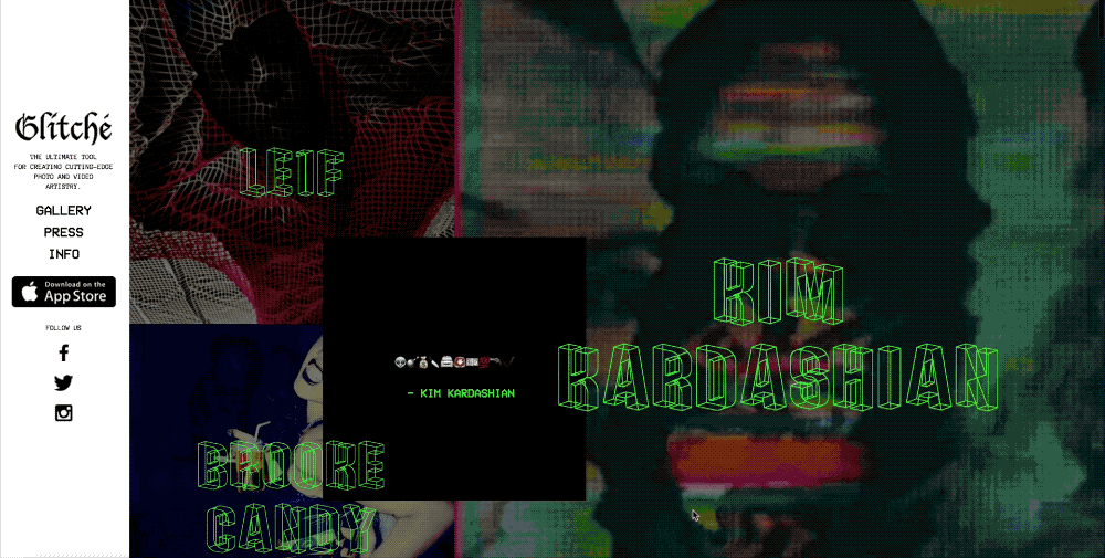
Glitché allows users to edit photos with almost 50 effects and has a very interesting maximalist website.
The visuals of the website might be a lot for you if you are used to such designs. We’ll be honest with you – this site is not for the faint eye. The visitor can not just scroll through this particular website.
As you log on to the website, you are greeted with a neon-green color light that flickers continuously before showcasing a series of pages layered with images and videos.
-
Alex Tade’s Portfolio
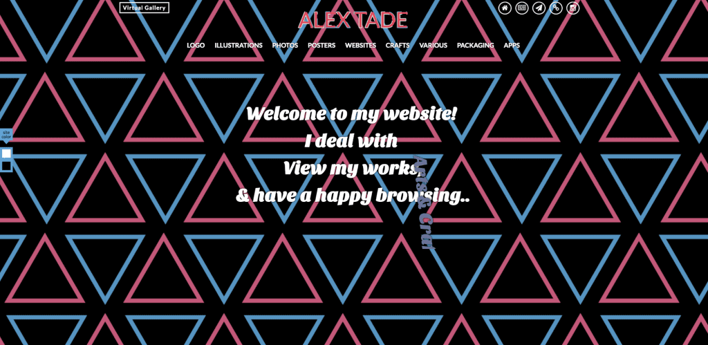
If we are talking about maximalist web designs in action, we can not leave behind this design. When we are talking about Trade, we are also talking about an artist, a web designer, a developer, a painter, an illustrator, a sculptor, a photographer, and also a writer. His personal portfolio is the best example of this approach.
When the visitor enters his portfolio it feels like they are playing an arcade game because it has responsive texts, geometric shapes, and loud colors.
Go Big or Go Home
I guess we have now established the point that the maximalist web design approach involves embracing the creative flow. Now this flow can be loud, excessive, or distinctive in nature.
The Two Major Takeaways are
- Minimalism can be useful but with the mentioned restrictions it’s not fair to assume that it’ll serve your website’s vision.
- Maximalism on the other hand can serve specific design ideas that less aggressive designs or aesthetics can’t.
After all, the end line or goal of designing a company’s website should be to recognize the brand’s identity.
Don’t be afraid to embrace more aggressive styles if you think they’ll help your brand.
Need Help With Developing Your Website?
Happy Designing!!!