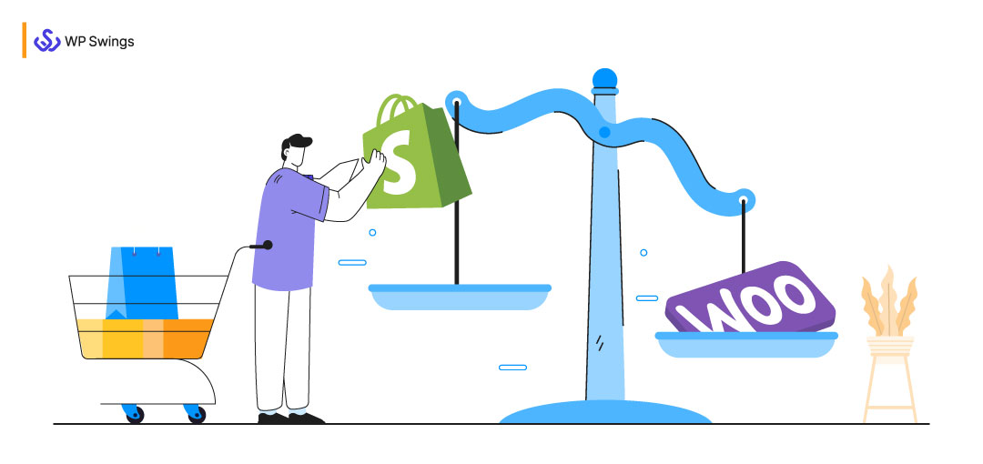
Do you want to build a Shopify checkout for WooCommerce? We have the ideal tutorial for you! The guide will teach you how to make your WooCommerce checkout look like Shopify with no coding involved.
The Shopify checkout can be one of the biggest additions to consider while working for an eCommerce platform. Its checkout flow, or in other words, the set of steps a buyer takes to place a purchase will definitely improve the conversion rate of a store.
How come? What is so special about adding a Shopify-style checkout to your store?
According to Baymard’s checkout UX research, the typical site has 31 avoidable usability flaws in the checkout phase. As a result, most stores have a lot of room for development and improvement.
A highly conversion-optimized checkout procedure is what should be an ideal thing one should follow.
Before going further..let’s take a look at the pros and cons of both the Shopify and WooCommerce default checkouts, as well as why we often wind up generating a very similar experience to the Shopify design when building our websites. We’ll show you how to do it yourself, as a result, getting more conversions and a better user interface.
Table of Contents
Shopify Checkout Process Vs WooCommerce Checkout Process
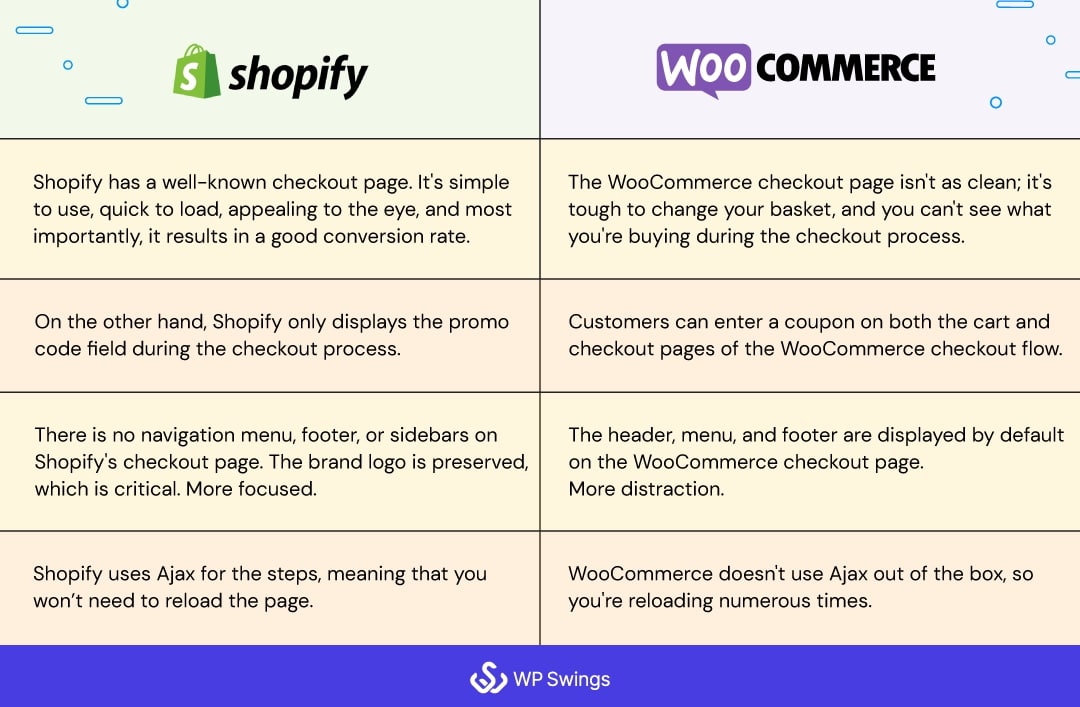
One of Shopify’s main benefits over WooCommerce is its well-known checkout page. It’s simple to use, quick to load, appealing to the eye, and most importantly, it results in a good conversion rate. Ajax is used for the steps, meaning that you won’t need to reload the page.
While the WooCommerce checkout page isn’t as clean; it’s tough to change your basket, you can’t see what you’re buying during the checkout process, and it doesn’t use Ajax out of the box, so you’re reloading numerous times.
WooCommerce is one of the most adaptable eCommerce platforms available, offering a wide range of customization choices. However, for site administrators and customers, all of these benefits might be overwhelming at times.
You yourself must have experienced that WooCommerce allows you to add a lot of checkout fields. And, if you include too many, you may wind up with a lengthy and difficult checkout page. Users may find filling in so many fields laborious which may increase cart abandonment..leading to an impact on your conversion rate.
Shopify, on the other hand, has a more comprehensive checkout process. Customers add things to their basket, proceed to the cart page, and then select their checkout option before placing their order. It lets you offer a regular checkout that allows customers to fill in their information, enter their shipping details, and then continue to the payment page. Also, you can prefer an express checkout which seamlessly lets the customers checkout from your online store.
In other words, the Shopify checkout has a single, clear call to action button. Its checkout page’s layout is organized in a logical way that makes it easy for customers to fill out. A one-way workflow ensures customers don’t get disoriented mid-checkout.
WooCommerce vs Shopify checkout flow: coupon code
Customers can enter a coupon on the WooCommerce checkout flow’s cart and checkout pages.
Shopify, on the other hand, shows the discount code area only during the checkout process.
WooCommerce vs Shopify checkout flow: distraction-free layout
On the WooCommerce checkout page, the header, menu, and footer are displayed by default. During the checkout process, customers may become sidetracked and click on any of these links.
On Shopify’s checkout page, there is no navigation menu, footer, or sidebars. On the other hand, the brand logo is kept, which is crucial. As a result, customers will be able to stay focused on the checkout form and the task all under control.
Below is the default WooCommerce checkout page
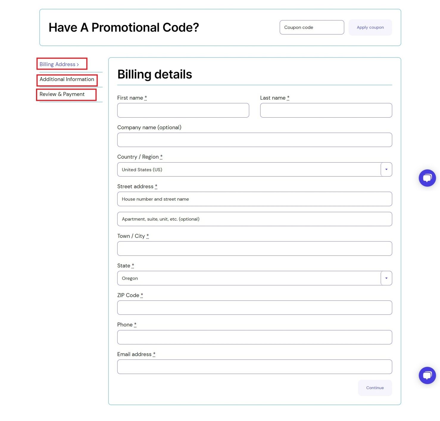
and the default Shopify checkout page
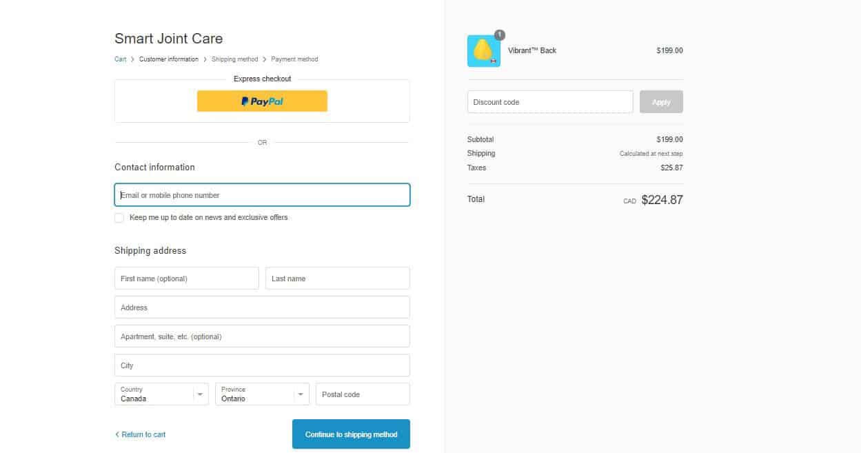
As you can see, the checkout page of WooCommerce is much more complicated and has many fields to fill- the billing address, additional information and review and payment while the Shopify checkout page is simple and quick to fill.
Below is the graph of the global market share of each ecommerce platform as of April 2022.
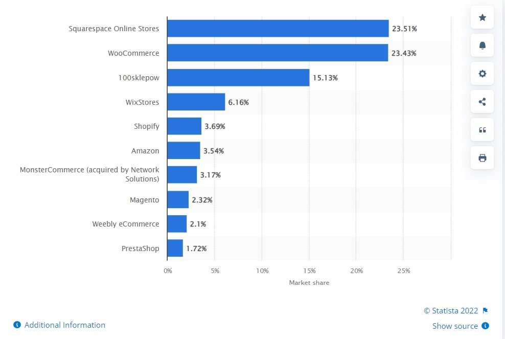
Obviously, you must be thinking that if WooCommerce checkout has so many complications then why do people even go for WooCommerce? Clearly, Shopify is the winner in checkout. Many businesses even partner with a trusted Shopify plus development company to further enhance and optimize their checkout experience. What can WooCommerce do to make its checkout as attractive as Shopify? Let’s see!
The good news is that since WooCommerce has a lot of customization options, you can easily make your WooCommerce checkout look like Shopify. Let’s see how!
Know More about the Difference Between WooCommerce and Shopify!!
Plugins to Create Shopify Checkout for WooCommerce
There are numerous methods to modify your WooCommerce site’s default checkout experience and make it look and function more like Shopify.
You can utilize WooCommerce-specific themes and plugins to improve the checkout process and tailor your online store to your needs.
Let’s look at some of the greatest themes and plugins for doing so:
WooCommerce Blocks plugin, developed by Automattic, is a free one. There are several Gutenberg blocks dedicated to WooCommerce, of which one is especially designed for the checkout.
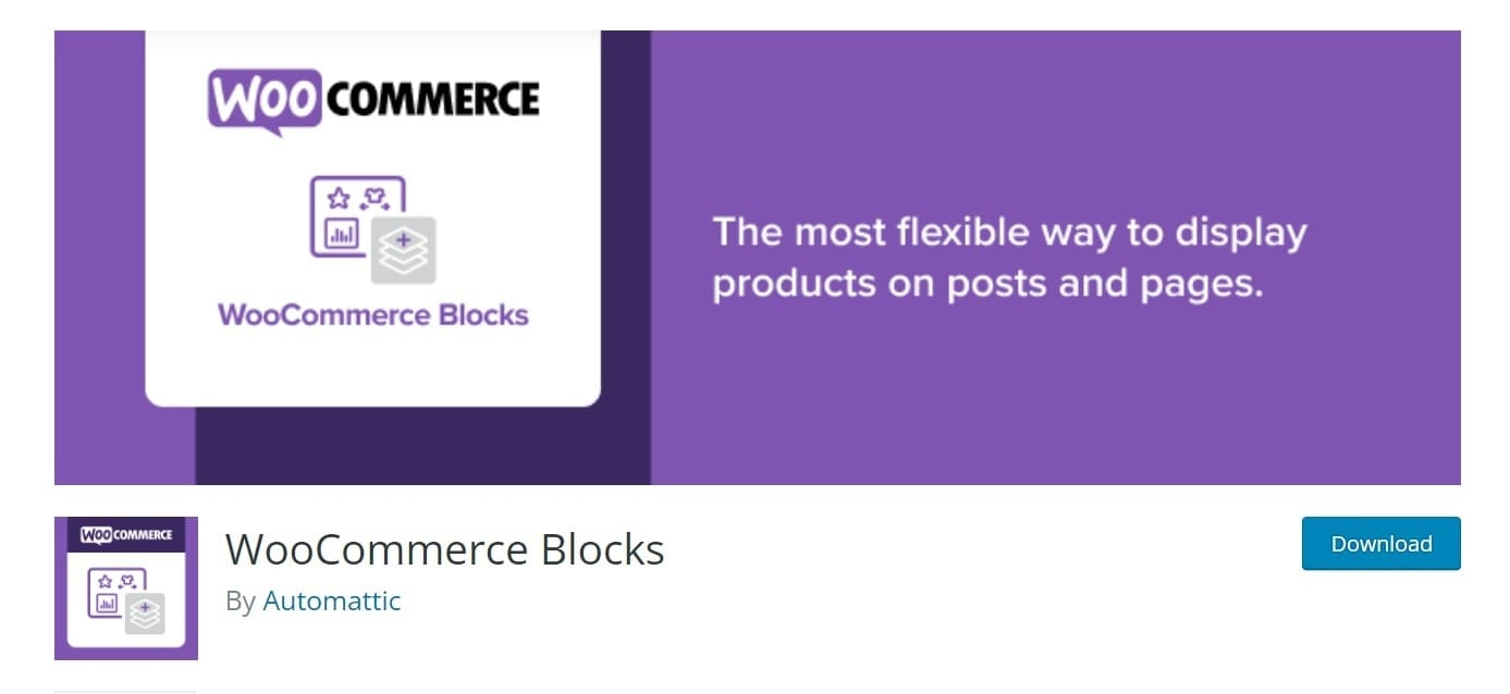
You can quickly make your WooCommerce checkout seem like the Shopify checkout with the help of the checkout block. It even comes with identical default layouts and content sections making the transition a breeze. This tool also offers a number of customization options for the checkout block, allowing you to tailor it to your specific requirements.
The CheckoutWC plugin is intended to make the checkout process for your online store much easier and faster. Below is the image of a store detecting the CheckoutWC.
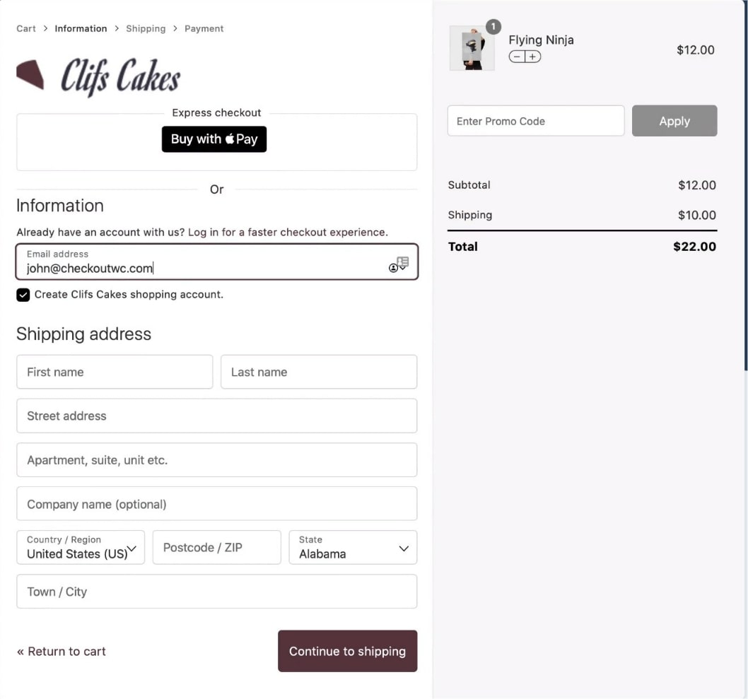
It allows you to set up a three-step checkout procedure, which is a wonderful method to keep clients focused on the checkout form rather than being distracted by other material on your eCommerce site.
The plugin also allows you to change the default WooCommerce checkout form with a more user-friendly and engaging one. This not only improves your online store’s conversion rate, but also improves the checkout process.
The Aero Checkout plugin provides an all-in-one solution for customizing your online store’s checkout page.
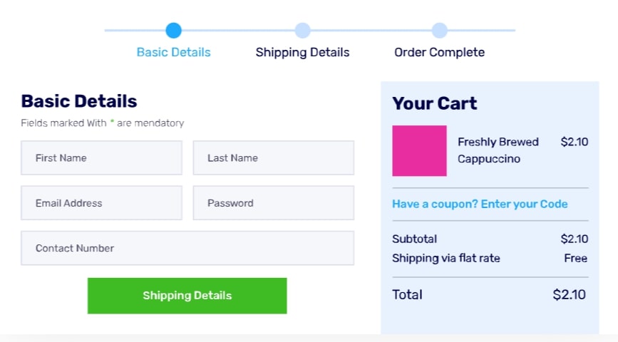
You may construct a multi-step checkout process, similar to Shopify using this powerful plugin. Customers will be able to see where they are in the checkout process, encouraging them to finish it before leaving.
The Aero Checkout plugin includes pre-designed templates that enable you to easily construct a professional-looking custom checkout page.
CartFlows is a popular WooCommerce sales funnel builder that comes with a slew of useful features to help you boost conversions.
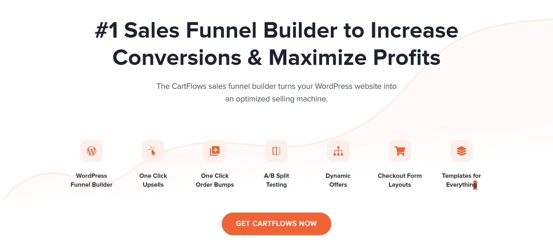
It allows you to add one-click upsells, order bumps, and dynamic offers to your online store with ease. Its Checkout Editor tool allows you to modify the WooCommerce checkout experience of your choice, and you can get started quickly using the supplied sales funnel templates. In addition, you can run A/B tests on checkout designs to see which one converts the best.
The Shoptimizer WooCommerce theme was created to assist store owners in increasing conversions while maintaining a professional appearance.
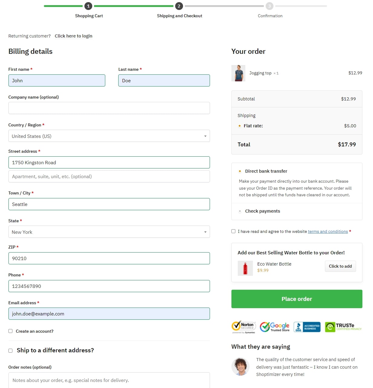
It is a high-performance WooCommerce theme that will help you improve your online store and increase conversions. The theme comes with a distraction-free checkout page removing the header, footer, and sidebars from your online store’s checkout page. As a result, customers will remain focused on finishing the checkout form.
Furthermore, the Shoptimizer theme may also be used to display trust badges and testimonials on the checkout page. This allows you to address any concerns clients may have and assist them in validating their purchasing decision.
And many more….
How to Add Shopify like Checkout Fields for WooCommerce?
We’ll take WooCommerce Blocks as a plugin in this article to make your WooCommerce checkout look like Shopify’s. It’s a fantastic free plugin with a tonne of options for customizing your WooCommerce store, including a dedicated checkout block.
Make sure WooCommerce is correctly installed on your site before we begin. You can either watch the video below or follow the steps along with us to get the WooCommerce Shopify checkout as you wanted. Let’s begin!
1. Install and Activate WooCommerce Blocks
Install and activate the plugin first. In your WordPress dashboard, navigate to Plugins > Add New and search for the WooCommerce Blocks plugin. Install it by clicking Install Now once you find it.
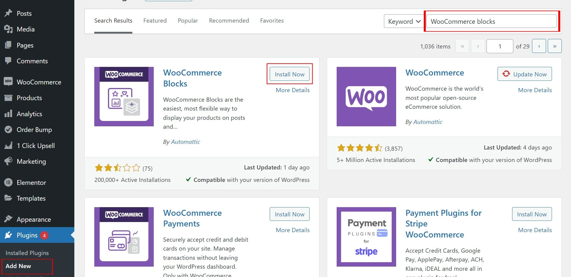
Once installed, activate the plugin.
2. Customize and Configure the Checkout Page
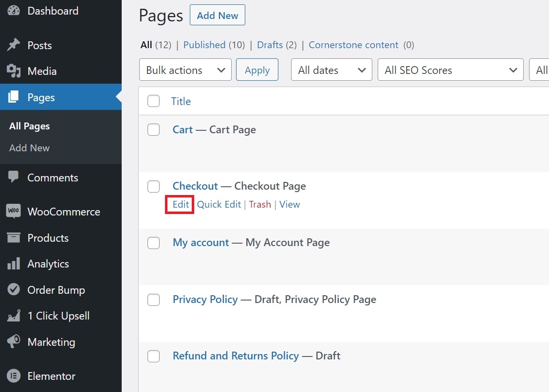
After that, go to Pages in your dashboard, find the Checkout page, and press Edit.
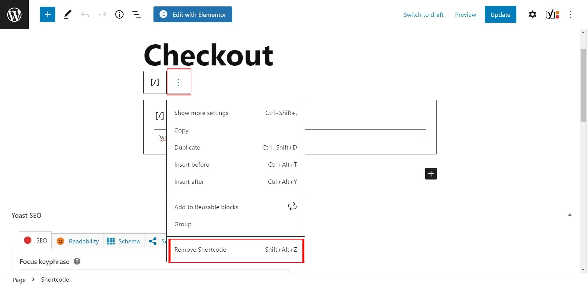
You will be able to see the default WooCommerce checkout page shortcode now. Remove the shortcode in order to make the WooCommerce checkout look like Shopify’s. Simply click on the shortcode and press the three vertical dots to access the settings.
Then, to delete the shortcode, click Remove block. Alternatively, as demonstrated in the options shortcut, you can click on the block and then press Shift+Alt+Z.
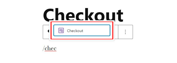
To add a new block, click the ‘+’ symbol or type ‘/’ and search for “Checkout.” Update the page by selecting the checkout block. You’ll be able to see your new Shopify-inspired checkout page now in WooCommerce.
You now have two choices: keep it as it is or change it. Let’s have a look at how to make changes to it.
First, go to the top right corner of your screen and select the settings symbol. In the right sidebar, you’ll find page and block settings. Then, from the block setting sidebar, click on one of the blocks to begin changing that particular block.
If you want to alter the fields of the shipping address, for example, simply press the shipping address block, and all the relevant choices will appear in the right sidebar.
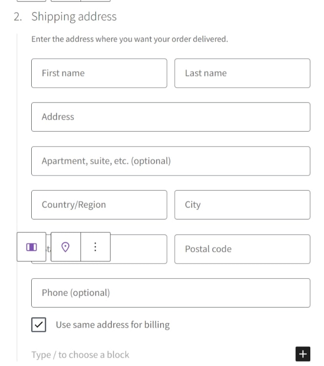
You can then choose whether to display or conceal the field editors for your checkout page.
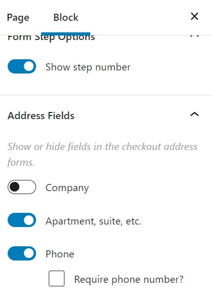
Update the page once you’ve done all of the necessary adjustments. You’ll notice your new checkout screen if you go to your checkout from the front end.

Tip to Remember: Make sure the Cart and Checkout pages are the same.
If you have a cart page, you may follow the same steps as before to make the checkout and cart pages match in appearance.
Simply navigate to Pages in your WordPress dashboard, find the Cart page, and delete the default WooCommerce cart page shortcode. Then, with the cart page still open, create a new cart block and update it.
It depends on the sort of goods or service you have, but to make the checkout process simple and crisp, we recommend skipping the cart page.
Want to Migrate Your Shopify Site to WooCommerce One?
Ways to Enhance Your WooCommerce Store’s Checkout Process
-
Ability to create one-page checkout
What if you wanted to combine all of the fields into a single step and make a Shopify checkout with just one step?
Develop a separate one-page checkout for certain products, or even better, create a dedicated one-page checkout for specific products. You should be able to accomplish this with the help of your checkout page builder. Also, you can add one click upsell funnel to make your checkout more engaging.
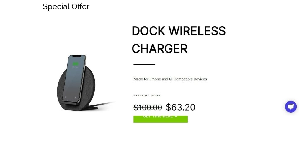
However, Shopify does not allow you to do so— WooCommerce does!
-
Increase the average order value by adding an order bump
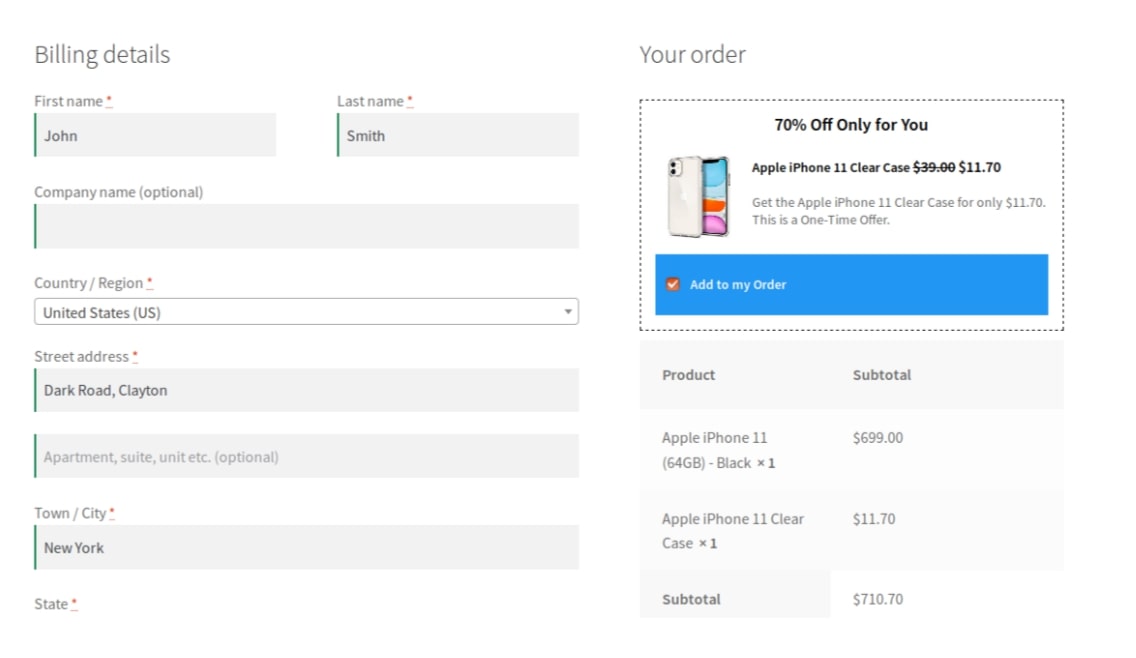
Adding an order bump will allow customers to get last-minute product offers—which will add value to their purchase while improving your average order value!
Make an enticing offer that clients can’t refuse on your Shopify checkout page. With a simple click on the checkbox, the user can add the item to their order.
An order bump is quite valuable because it avoids the need for you to show pop-ups or conduct obtrusive cross-sells.
-
Include Testimonials
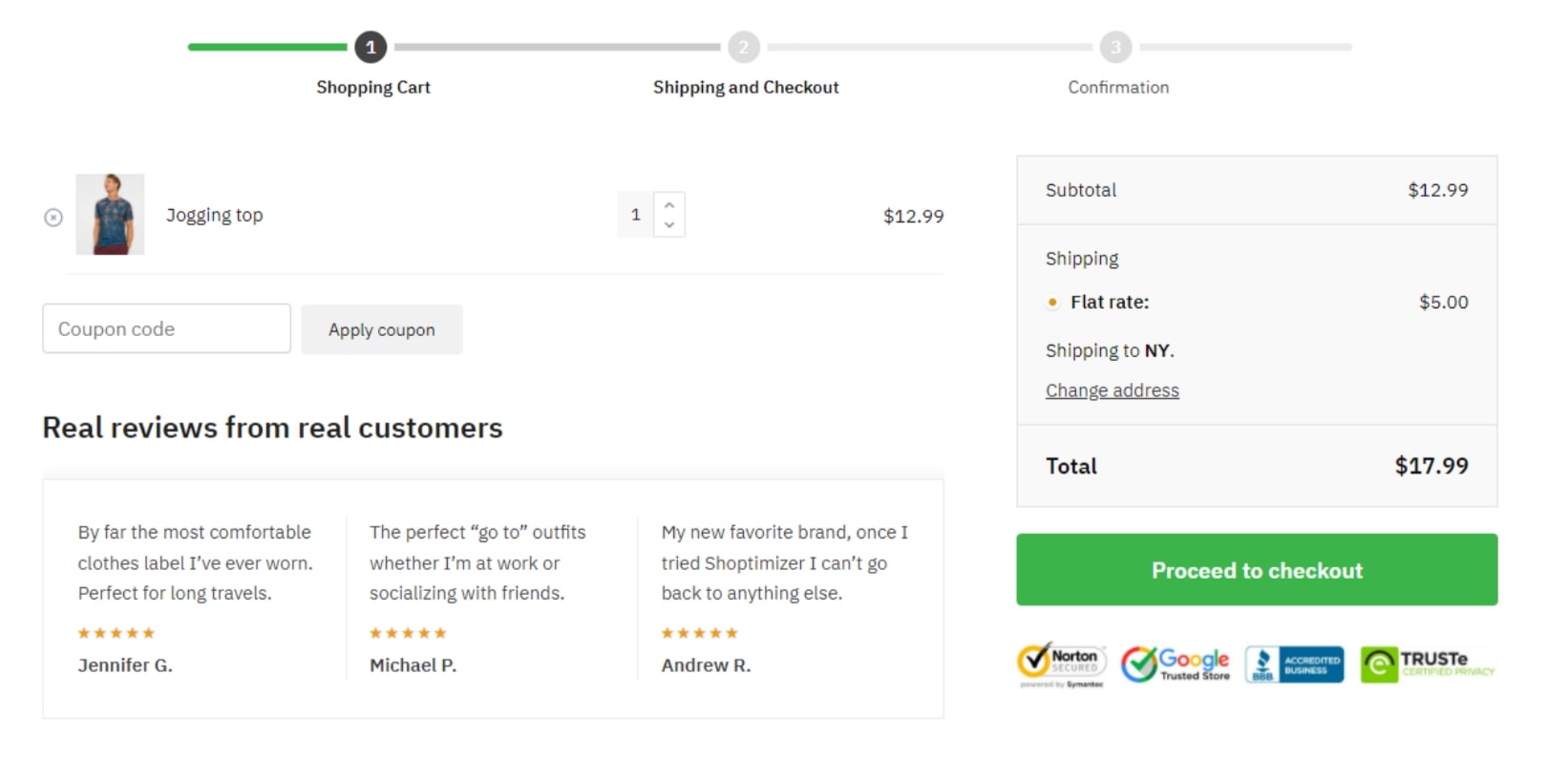
Including testimonials in your WooCommerce checkout flow is also a wonderful approach to improve it. Customers may substantiate their buying decisions by seeing testimonials and good reviews.
A first-time customer, for example, might be hesitant to provide you their credit card information. They’ll be more likely to place their order after they notice that other individuals have successfully purchased things from your online business.
Testimonials demonstrate to customers that others have had positive experiences with your WooCommerce store.
-
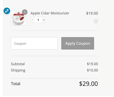
Provide cart editing on the checkout page.
Giving users the option to modify their carts on the Shopify checkout page is a fantastic hack.
It reduces the amount of friction in the purchasing process. To make changes, the user does not need to return to the cart page.
They will have complete control over their buy as a result of this. Checkout field editor can help you out with this.
Contributions Are Welcome
The checkout flows of WooCommerce and Shopify are similar in some ways and dissimilar in others.
While the WooCommerce checkout experience is simple and straightforward, you can improve it with a few simple changes. Give this a try!
Do let us know in the comments section your experience with and without the Shopify WooCommerce checkout and if facing any complications, we are here for you.

