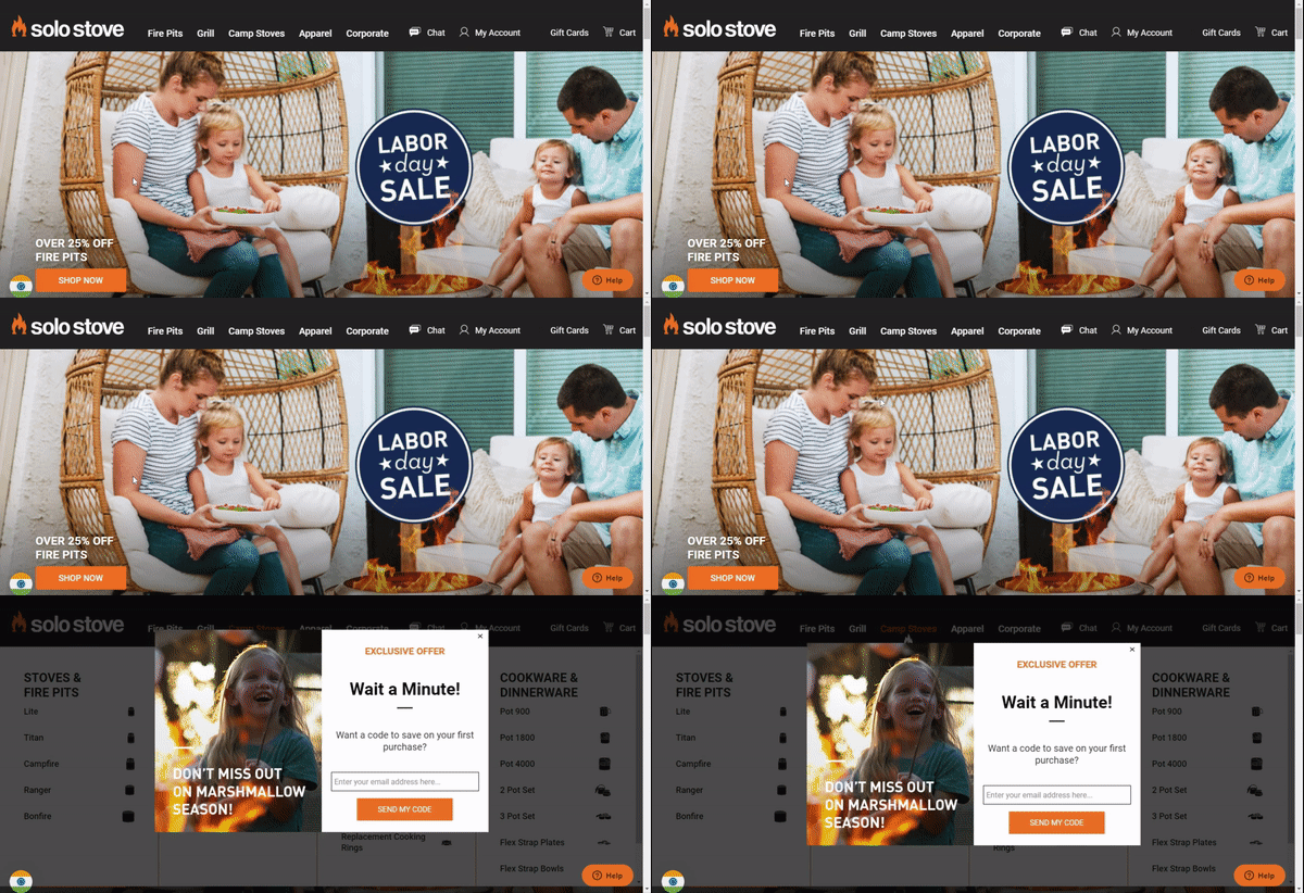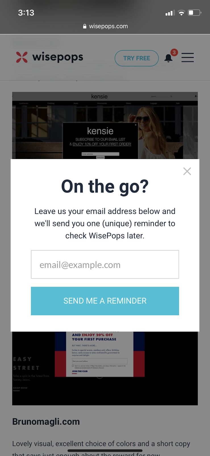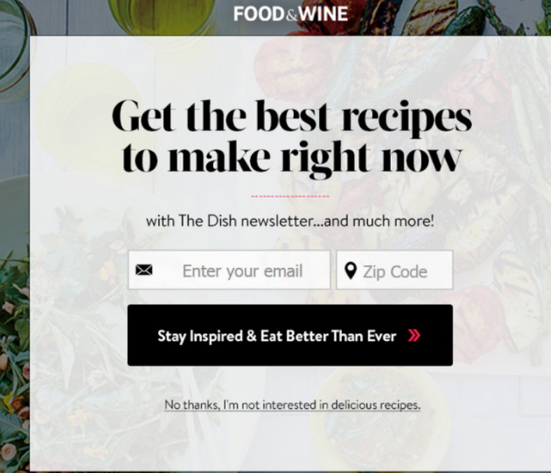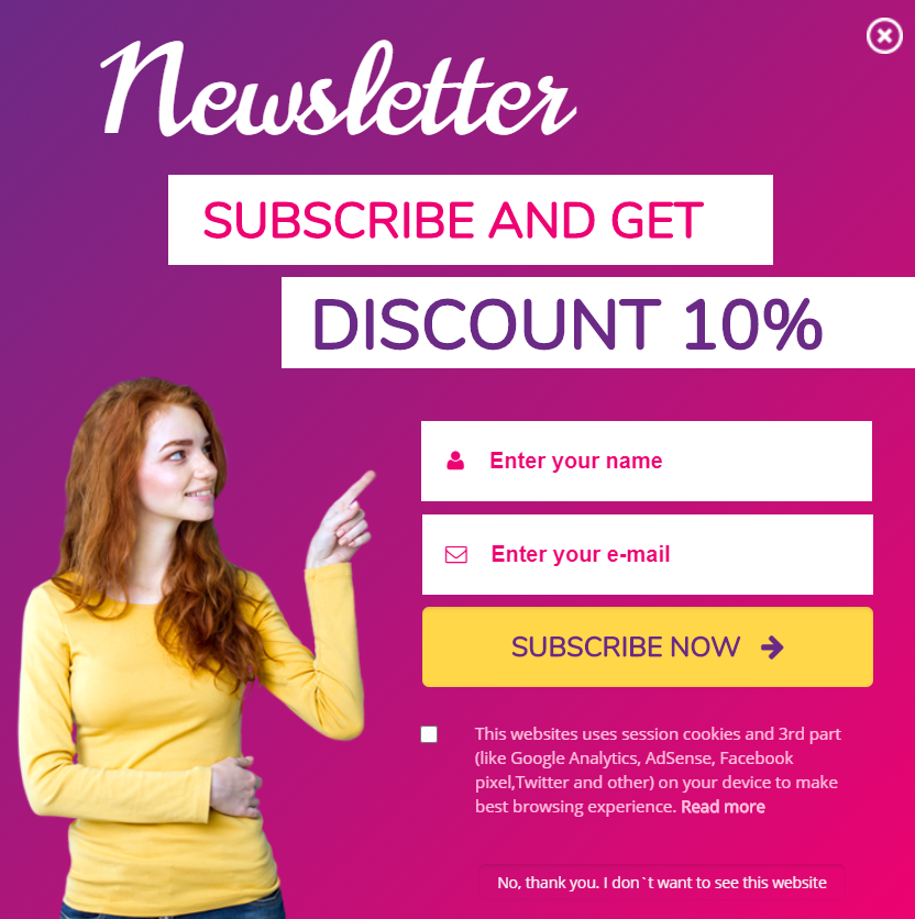
eCommerce email popups are recalled as a pushy, provocative sales approach that is obtrusive, irritating, and downright infuriating sometimes. But why so? Pop-ups aren’t the problem; poorly executed pop-ups are! Specifically, cramming them into one-size fits in instances when clever, wonderful targeting choices exist.
Giving your visitors an easy, apparent, and motivated way to sign up for your email list fosters long-term growth.
Not all visitors are convertible! You have to accept that some visitors will simply not buy, regardless of how amazing your product is or how many deals and incentives you provide.
You’ll have to construct pop-ups that target the proper demographic, offer the finest incentives, and convert website visitors into strong leads to grow your business by trying a variety of approaches using a proven checklist.
As per the 3/47/50 rule:
- Only 3% of visitors buy from your store.
- 47% of the audience do not buy immediately but are willing to purchase in the future.
- 50% of visitors will never buy.
Even though, don’t put your sword down. entails pivoting on that 47% of visitors, who are not agreeable to buy immediately but are willing. Email marketing can be an excellent way to reach that target audience.
But Why Email Marketing?
Emails are one of the most widely used forms of digital communication, which is why employing them for marketing purposes can be tremendously effective. They aid in escalating user engagement, announcing the best discounts, customer loyalty, sharing relevant information, and increasing sales. Including a well-crafted email signature can further enhance brand consistency and professionalism in every message.
The importance of email marketing in achieving business success cannot be overstated. Implementing a successful email strategy has numerous advantages. Email marketing allows you to raise brand awareness, establish a reputation, and form trusting relationships with your customers. In many cases, using cold emails can also help you reach new audiences and support these ongoing efforts. To extend the value of each email interaction, marketers increasingly explore email signature banners ideas as a subtle way to promote campaigns, showcase key updates, or drive traffic without overwhelming the reader. It’s also an excellent approach to creating leads, increasing revenue, and increasing website traffic.
According to Campaign Monitor,
- 72% of people prefer accepting promotional content via email, compared to 17% who prefer social media.
- You are 6x more likely to get a click-through from an eCommerce email campaign than via a tweet.
- Email is 40 times more effective at acquiring new customers than Facebook or Twitter.
- 24% of visitors buy from email marketing, 2.49% of visitors from search engines, and 0.59% from social media.
- eCommerce email campaigns have an ROI of 3800%.
- For every $1 spent, email marketing generates $44 in ROI.
These stats are evident in the fact that if you have a potent email list, email marketing can work wonders for you, only if used in the right way.
What is the righteous way to do email marketing?
Building an email list can be tricky one. Emails from visitors are collected in a variety of ways by online marketers. Some of these approaches may irritate consumers to the point where, rather than sharing their emails, they feel compelled to leave your site and may never return.
So it is a must to take extreme caution while picking an email list-building strategy. Email pop-ups are certainly worthy of attention when it comes to methods of growing your email list.
The greatest way to create an email list, in my opinion, is to use eCommerce email popups.
Also Learn, How You Can Leverage Social Media To Drive Marketing Benefits!
What Are Email Pop-Ups?
Email pop-ups are the inlays that pop up in the middle or sometimes around any corner of the web page to catch the user’s attention. Pop-ups are mostly used by marketers to advertise and generate leads.
Email pop-ups are an astonishingly useful digital asset that can build your email list. And if you are not leveraging or applying the best practices of email pop-ups, you are missing out on a lot.
Sometimes, the popups may be irritating as they just upset the audience, giving no added value. This is why you should give your visitors something that is relevant in exchange for their emails.
Popups do have a con that if they’re overly wide or difficult to close, they might block access to the page’s content, degrading the user experience.
In this guide, we’ve included email pop-up best practices used by industry leaders that you can use to make your site stand out and your email list grow.
Why Email Pop-Ups And Do They Work?
Why do businesses continue to use pop-ups when everyone you ask despises them?
Despite how unpleasant they are and how much they violate UX best practices, it appears like you can’t visit a website these days without being bombarded with unapologetic pop-ups.
When this happens, we all know how we feel frustrated, insulted, tricked, and unengaged right away.
Then why? Because annoyance does not imply inefficiency. They can even have a positive impact on your readers and business if done correctly. Some pop-ups have a high conversion rate. They have the potential to convert up to 40% of your website visitors into subscribers or leads.
The point is that pop-ups, like emails, Facebook advertisements, and other forms of marketing, have a place and time. According to Hubspot, email marketing is the greatest approach to increase sales and customer retention for 80% of eCommerce merchants.
Do You Know You Can Effectively Increase Your Customer Retention With An On-Point Return Policy?
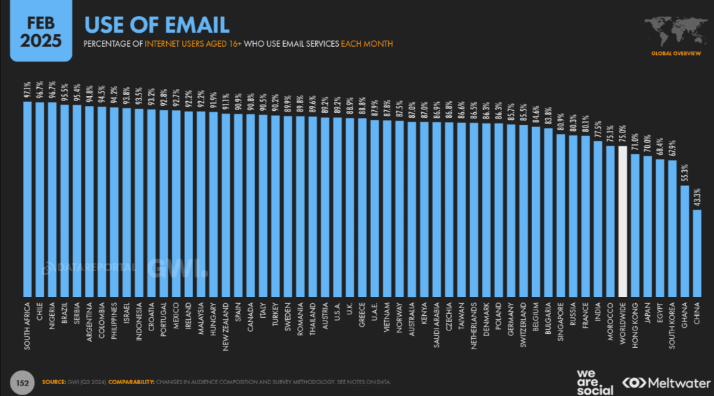
However, at a worldwide level, GWI’s regular research finds that 75 percent of online adults use email at least once per month.
Therefore, capturing the maximum number of email addresses from website visitors is a very substantial part of your business success. From my perspective, pop-ups are the best asset to attract users at the very first instance because of the design, presentation, offers, etc.
Various other points of why to choose pop-ups are:
- Pop-ups help announce important news, offers, etc.
- They are a pre-eminent way to grow your email list with a sign-up form.
- Pop-ups come with a lot of targeting and segmentation options.
- They offer you flexibility in terms of design
Do Pop-Ups Work?
The answer is yes, but only if you understand how to use them properly.
You must consider your target audience when deciding where to place a pop-up in an eCommerce campaign. If a visitor is on your product page, for example, your goal should be to persuade them to buy the product, not to distract them with pop-ups.
The success of your email pop-ups is largely determined by their alignment and location. Check out the following section for further information.
Types Of Email Pop-Ups
1) Time-Based Pop-Ups
After running multiple AB tests with our customers, we have concluded that the shorter you wait, the more emails you’ll collect; nevertheless, the longer you wait, the higher your subscription rate will be. Time-based pop-ups are those that occur for a definite period on a specified interval.
Sometimes what marketers do is:
They just fit the pop-up at the very start of the website landing page, which may irritate your visitors.
The right move to insert the pop is:
Firstly, give your audience time to scroll through your site, so that they can build trust with you. Once the trust is built, your visitors can easily be converted into subscribers and then hopefully into buyers.
Need to find the Sweet Spot? An AB test is the most effective technique to determine the exact timing that increases conversions while maintaining a reasonable conversion rate. You can see how your popups appear on landing, after 10 seconds, 20 seconds, and so on.
If you don’t want to select, you can also use exit-intent detection described later to activate your pop-up when your users are going to leave your website.
2) Welcome Pop-Ups
The pop-ups that are shown just after the visitor lands on your site are Welcome pop-ups.
Whenever a pop-up arrives, you usually prefer weighing the pros and cons of giving away your email address.
This is where your offer comes in. The best offers can be Coupons, Sweepstakes, Freebies, Mystery offers, good content, and many more.
Appearing pop-ups on the whole screen ensures the full attention of the audience so that the visitor gets influenced by your offer. But at the same time, you have to be very conscientious while using these welcome pop-ups, as they are very distracting and can agitate your users.
Therefore, select them for special occasions and then see your audience’s response.
3) Exit-Intent Pop-Ups
An exit-intent pop-up appears when your customer is about to leave your site.
This is the technique used by online shoppers and marketers to retain audiences that are going to leave their sites.
In these pop-ups, the visitor’s mouse location is tracked, and when the cursor reaches the top corner of the page i.e. the close(x) button, it detects the same and an exit-intent pop-up appears immediately reminding you about offers and coupons.
4) Discount And Coupon Code Pop-Ups
Coupons are the most effective technique to persuade your visitors to sign up for your newsletter. Agree?
When it comes to coupons, though, savings aren’t the only choice. Free shipping offers are also effective.
Try giving it a shot!
If utilized correctly, coupons are the easiest to install and most well-liked pop-ups. When you offer coupons to your visitors in pop-ups, they are more likely to make a purchase.
The finest pop-up campaign, according to eCommerce data, can have a conversion rate of more than 50%. All of this, however, is contingent on how you craft your promotions.
You may utilize a special discount pop-up, or pop-ups with free delivery offers, for example.
5) Lightbox Pop-Up
There’s a reason why theaters and cinemas turn off the lights before a performance. It’s the same reason why lightbox popups appear in the way they do: to catch the attention of the viewer.
Using lightbox popups (also known as modal popups) is one of the most efficient ways to convert website visitors into email subscribers and customers.
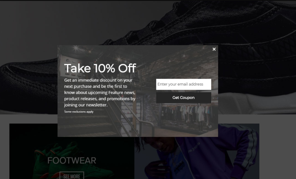
When it displays, the backdrop of the webpage is darkened to make the form stand out. It looks lovely because of the dim background, simple lighting, and standard. They’re extremely visible, interruptive, and can readily grab visitors’ attention while they’re navigating the site.
They are intruding. Prefer using them when customers are about to leave your site. Otherwise, there may be a good chance of increasing your bounce rate, which will affect your conversion rate.
6) Newsletter Pop-Ups
One of the most productive ways to increase your email list is by setting up subscription pop-ups.
Newsletter pop-ups are on-screen interactions that can be used to exhibit any call to action and help eCommerce marketers gain more email subscribers for their eCommerce store.
Compared to traditional footer sign-up links, the execution of newsletter pop-up ideas is easier. It attracts user attention to every foremost occurrence.
Best Practices For eCommerce Email PopUps (with examples)
- A clear call to action
- Use personalized pop-ups( use an image )
- Test your target campaign
- Eye-catching layout
- Make relevant pop-ups
- Easy to dismiss pop-ups
- Mobile optimized
- Appears at the right time
1) A Clear Call To Action
Any mess, whether it’s offline or an online one, people always get repelled by it. So why create one? The same applies to call to action, i.e., you shouldn’t have more than one call to action.
You must bear in mind that people are visiting your site for a reason, and the pop-up may interfere with their activity, causing them to become annoyed and depart.
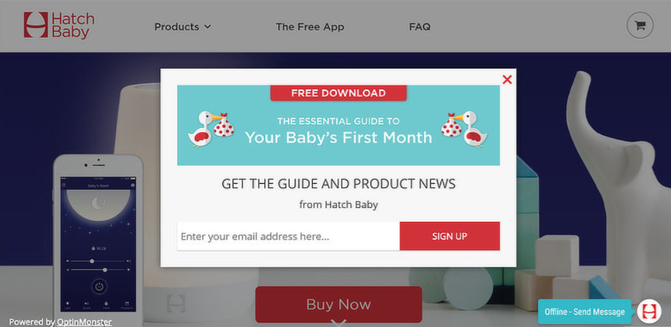
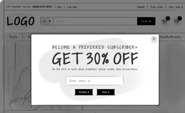
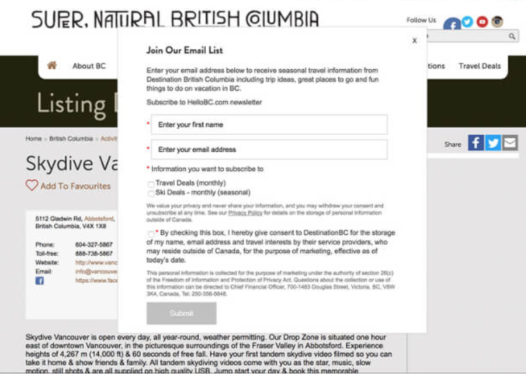
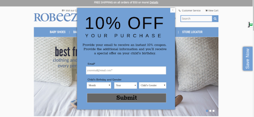
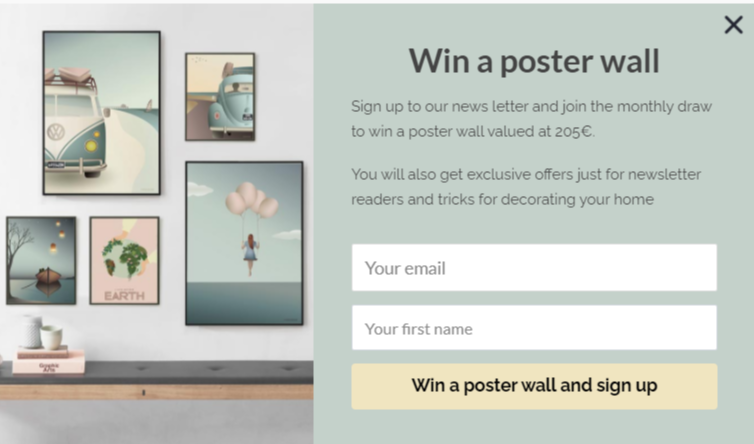
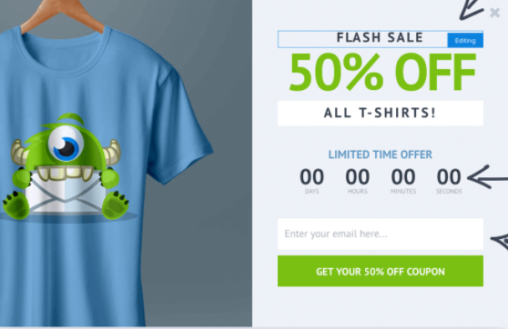
Let me explain with an example, look at the images and think which eCommerce email popup will get more responses.
This one?
Or this one?
Obviously, the first one, right?
Because in the first pop-up, no irrelevant information is given. The message is clear and concise.
Why not the second one? Because in the second one, all the things are messed up. The amount of information asked and the number of options shared are highly confusing and irritating.
This example shows exactly what you don’t have to do while creating a pop-up. Such marketing tactics are disliked by many audiences as they hamper the customer experience.
Hence, always use a clear and strong call to action. To know more about CTA hacks-
2) Use Personalized Pop-ups (Use Images)
Humans acknowledge images and videos more than anything else and try to copy them.
A maximum of people visit or stay on your website just because of the designs and themes you use. Hence, it is important to personalize image pop-ups.
Personalization makes an eCommerce email pop-up feel more friendly and attractive. It is a plan to coordinate your pop-ups with the page on which it is presented. So, despite having one site pop-up, you can create different pop-ups according to your landing pages or categories.
But again, how do we personalize the pop-ups?
One effortless and facile technique to personalize the pop-up is: You can use referrer detection technology to mark when visitors come to your store and what they want. You can use this information for customization later on. Personalization offers make your customers feel as if you have made that offer just for them. You can extend this personalization to emails using AMP emails, which let users interact with tailored offers directly inside their inbox.
You can also use visuals to make your pop-up look more engaging. Use floating images instead of boring ones.
3) Test Your Target Campaign
As an eCommerce professional, you already know the importance of testing your marketing efforts once. We have faced this in our whole lives, even in our schools or colleges. Putting in effort doesn’t decide what we have learned, but a final assessment or examination does.
Consequently, it is very important to test your email pop-ups on your target email campaign audience.
But you must be wondering:
What should I test?
Another important aspect of testing is making sure your campaign successfully reaches your recipients’ inboxes. Tools like GlockApps allow marketers to run spam placement tests and evaluate their campaigns before launching. By analyzing deliverability reports across major providers and reviewing factors such as authentication records, content issues, and sender reputation, senders can identify problems early and improve their campaign reach.
You should test the basic elements like design, theme, template, place, etc., but besides this, the foremost important point that has to be checked is the timing of your pop-ups. Timing plays a very important part in managing and attracting audiences. We will also discuss it later in this blog.
4) Eye-Catching Layout
The pop-ups that are imagery and communicative are fun, eye-catching, and even more convincing.
While designing eCommerce email popups, think like your audience and what they may want. That’s how you will achieve relevance. The best way to convert a visitor into a buyer is to use eye-catching pop-ups. Use the pop-up that flashes on the whole screen; there is no way users can ignore such a pop-up.
Look at AVWeb’s example of a full-screen pop-up to see how well it captures user attention.
5) Create Relevant Pop-Ups
Everyone wants something interesting when it comes to pop-ups. Relevancy is the queen that will help you convert your visitors into subscribers.
A user comes to your site because he wants something that can add value to him. Therefore, think about the offers you present to them and how they can help your subscribers.
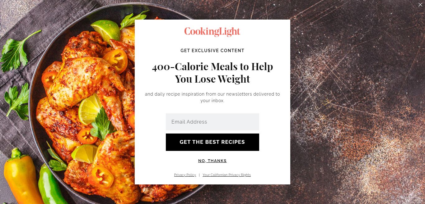
Here’s an example of a relevant offer in a pop-up appearing on a cooking magazine site:
It is quite clear that the cooking magazine website would appreciate a good resource on losing weight, as shown above. The relevancy of your eCommerce email popups matters a lot, and you should keep this in consideration while framing them. Do not use irrelevant pop-ups that are not relatable to your page.
6) Easy To Dismiss Pop-Ups
Remember what we said about not misapplying pop-ups?
You ought to always give your visitors a simple way to dismiss a pop-up. Your close buttons should not be as leading as your CTA, but they cannot be something a visitor would miss either.
And also, please don’t use pessimistic or aggressive sentences as an option for closing a pop-up. Phrases like “I don’t need more email subscribers for the eCommerce store”, etc., annoy your audience and can damage your brand image.
In the Tim Ferris pop-up example below, notice how he has used the pop-up with a simple thank you message despite commenting on anything inappropriate.
7) Mobile-Optimized
Do you know there are almost 11 billion mobile devices in the world?
And this number is increasing day by day!
Hence, if you are not targeting mobile devices in your marketing tactics, you are leaving 80% of the audience, and as a business professional, you cannot afford this great loss.
OptinMonster helps you to get the attention of smartphone users with its Mobile-Friendly Popups, specially designed to perform great on all mobile devices. Also, you can customize any template using the drag and drop builder or can even create your own mobile pop-ups from scratch with our Canvas technology.
Learn More About How To Make Your Store Mobile-Friendly!
Therefore, instead of annoying your visitors with non-responsive, slow-loading, and hard-to-read forms, you can make your user experience excellent by using OptinMonster’s fast and targeted mobile campaigns
Various other plugins are also available by which you can make an eCommerce email pop-up to collect verified email address, which we have discussed later in this blog.
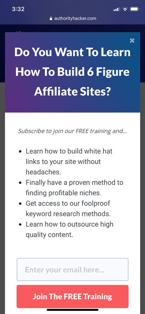
Here is an example of a mobile-optimized pop-up.
8) Appears At The Right Time
Determining the right time to display your pop-up is the key to your business success.
When visitors browse your site for the first time, it is a must to create positive first impressions. You must be aware of the phrase, ” The first impression is the last impression”. Therefore, you must ensure that your first impression of your visitors is a positive and memorable one
Most marketers block the experience of the customers by inserting a pop-up just after they land on your site. This only creates trouble for your user and makes their experience worse.
To make your eCommerce email pop-up productive, give your customers some time so that they can become familiar with your website and build trust.
The correct time for any pop-up to appear is at least 60 seconds after the user visits your site.
If you have Google Analytics set up for your site, you can find the average time on different pages. Just click on the “Behavior” tab and then the “Overview” option.
Go through your Google Analytics data and examine where to start; check different time durations to get the best result.
Try to use the pop-up at the end of every user session, if possible, for the best results.
Tools To Optimize The Timing Of Pop-Ups
6 Tips To Thumbnail Your Pop-Up Design
Besides creating content that viewers and fans desire to scroll, creators should adhere to a few guidelines while creating amazing pop-up designs, such as:
- A clear CTA
- Use the colorful design for your CTA
- Use different formats
- Aim for personalization
- Mobile optimized
- Take care of the timing
How To Use Pop-Up Design
Time to get some useful information on how to create a smart and attractive pop-up design that can make users fall for you in a sight.
- Your tagline is a hero
- Be clear and concise
- Use user experience
- A strong call to action
- Customer feedbacks
Well, after knowing everything about eCommerce email popups, you might still be wondering about:
How To Create Email Pop-Ups?
Well, you need not worry about this; creating pop-ups is not as intimidating as it seems. There are many best email popup apps and tools available that help you create awesome pop-ups for your website.
Popup Maker – The WordPress plugin that allows you to make adorable pop-ups for your website in just a few minutes.
Ninja pop-ups– Ninja Pop-ups are professionally designed pop-ups to convert visitors on your site into taking action, whether they are subscribing to your newsletter or you are offering discounts and coupons to them.
This powerful pop-up plugin gives you high-quality leads and increases your conversion rate.
Sumo– This is a free email pop-up WordPress plugin. Sumo enables you to seize the audience’s attention at once, and you can get a lot of emails and subscribers using this.
OptinMonster– OptinMonster is the most powerful conversion optimization toolkit in the world. Here’s why smart marketers and eCommerce site owners love OptinMonster.
4 Best Examples Of Using eCommerce Email PopUps
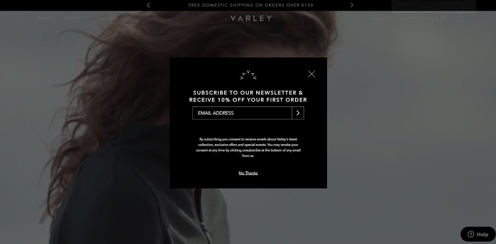
1) Varley
This lightbox pop-up grabs the user’s attention at the very first sight as it lands on Varley’s homepage. The design of the pop-up may look simple, but its high standard and attractive theme charm the users instantly.
The 10% off on your first order coupon convinces the user to give their email address to you.
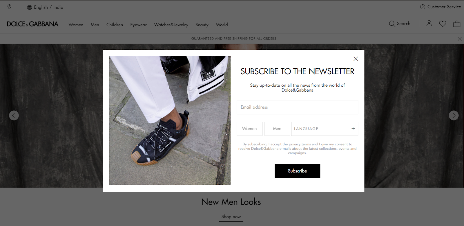
2) Dolce & Gabbana
You can check the example of Dolce & Gabbana and how perfectly they are using the pop-up. They have even asked for four fields of information but due to its design, it is looking as if they have only asked for the email address.
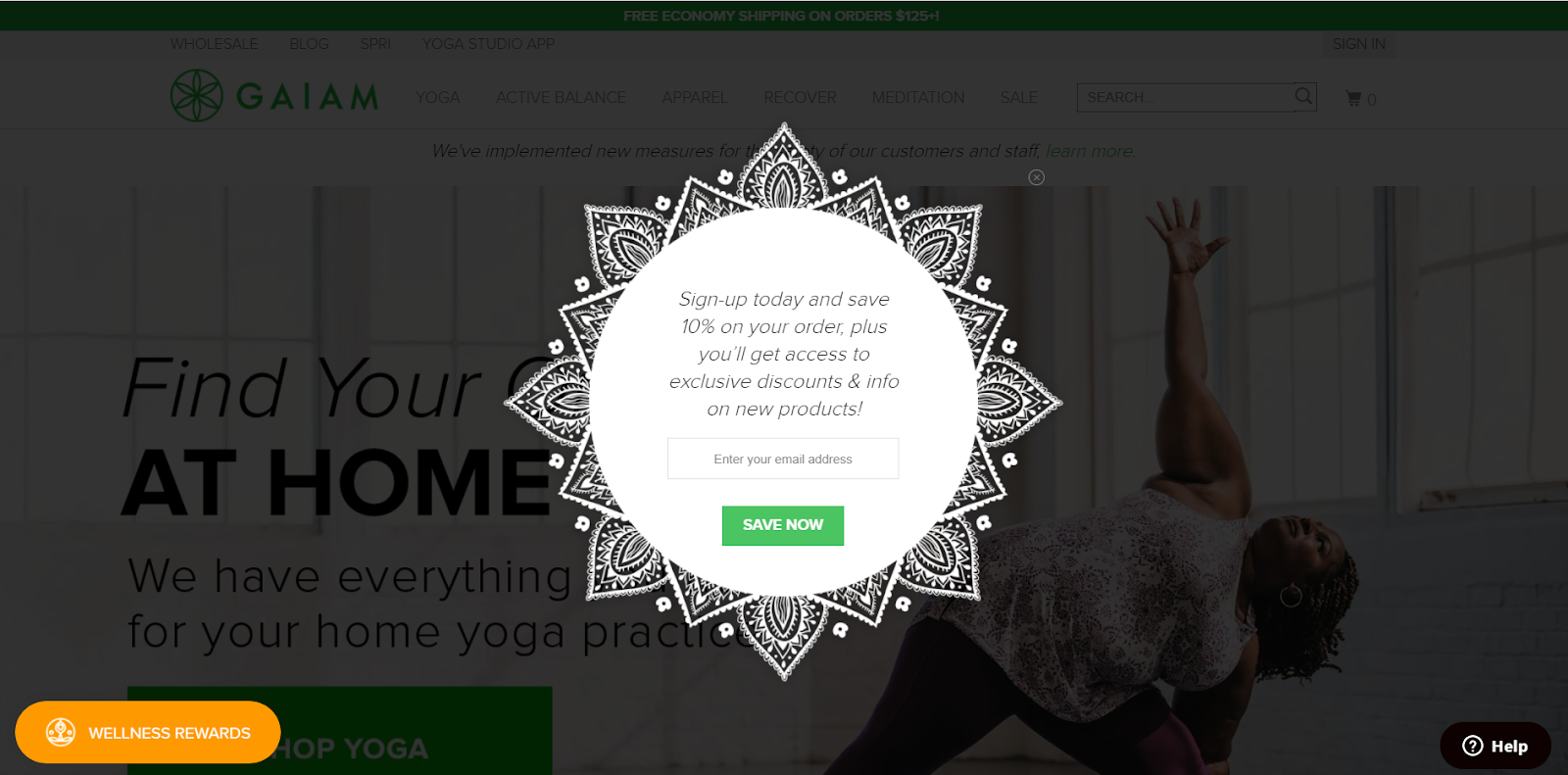
3) Gaiam.com
The different shape pop-up catches your customer’s attention at the very first sight and produces positive vibes. The classic structure and design with the offer of 10% off, plus you will get exclusive discounts on new products, will compel your users to give their email addresses.
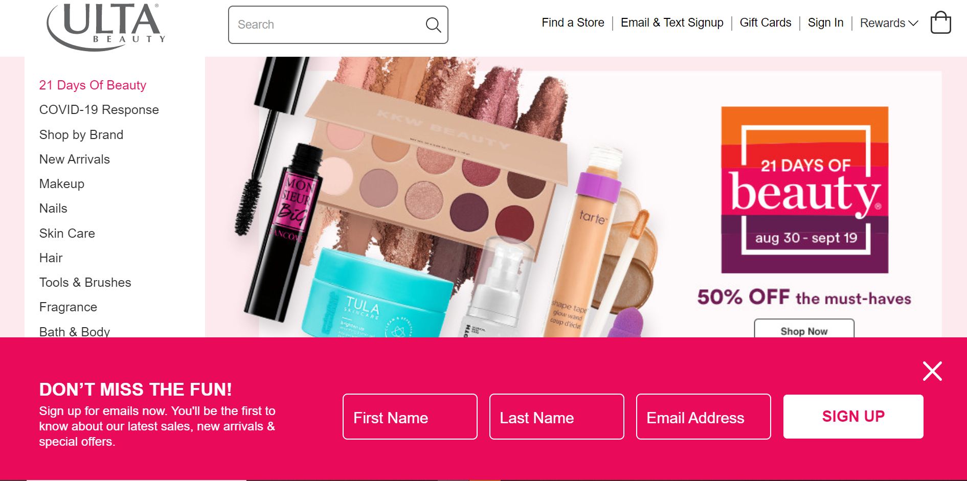
4) Ulta.com
You can also use this type of email bar. This example from ulta.com shows how perfectly they are using email bars for pop-ups. Bright colors, eye-catching layout, and excellent position.
The main attractive point of this pop-up is its position; users can easily browse and access the different things on the page without any hindrance.
Conclusion
Email marketing can be proven as a very effective way to get success if you have a strong email list.
Building an email list can be very rigid if you don’t use the correct technique.
In this blog, we have looked at best practices, examples, and types of pop-ups that can help you to get more email subscribers.
Tell us your experience of using eCommerce email popups on your site.
Leave a comment and share your views accordingly.

