

This is a fascinating subject that isn’t commonly mentioned in regard to web design. Photographers undoubtedly have a clear grasp of the rule of thirds in reference to photo composition. But how specifically could interface designers make use of the rule of thirds to develop intriguing web designs?
If you want to put something stuck in someone’s head, put in a sequence of three…—Brian Clark
I’ll explain about the rule of thirds in this piece and provide some recommendations on how to implement it on web pages. It is sometimes ideal to adhere to a regimen that helps facilitate things just because a few people won’t be finding this useful. But rather because the rule of thirds is such a basic aspect, it is certainly essential to appreciate how it operates and how it pertains to website designs.
The imaginative and creative domain of design enables numerous possibilities for designers to express their talents. It does have some restrictions and guidelines, though.
I’ve never been a fan of the term “rules of composition” It seems overly pompous to me to imply that such a sophisticated discipline as composition can be simplified to a few simple instructions.
The Rule of Thirds—What Is Actually & How to Apply???
The Rule of Thirds emerged in photography and is now extensively used to produce appealing and enticing compositions. Actually, this rule is based on the well-known Golden Ratio idea (or the Divine Proportion).
According to the Golden Ratio, a rectangular shape has ideal proportions when the ratio of the longer, larger section to the shorter, smaller part is around 1.618.
To put simply, the rule of thirds is a methodology for segmenting the image or design into sections using rows and columns that constitute a grid. 9 identical squares that fit over the image are generated by the grid’s 3 uniformly spaced rows and columns. The grid displayed below on the product page is a good illustration of this.
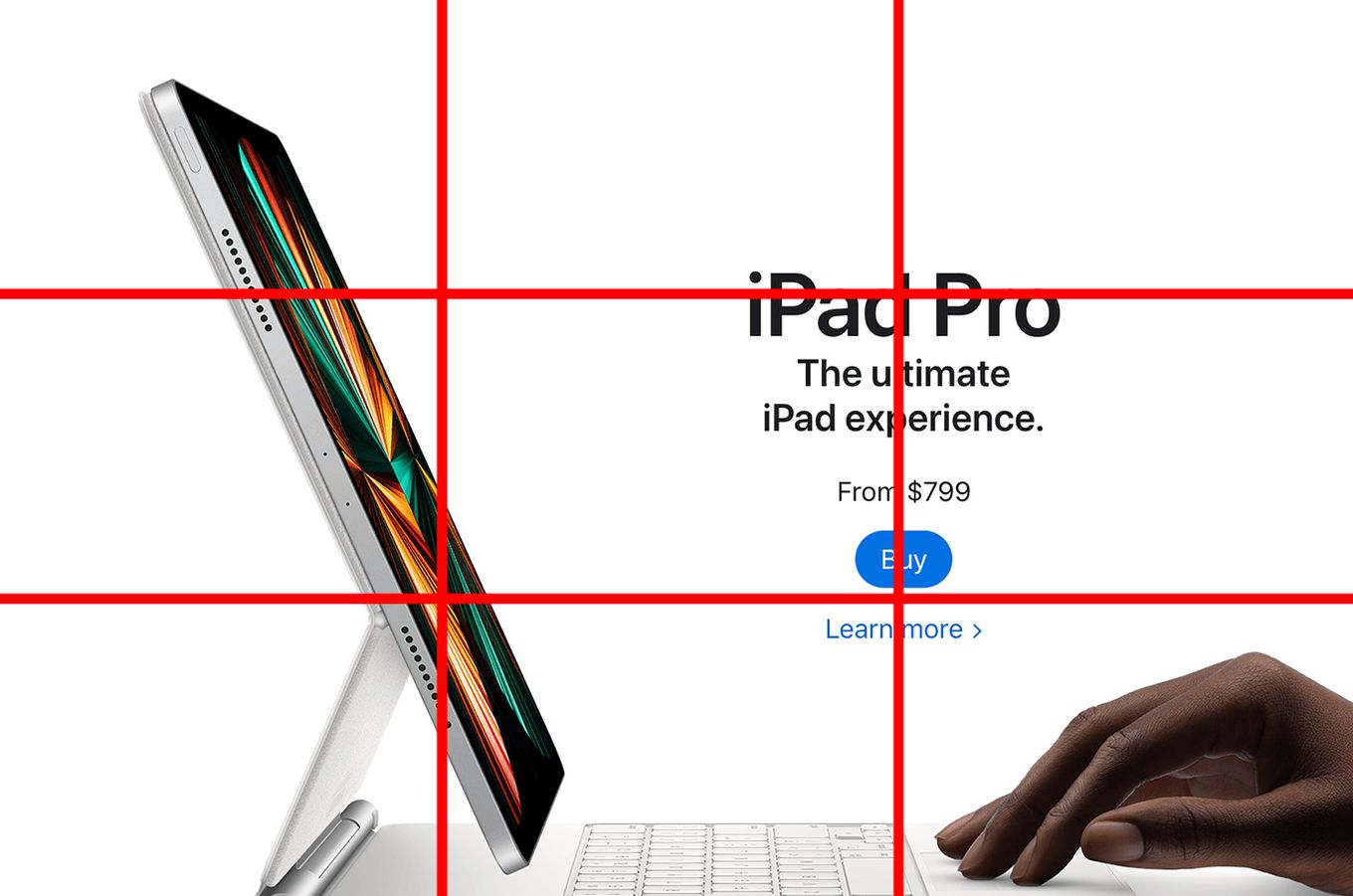
You must first be aware of the image’s dimensions in order to create a grid using the rule of thirds. Once you have the height and breadth, divide each by three evenly, and then mark the top, bottom, left, and right sides of the page at these proportions.
The lines in the grids in the example connect at four prominent places, as you can see. When glancing at an image or design, the human eye instinctively concentrates on these elements.
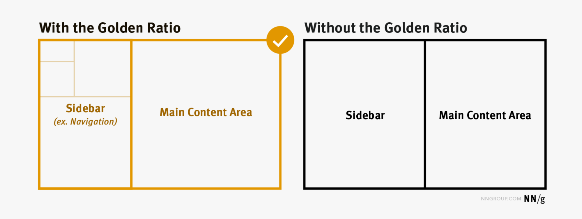
According to that theory, the layout of 960 pixels wide will contain a larger block for the content that is 593 pixels wide and a narrower block for the sidebar that is 367 pixels wide. The key is to find out the optimum ratio; it doesn’t matter if the left or right side is greater.
Busy Developing a Remarkably Effective Checkout Page? Perhaps, We Can Also Assist…
Numerous things around us exhibit this Ratio, and the majority of human creations adhere to it (such as architecture and its elements, paintings and sculpture). The truth is that the Golden Ratio or the Rule of Thirds makes things stunningly pretty and aesthetically pleasing by bringing a sense of harmony to them.
How to Apply Rule of Thirds Over an Image or a Design??
In a perfect scenario, the focus of your layout would be strategically focused on the four points of interest (intersecting points), although it is variable according to the designer’s vision.
Put marks at three intervals on the top, bottom, left, and right sides of the paper after dividing the height and width by three. Next, draw two horizontal and two vertical straight lines at each of the intervals you marked.

For example, if your image is 24 cm wide and 15 cm tall, you would draw lines from top to bottom at the 8 cm and 16 cm points and from left to right at the 5 cm and 10 cm points.
By using two horizontal and two vertical lines, the Rule of Thirds essentially divides the design into nine equal portions. Each of these portions will occupy roughly 33.33% of the horizontal and 33.33% of the vertical space. They are known as “Thirds” because of this.
The essential components of the composition should be organized around the intersections of the lines, which serve as focus points. What could be more basic—
There are 4 lines, 4 intersections, and 9 equal parts.
Major Usability of Rule of Thirds in Web Designing
Almost all graphics, including photos, and virtually all web design from global agencies to web design New Jersey firms, use the rule of thirds, whether consciously or unconsciously
The first recorded mention of the Rule of Thirds was made by John Thomas Smith in “Remarks on Rural Scenery,” which dates back more than a century (1797). The expression “Rule of Thirds,” which is now widely used by artists, photographers, and designers choice, was coined by him in a writing about the philosophy and how it applied to painting and art.
The principle of the rule of thirds is ever-present, even though it might be applied on purpose in art, photography, or design. The rule of thirds applies even when no planning or accommodations are made. Using it to your design’s advantage is your responsibility. This principle also holds for images generated by AI, where composition and balance play a crucial role in creating visually appealing and professional-looking results
The Parthenon in Athens, the Pyramids in Egypt, and several Gothic Cathedrals and Churches are the most well-known examples of the Golden Ratio or the Rule of Thirds in web design that we are unaware of.

Our phones, tablets, and desktop screens are the right size for the Golden Ratio or the Rule of Thirds in web design because it largely applies to rectangles. This theory can also be utilized in web design as a rule of thumb for element placement because it creates a seamless distribution when applied to any rectangle. It serves as a reliable foundation upon which the grid’s vertical and horizontal lines are drawn.
The usability criteria for Rule of Thirds in web design or the Golden Ratio is quite varied one, i.e. Photography, Paintings, Cinema, Designing, etc. As we’re more concerned over the Web Designing here as well as Rule Of Thirds importance. So, without even wasting a precious sec of yours let’s head on straight to that—
WEB DESIGNING
Since at least 200 years ago, the Rule of Thirds in web design has benefited designers and artists. In order to direct the user’s attention to particular regions of the design, artists and designers create a grid of nine boxes, which is a universal notion.
Utilizing the grid intersection also referred to as Sweet Spots are the ideal indicators for where to place an object, a logo, or text. This is due to the fact that the eye is consciously and subconsciously scanning the page when it lands on a screen, sheet, or image.
There are many ways to apply the Rule of Thirds in web design, but a few of the most popular ones include using it as a blueprint for designing asymmetrical layouts, positioning crucial components in intersections, and using diagonal lines to build tension. In order to establish a unified design, you may also utilize it to guide your font and color selections.
When determining what will work best for your personal website, testing is essential as always. some well-liked software for utilizing the Rule of Thirds in site design are—InDesign, Sketch, and Photoshop. For faster and more efficient workflows, check out these tips for faster exports in Photoshop
Do You Need Assistance in Designing a Theme for Your Website on WordPress?
Rules of Thirds on Website Homepages
When applying the rule of thirds in web design to home or index pages, having site-wide objectives prioritized is of vital importance. In the case of the three sites reviewed, exposing content, profiling advertising, and encouraging “social” are the apparent core objectives of these sites when the rule of thirds is applied.
So How Do the Sites Stack Up?
When examining an image or even your website, a person will naturally gravitate toward certain parts of the image according to the grid-like rule of thirds. The intersections of the grid lines are, in theory, the most striking features.
You may improve the composition of a piece of artwork or a photograph by knowing where these important points lie, choose a more appealing crop, and even add items on the landing page of your website. The top left grid intersection typically draws attention first, then the intersection below it, the top right and bottom right cross-sections, and finally the intersection below it.
For Example- The Center of Austin website, the left vertical line is placed next to the background image of the website in focus. Below the image, along the horizontal line, are listed the major Featured Services section of the website. The upper horizontal line has a short, attractive statement too.

Furthermore, using images on your website might benefit from the rule of thirds. Make smarter cropping and scaling judgments with the assistance of this. Consider where the subject of each image lies as well as the motion or mood it evokes.
Needed a List of Competent SMB Website Builders? We Have That… Check That Out
Rules of Third on Content Pages
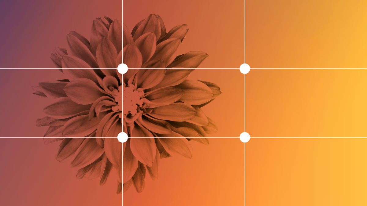
The rule of thirds in web design is handy when designing content pages yet again. Keep in mind that the areas surrounding the intersections of our “thirds” (shown by the blue dots) are also expected to be the readers’ primary focus instead of just the intersections itself.
How Do These Pages Contrast Then?
By striving to place the most crucial information in the top third of each page, web designers can also apply the Rule of Thirds in web design. That must be above the junctions or sweet spots, so you could find this strange.
On the other hand, scrollable pages are a reality in web design. The entire web page might not fit on the screen of a lot of contemporary smartphones. In order to implement the Rule of Thirds, we place material “above the fold.” Still, all the appropriate spots will catch the user’s sight.
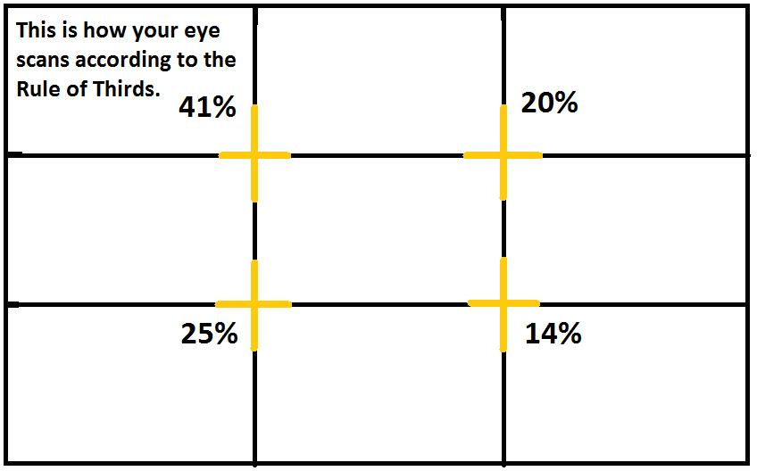
It also matches with how humans consume information, which has a visual hierarchy. With our four sweet spots, almost two-fifths of the user’s attention will be pulled to the top-left sweet spot because research has shown that the eye tends to scan images in a certain way.
The eye will next sag to the bottom-left sweet spot, where it will typically focus about a quarter of its attention. The final sweet spot is in the bottom right before it descends from the top-right sweet spot, which attracts a fifth of its attention.
This leads us to the conclusion that people typically read with a capital “F“-like manner. The top-left sweet spot is your best opportunity to “capture” your target.
What Makes Web Design So Essential? Acknowledge the Facts Utilizing This Website’s Navigational Guide?
Rule of Thirds for Product Pages
Your product images must be appealing to customers if your website sells merchandise. Not simply color and typeface contribute to an image’s beauty. The way you organize things in space also adds to it.
It is comparable to home decoration in that you evaluate not just the objects you will need to home to look lovely, but also their organization and positioning.
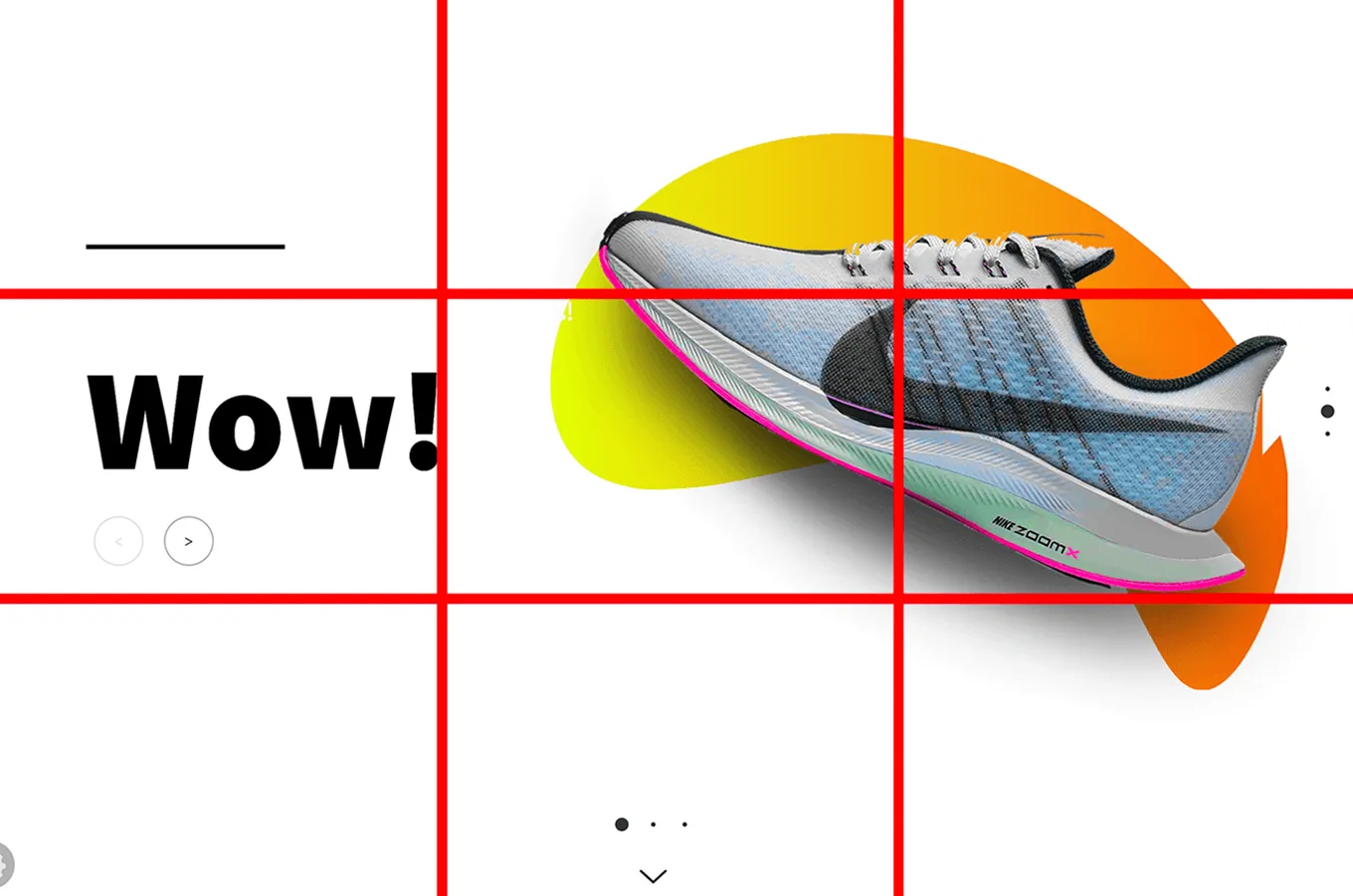
A time-honored design principle, the rule of thirds was initially applied to paintings during the Renaissance. However, you can use it for website product photos. The elements of a typical product image are as follows—
- A Product Image
- The Brand Name
- A Unique Heading or A Tagline
- A CTA button that prompts Action
- A Background Image
- The Description Content
By using the rule of thirds in web design to arrange these components in your product images. Along with that, you can provide users with the finest possible perspective of your products. It’s important to note how the elements and the product image are balanced in space.
Because every element touches the intersecting grid lines, nothing is neglected or overlooked. It is simple to capture the beauty of the product in a single focal point thanks to the thoughtful arrangement of all the pieces.
For instance– You can check out the outstanding example of the Blackberry Playbook advertisement.

You can clearly see that there is spatial harmony between the components in the product image. Since every element touches a grid intersection, no element is neglected or disregarded.
The elements are all arranged such that it is easy to isolate the product’s visual appeal in a single focus point.
The rule of thirds in web design would not be adhered to by a poor product image, though. Users would be forced to squint and move their eyes across the website in order to look at each element.
Live Web Design Examples
Photography, web design, architecture, film, and other mediums all use the rule of thirds. We’ve put up a small selection of some excellent examples. You can get an idea of what the application of this rule looks like in various media—
Web Design Layout for STAAK
This London-based design agency i.e. STAAK did a great job incorporating the rule of thirds into the layout of their website.
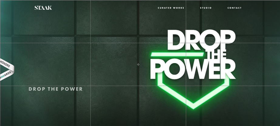
They have selected the locations of their attention-grabbing text and the necessary negative space using the grid. The softer description text on the bottom left draws the eye naturally away from the title’s more vivid language.
HubSpot
The majority of visitors’ attention will first be drawn to the left side of your website, so HubSpot leverages the law of thirds to bring attention to its slogan and “Get HubSpot free” CTA right away.

Also, to balance the page, the cartoon images are then positioned in the right third. This facilitates the creation of a user flow, from left to right. This flow would thereby be more challenging with a symmetrical design. That’s also an example of the Rule of Thirds.
A Still From the Avengers
With a more dynamic medium, like a movie, the rule of thirds in web design can be used to draw the viewer’s attention. One can easily draw attention to key aspects that support the story or enhance the visual appeal.
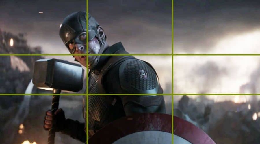
Captain America is perfectly lined up with the grid’s hot spots in the image below. Along with, his hammer is placed quite close to the hot point on the bottom left.
The location of the things in the frame ensures that viewers notice them and can infer what may happen next by noticing them.
Twist With the Rule of Thirds, Learn When to FOLLOW & When NOT.
Even if they don’t always need to mention anything important. Don’t forget to place your link, image, or textual information next to the intersecting places on your page.
Additionally, the restriction only applies to newly loaded pages. In other words, the only thing that matters is the page that visitors. Must see when they click an external link to your home page or type the address directly into their browser.
When a page has been scrolled, the rule is no longer valid. That is so, because webpages are often broader than they are long. This must be done appropriately in order to include all of the essential information in the initial loaded view.
REMEMBER…..
To avoid breaking this guideline, avoid basing your entire website on it. However, it is not meant to be used as a grid-line tool for architecture. The rule of thirds in web design is helpful for making some tweaks in your design.
Use it to attract attention to the crucial data you are providing the user. Instead, and then neglect it after that. Without a mistake, it is a great tool to use. But you should just not compel every web page to comply to this essential part.
You Can Use It to Add or Change Information, or You Can Use It to Slightly Alter the Website’s Layout. Make the Most of It.
It’s crucial to remember that there are exceptions to every design guideline and fashion. There are no hard-and-fast rules that you must obey when creating art works or designs.
The rule of thirds in web design can be broken as you see fit once you comprehend how it can affect a user’s experience.
WARNING….
I wrote this article while I should have been sleeping because the law of thirds has me more upset (because of its rigid pre-requisites) than I probably should be. If you find the rule of thirds useful in your creations, do not misinterpret this article as condemning it.
Since each person is unique, I heartily support any strategy that enables you to produce designs that you find appealing. This article is basically a visual demonstration of Schrodinger’s Smiley :): in designs….
Perception is all that matters.
Wrapping Up….
Creators are free to experiment and express themselves across a wide range of creative disciplines.
However, there are methods that have been thoroughly researched that can help ensure designs that are aesthetically pleasing and useful. These tools have included the rule of thirds.
Focusing on and positioning essential images, text, or buttons is much simpler utilizing the rule of thirds. To increase the likelihood that viewers will discover crucial information. The Rule of Thirds in web design replicates the natural path taken by the naked eye when exploring a field.
Although the rule of thirds is great for giving designs visuals vitality and balance. Yet, it’s crucial to remember that it is merely a general rule that may be violated in rare circumstances.
Best is that— Determine which design aspects suit better the needs of your own brand. When in uncertainty, play experimenting with both more proportional and rule-of-thirds designs. You can also move forward with about A/B tests to ensure which actually works with your demographic.
Happy Designing 🙃
About the Author: Bhagyashree A Awasthi


Hey Douglas K. Peter,
Thank You So Much….
I value the time and work you invested in reading our blog. This is fantastic beyond words. As we frequently publish articles like this, kindly stay tuned.
How you managed to take this informative article and turn it into an interesting piece of writing is simply amazing to me. After reading this article I get to know more about eCommerce websites and how it’s helpful in Business