You won’t realize the importance of website navigation until you’re lost on a website or irritated by the web page menu sliding out and obstructing the content. Despite this, the vast majority of users agree that the most useful web page feature is easy navigation.
Traffic is GOOD, but Clients are BETTER.
Mono websites are no longer popular. As our understanding of whatever works and what doesn’t has developed, so has our understanding of how to build websites. The rise of search engines and, particularly, search engine optimization (SEO) has altered how areas are created.
Navigation is an integral part of any website, but this doesn’t mean it has to be flashy or complex to win your users over. When it comes to finding your way around a website, simplicity is best.
The function should take precedence over form since visitors would sooner stick with a site that can be explored than waste time with a rigid novelty page.
Guide’s Outline
- What is the Importance of Website Navigation?
- Know-How your Website Is Performing?
- What are the Website Navigation Types Available?
- LIVE Examples of highly interactive websites with outstanding navigation
- Best Practices for website navigation that offer Seamless User Experience
- What are the Advanced Website Navigation options Available in the Future?
So, let us just take a look at why navigation is so essential in web design, what best practices there are, and when dedicated website navigation trends are available to help your site operate better, and even when they’re not.
What Is the Importance of Website Navigation?
Individuals who are intending to start a company website often simply focus on the content. Nevertheless, a large percentage of today’s users aren’t trying to look for the subject matter. They’re utilizing your site to quickly locate the goods or services they’re seeking for.
I may not have gone where I intended to go, but I think I have ended up where I needed to be.
― Douglas Adams, The Long Dark Tea-Time of the Soul
I was on the local grocery store’s website, selecting some daily necessities. And, that’s how I followed through the navigation ending up literally nowhere-
- Out of stock => OK,
- try again => Selecting a variant => Out of stock => OK,
- try again => A pop-up banner promoting a limited-time offer => Select “Conditions” => “Shipping and delivery…” from the drop-down menu.
What had brought me here, and where was I supposed to go? The logo didn’t even take me back to the home page! My situation was literally like-

Source: Google
That’s one of the natural consequences of bad site navigation design. The ultimate goal of any page is to turn leads into customers. That is why navigation mistakes are expensive. Poor web navigation will result in fewer users. Website navigation is fundamental to UX design. Good navigation amplifies usability.
As stated in a survey done by Tony Haile at Chartbeat, a striking 55% of users spend fewer than 15 seconds actively on a page. Not much time to engage a user!
Arm yourself with the knowledge to avoid making common mistakes and revitalize your website to compete with others. This article will show you some fresh designs and web navigation ideas and also cases when you’d be better off not using them.
Understand the Connection Between Website Navigation and User Experience
Website navigation is crucial- as per the Interaction Technique there are three areas to improve based on different perspectives i.e. System’s view, the Designer’s view, and the User’s view. All that consecutively assists one in developing a strong interaction strategy.
Website navigation is one of the top factors to consider, though, because if visitors can’t find your web form, it doesn’t matter how pretty it is.
Website navigation allows visitors to flow from one page to another without frustration. If you’ve done your job well, visitors leave your site with the intention to return and might even buy something from you or sign up for your email list.
People visit lots of websites every day, so they have no shortage of places to find what they want. If you don’t offer a clear website navigation menu, breadcrumbs, and other ways to explore your site, they won’t bother. To ensure your site meets these expectations, working with a software development company can help implement navigation that keeps visitors engaged.
But, How do you know if your site really requires web navigation or not? Let’s check out-
Know-How Your Website Is Performing?
Before you approach your website navigation, you must first comprehend how your guests currently use your site to help make sure that your modifications are impactful. The required tools can allow you to understand your users’ behavior and attitude well.
1. Google Analytics
A widely renowned yet trusted tool from Google is Google Analytics. I don’t think this needs a mention here, people are well aware of it. It is a very vast and very effective tool from Google to determine and keep track of all your website performance from time to time.
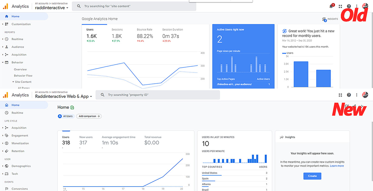
Source: Google Analytics
You can see the path your users take on your site using Google Analytics’ visitor flow feature. This can assist in identifying any areas where users are likely to become stuck or abandon your site.
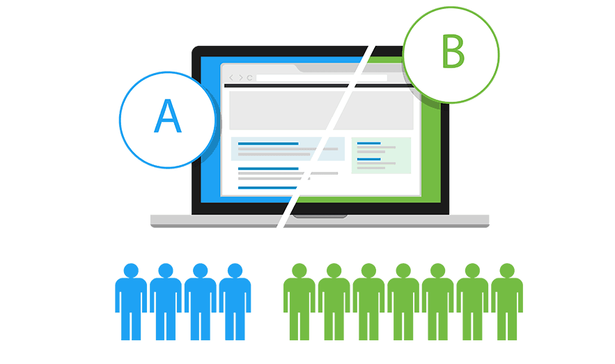
2. A/B Tests
Small and effective changes can be performed over website sections from time to time and let your users get hands-on. This can be quite helpful to understand as well as strategize your customer’s needs in a more specific way possible.
Source: Google
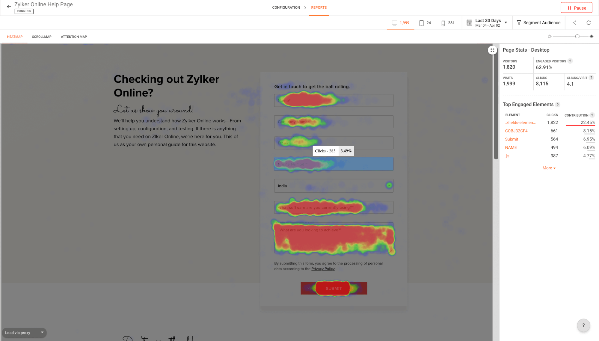
3. Heatmaps
Widely popular metric to easily track user engagement on your site and with respect to stress areas.
Source: Google
Heatmaps are quite effective yet an outstanding approach, it allows you easily discover hidden stress spots in your site which might become benefit areas for you.
4. Other Free Tools
Apart from that, there are numerous tools available online on a FREE and Premium basis that can assist you in determining your site’s performance. We, WP Swings also offer some toolset supports, if you require a tool just pick it out from the list below and make use of it, for FREE-
- Mobile-Friendly Test Tool for your Website
- Overall Website Audit Tool
- HTTP Status Code Checker Tool
- Search Engine Spider Simulator Tool
- On-Page SEO Tool
Now, till here very well you know about the navigation requirement and need for your website. So, the next step involves understanding the specifics of navigation too with the help of Live demonstrative examples
What Are the Website Navigation Types Available?
People visiting a website can undergo the site with some of the most effective and the slightest ineptness by using web crawler tools. A navigation system works similarly to a route map, allowing visitors to explore and discover various locations and information on the website.
There seem to be a variety of ways to navigate a webpage:
1. Navigation on a Website That Is Organized in a Hierarchy i.e. Hierarchical Navigation
The menus keep changing based on the circumstances of each page in hierarchy navigation. Hierarchical navigation is found in most newspapers that are solely focused on the subject matter.
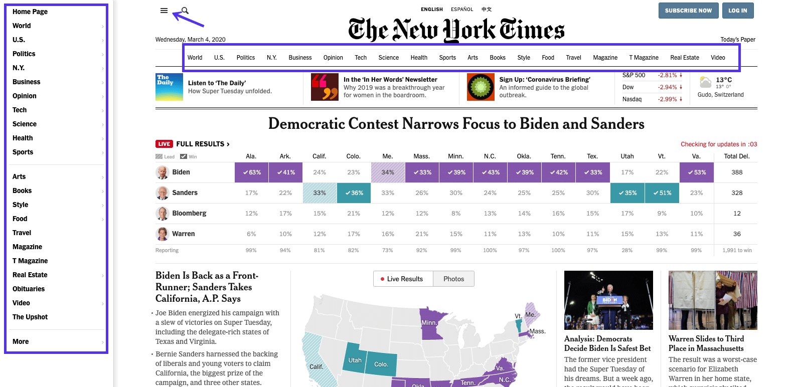
Source: New York Times
If you’ve been to the top page of the newspaper, for example, the top corner menu will usually have links to the headline news classifications.
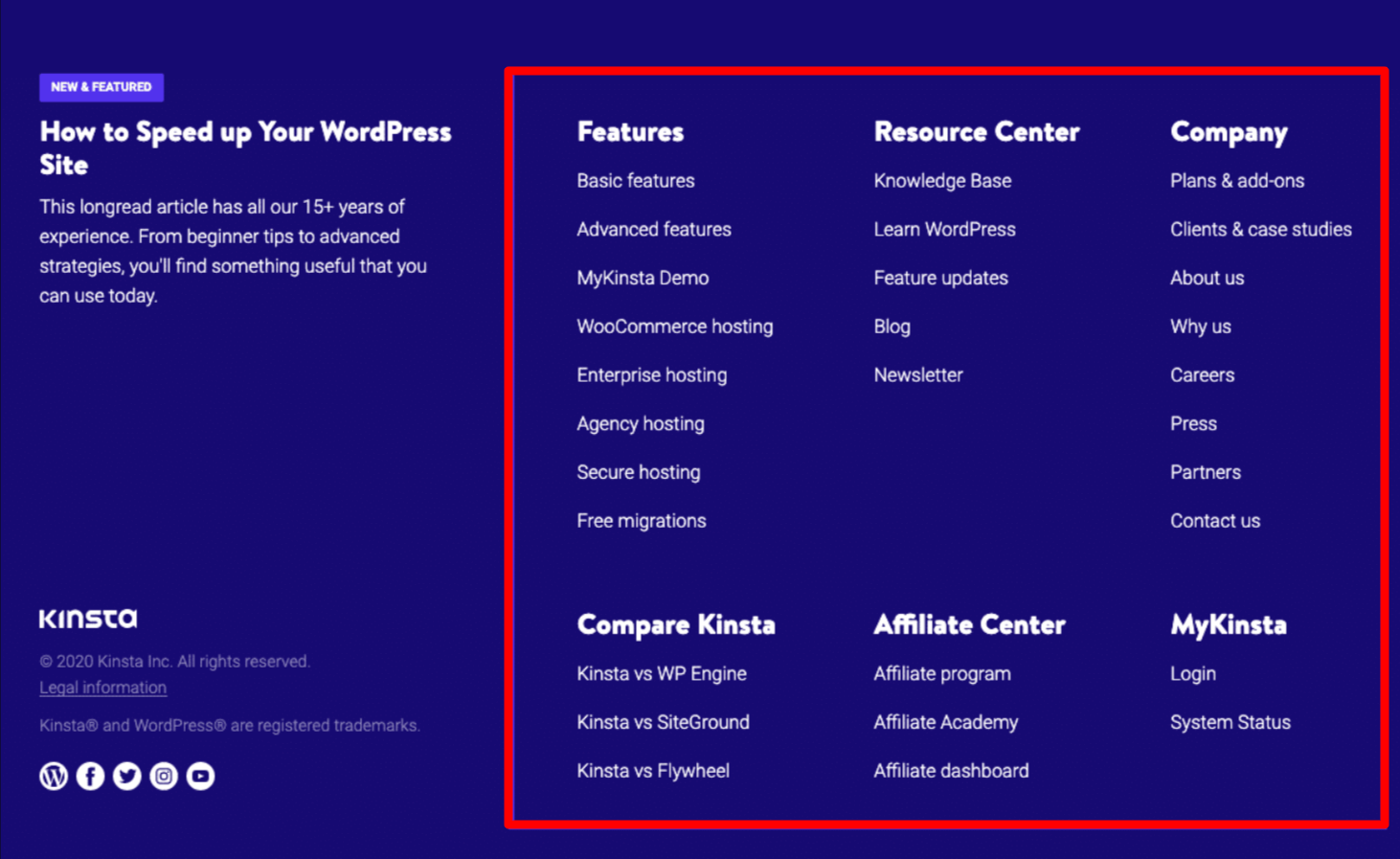
2. Navigation Across the Entire Website i.e. Global Navigation
The menu and links on all sections of the site are identical when using global website navigation. Many contemporary menus like that of Kinsta, are crafted in this manner: the menu “follows” you as you move the cursor down on the page.
Their footer menu is also global, highlighting crucial components of the site as well as some showcased subject matter.
3. Navigation Within the Website or a Single Page i.e. Local Navigation
Internal links within the content of a webpage are referred to as local website nav. Commonly, the users are given viable alternatives at the very same level or one level profound in the hierarchy, as well as links to other specific pages. Publication websites, for example, frequently use connections to help the reader discover the detailed insight of an article in particular.
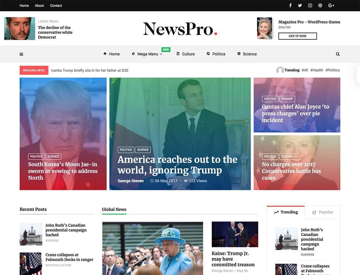
Source: News Pro
If they bring up an instance they’ve normally mentioned, they’ll link to that news piece rather than trying to explain the in-depth information.
Live Examples of Highly Interactive Websites With Outstanding Navigation
Here’s the list of a few amazing, outstanding examples of website navigation available, let’s check them out-
Mosster Studio
The very first website in this collection is Mosster, it is really amazing in each and every aspect. This lively website is designed and crafted using all bright outstanding colors, patterns, shapes, etc.
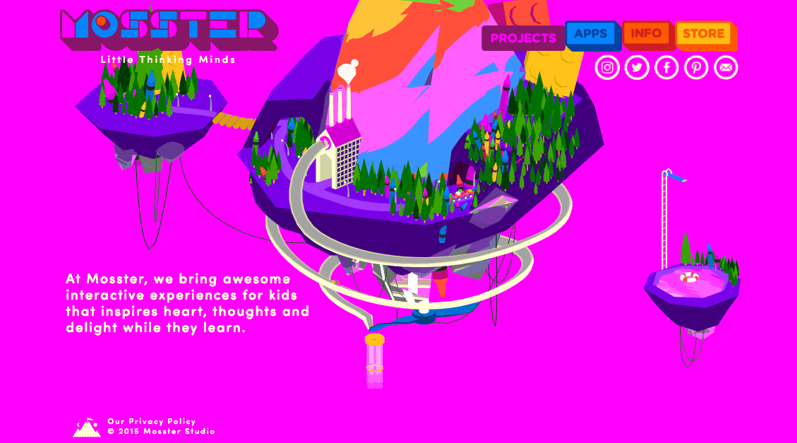
The designers have put their soul into animating the whole website making it more attractive yet creative, I can surely say this is the thing that brings out visitors’ attention for a minute definitely.
Their top navbar is sticky on scroll fully designed with animation in building blocks like structure that follows till the footer. This shows their design consistency and ease.
Air Tasker
The category section of Airtasker’s website is a massive mega menu, as one might expect. The whole navigation bar is pretty straightforward, with a fixed header running all along the top of the front page, and the ‘Categories‘ label serves solely to release the massive menu.
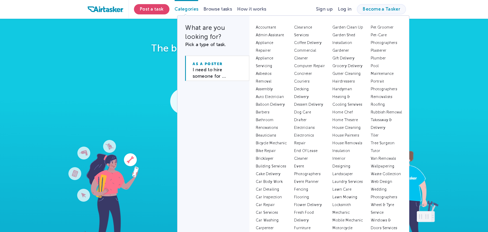
The thing I love best about this nav example is how a web user can quickly filter categorization information at the very top level of the IA via the mega menu by denoting whether they are searching for employment or looking to hire somebody else.
We3
This is the most outstanding website that I came across to date in terms of website navigation. Yes, the We3 website had implemented almost every aspect of navigation with respect to their customer’s needs and requirements considering the engagement and creativity at hand.
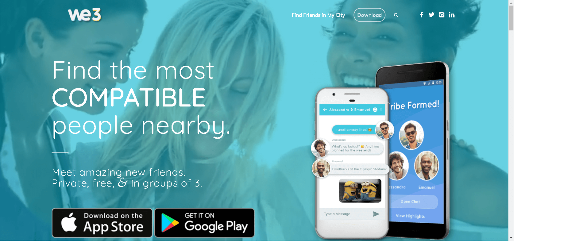
The Download button is one of a kind. It is impossible to overlook the importance of Search in website navigation. Their scroll to the overall page is also very smooth and clear defining the minimal use of high-quality media. A perfect blend of animation with a feature-driven approach ranks this site to be number one.
Ensurem
This is an example of another excellent navigational assistance website that makes its contact information available as a valuable resource. If you want your user to be able to navigate through all of your site’s pages, the example of Ensurem will show you how to do so-
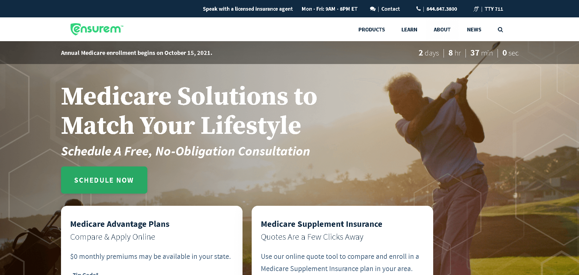
They provide the most basic, yet critical, two methods for contacting their company representatives, both of which are highlighted and clearly defined.
Not only that, but their shop pages are also incredible, with the Learn and Shop links expanding to show even more options and narrowing down to the exact point where the visitor needs to go. Not to mention their search bar, which is extremely accurate and concise.
There are many more to list out, but we can talk about them later in the content piece.
Till here, you’ve learned the importance, and types as well as checked out the live demonstrations of the best-performing sites. So, I think the clock is running and you must learn the art of website navigation.
Why wait, jump right straight into the process. Before that, it’s crucial to understand the best practices in detail with reference to that. Refer to them here…
Best Practices for Website Navigation Offering Seamless User Experience
All set to dive into the website navigation, just keep in check these amazing yet crucial best practices followed by the experts, we’ve listed 10 here-
1. ‘Less Is More’ Is a Good Motto to Live By
Web visitors should be able to locate what it is they’re searching for, as well as what you’re attempting to encourage them to be doing. They might not have to look all over your webpage for your contact numbers, or they’ll quit the site and end up leaving you with a high bounce percentage.
Decrease the number of drop-down menu options as often as conceivable to better user experience. A significant number of menu options on your web page is often confusing to tourists. Overall, please remember that if the goal is simple to locate and use, people are much more likely to remain on your webpage.
2. Website Responsiveness Is a Must To – Beat
One of the best ways to make your website look great on any device is to use a compact navigation style called the ‘hamburger menu,’ which is part of the responsive design trend.
This icon is made up of three horizontal lines that are slightly separated and has been compared to a hamburger because when the main elements are separated, you’re left with two slices of the bun and the meat in the middle.
Because screen space on a mobile device is limited, communicating how to take the next step is critical. Consider the amount of clickable space to ensure users can effectively use your navigation and avoid misclicks. To allow accurate SEO, navigation links should be at least 42px tall.
3. Product and Content Marketing Pages Have Links
Companies that sell multiple products or services will categorize their pages, create content silos, and connect them together as described above.
Several more SEO and content team members, on the other hand, create investments that are intended to be convincing and easy to share. This is frequently done through a blog, with posts containing links to products and services.
Links to related content advertising web pages should be included on product pages. This could include blog posts, FAQs, and merchandise handbooks, among other things.
4. Adapting Trackable Measures
User behavior is tracked in different ways by usability specialists and lead generation specialists. This may include the use of tracking parameters in URLs on the site.
In the URL, avoid utilizing tracking variables. Instead, use JavaScript to track the onclick callback function on links that pass the very same traceability parameters to track these. It can be done with occasion tracking in Google Analytics.
5. A Well-managed Categorial Plan
Strategize out just how your structure and navigation planning will look before you begin writing content on the website.
Planning is an integral part of ensuring that your visitors have a pleasant navigation experience. A sitemap creator can assist you in quickly creating mock-ups of what you want your website encounter to be like.
GlooMaps is a good example of a homepage tool.
Product categories should be intuitively organized, allowing people to instantly find the classification or item they’re searching for.
H&M has a simple navigation menu with distinct product categories. Brands frequently use indicators to help users figure out which page of the site they’re on. This can be accomplished by underlining, bolding, or highlighting the link with a different color.
6. Breadcrumbs
A website breadcrumb is a trail-style navigation element that allows users to keep track of where they are on a page. When a user wants to view other categories without having to click the “back” button and risk losing their progress, this is a useful option.
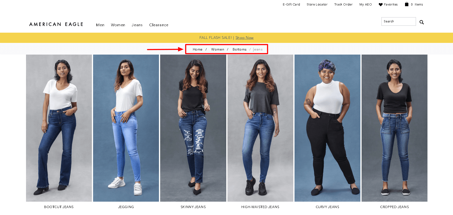
From American Eagle, a breadcrumb example. Conversions can be boosted significantly by using clean, simple navigation. Avoid unnecessary extra graphics and links, and keep the number of links to a minimum. Visitors will leave if there are too many options without a hierarchical presentation.
If you can view when you’re on a site, whether the menu is emphasized, navigation is noticeable, or the main banner pic displays the title tag, it’s always a great experience. The underscored menu treatment is one of my favorites; it’s simple and straightforward, having left no room for interpretation.
7. Create Separate User Dependent Website Navigation Menus
It’s always tricky to design an interface that caters equally to two distinct groups. To make sure each one can find what they need without having to dig through irrelevant content, divide your links into two.
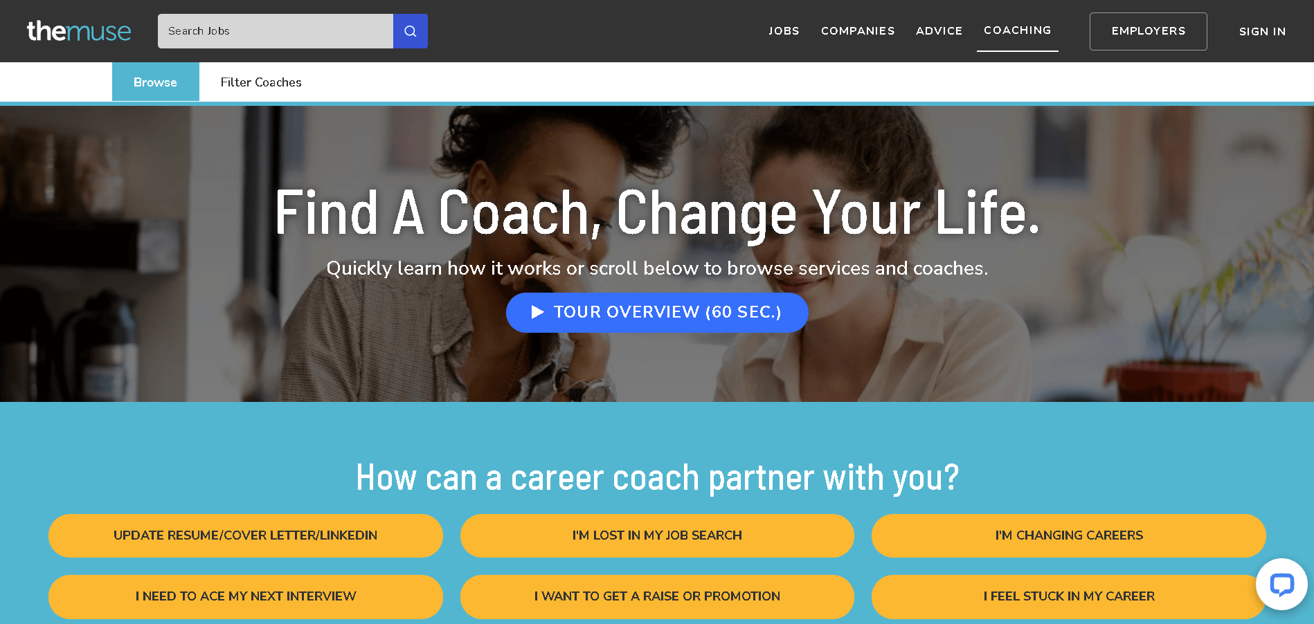
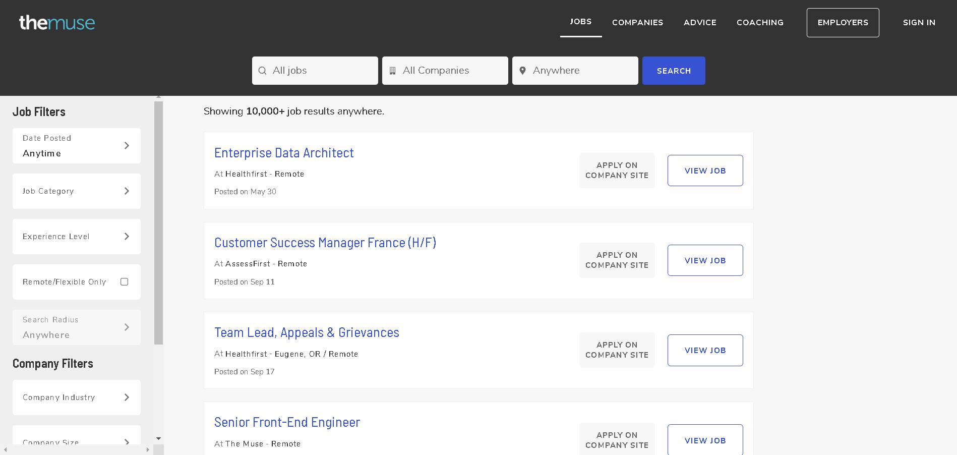
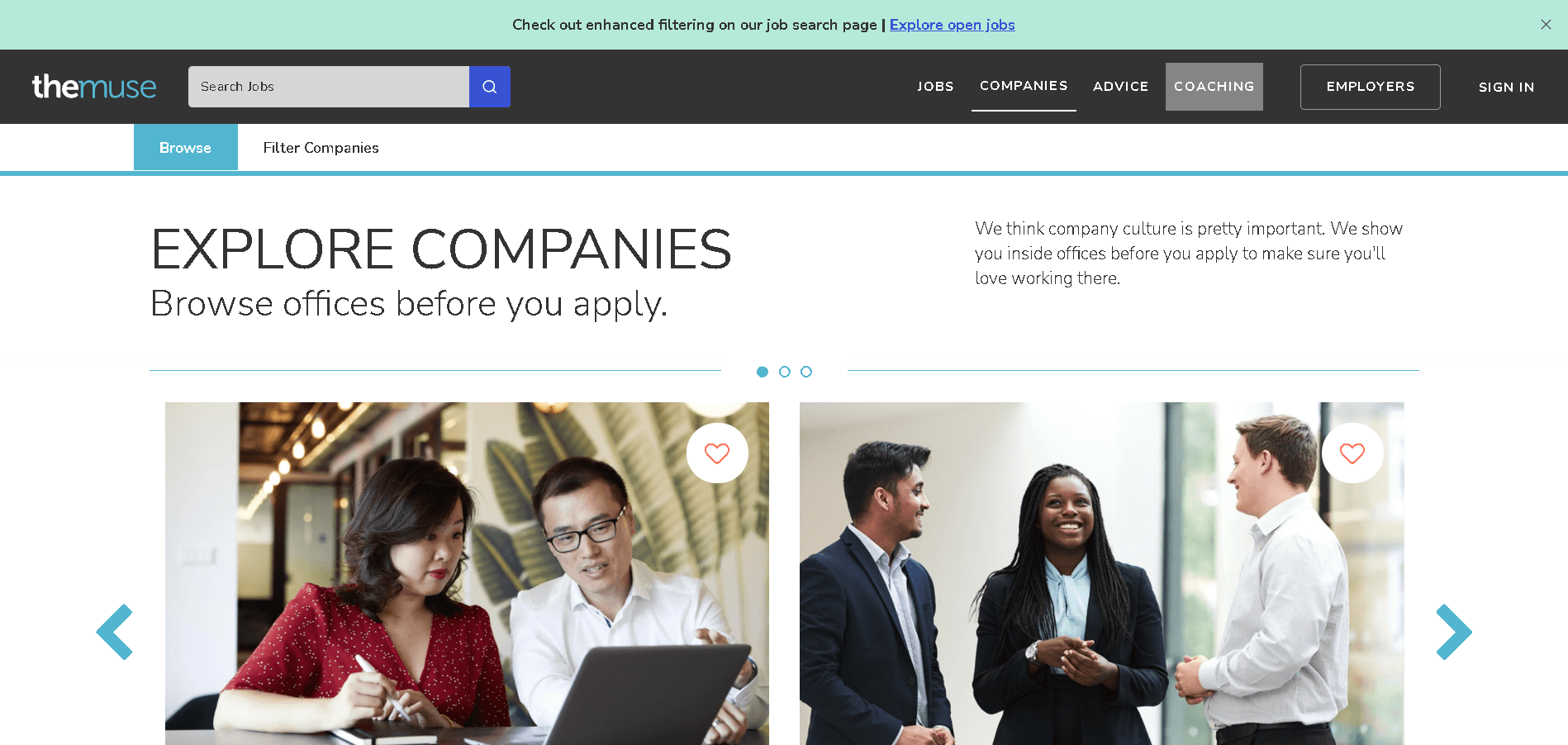
The Muse, for instance, has two audiences: job-seekers and employers. The first four links in the top navbar target job-seekers, while the fifth redirects companies to their own section of the site. The link is gray, not white, to indicate that it’s different from the others.
We have the best example to show here- that is the Muse, its website navigation splits into four options depending on the user’s requirement available there i.e. Coaching, Jobs, Companies, and Advice respectively.
Coaching Tab
For Jobs
Companies Tab
For Advice
Lyft also uses the same concept on its homepage. Instead of having a traditional nested navigation menu layout, they created separate menus and homepages for each category of users. Depending on which section of the website you’re on, you’ll see different main menu items.
Lyft divides website navigation for easy access depending on if you are a driver or a rider
8. Add a Mega Footer
Navigational exhaustion is a genuine condition, and users quickly tire of continuing to expand sub-menu after sub-menu when your site has an organizational structure.
Mega footers are the best option. They provide a navigation bar to all of your site’s important pages, allowing visitors to quickly find what it is they’re looking for. The inclusion of a mega-footer on your website can improve your bounce rate and overall exchange rate.
GrubHub’s mega footer displays many locations in the website navigation, which helps with SEO. Check out the screenshot below for more clarity.
A mega footer is also a great place to include relevant keywords that will help you score higher in Google’s search engine results (SERP). Learn a thing or two from GrubHub’s massive footer.
If you’re attempting to prioritize a set of specific areas, including them in your footer will aid your local SEO efforts without requiring you to use them in your menu bar.
9. Illustrated Menu with Animations
Animation is all about aesthetics and gracefulness, not user-friendliness though beauty can be extremely useful. Furthermore, it directs the visitor’s attention to the exact location you desire.
This is a simple but effective attention systematic methodology. Let’s check out the possible phrases in this domain with respect to website navigation ease-
Micro Animation
Micro animations are comparatively tiny visuals, but as you’ve predicted from the name. Throughout this case, however, small does not imply insignificance. Whenever it tends to come to providing a path through their conversations with your webpage, micro visuals are incredibly helpful.
They can also add a whimsical component to your site, as Smashmallow appears to have done with their hero picture’s micro visuals:
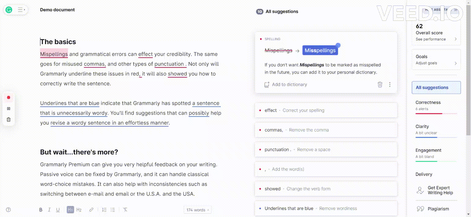
Micro Interactions
Micro-interactions are small animations that provide users with subtle responses to a website. When a user hovers their cursor over a link, we’re used all the and see it turn green.
Micro animations are one of the most recent design trends for e-commerce sites, and they’re being used to improve user experience and give shoppers a taste of their products. These are already being used in this Grammarly to show customers how their users the mistakes, and explaining them the reason.
Smart Video
For a long time, video has been touted as a need for internet sites. People enjoy watching videos! The video is fun to watch! It’s the most powerful marketing tool available!
Whereas the video is fantastic, it needs to be well-planned. Smart video is all about YouTube clips with meaning and purpose. Gone are the days when you could just make a video for the sake of having one on your website. A single well-thought-out, high-quality video is preferable to a dozen hastily made ones.
CEI‘s use of video in their hero image is striking but not obtrusive. It’s also a fun visual representation of what they do, which is to provide low-cost printers and copiers to Raleigh businesses.
Highly Engaging the Static 3D Content
Thanks to maturing web technology and web designers wanting to stand out from the average webpage, 3D elements that users can interact with have been increasingly used.
The results can be breathtaking – like the use of interactive 3D content on the Campo Alle Comete website.
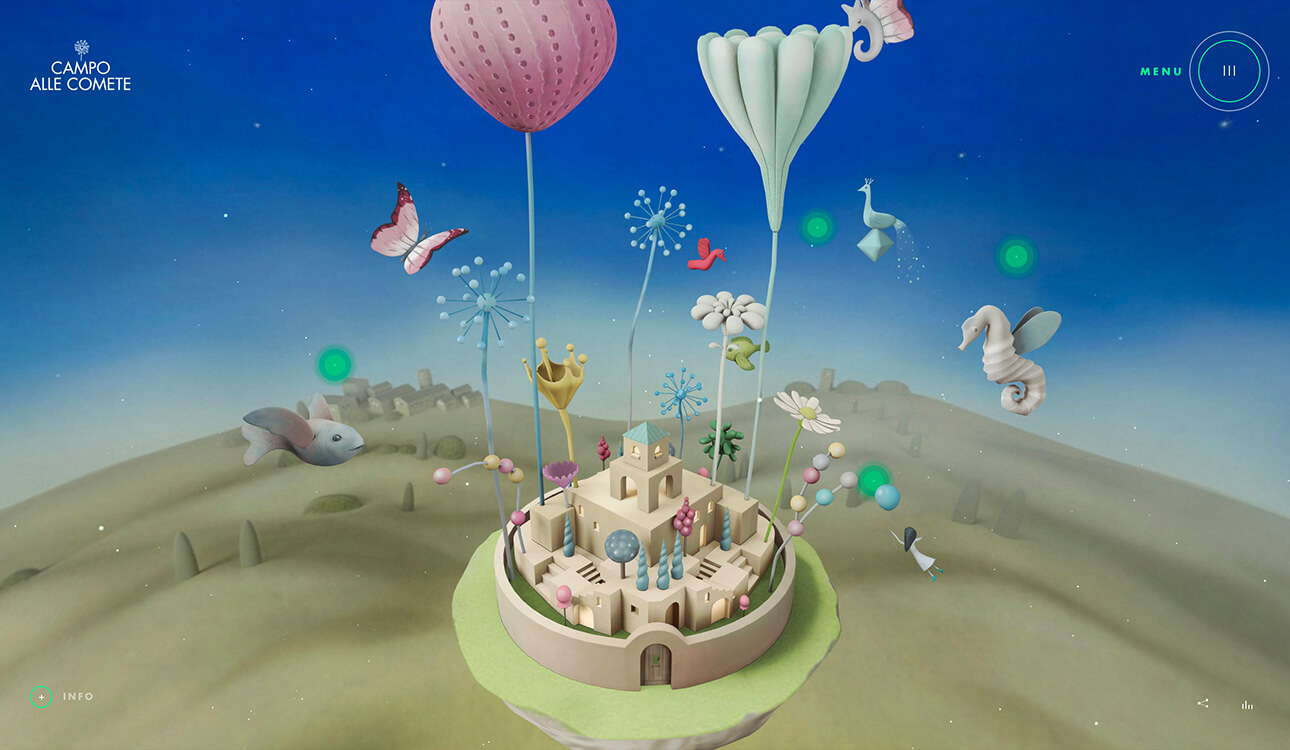
Must Check out once, you’ll love it.
The keyword here is “nuanced.” When done incorrectly, graphics can cause users to become distracted and even inhibit them from trying to navigate your site. Already when you add an animation, consider whether it has a purpose on the page. Here are a few helpful suggestions for constructive graphics.
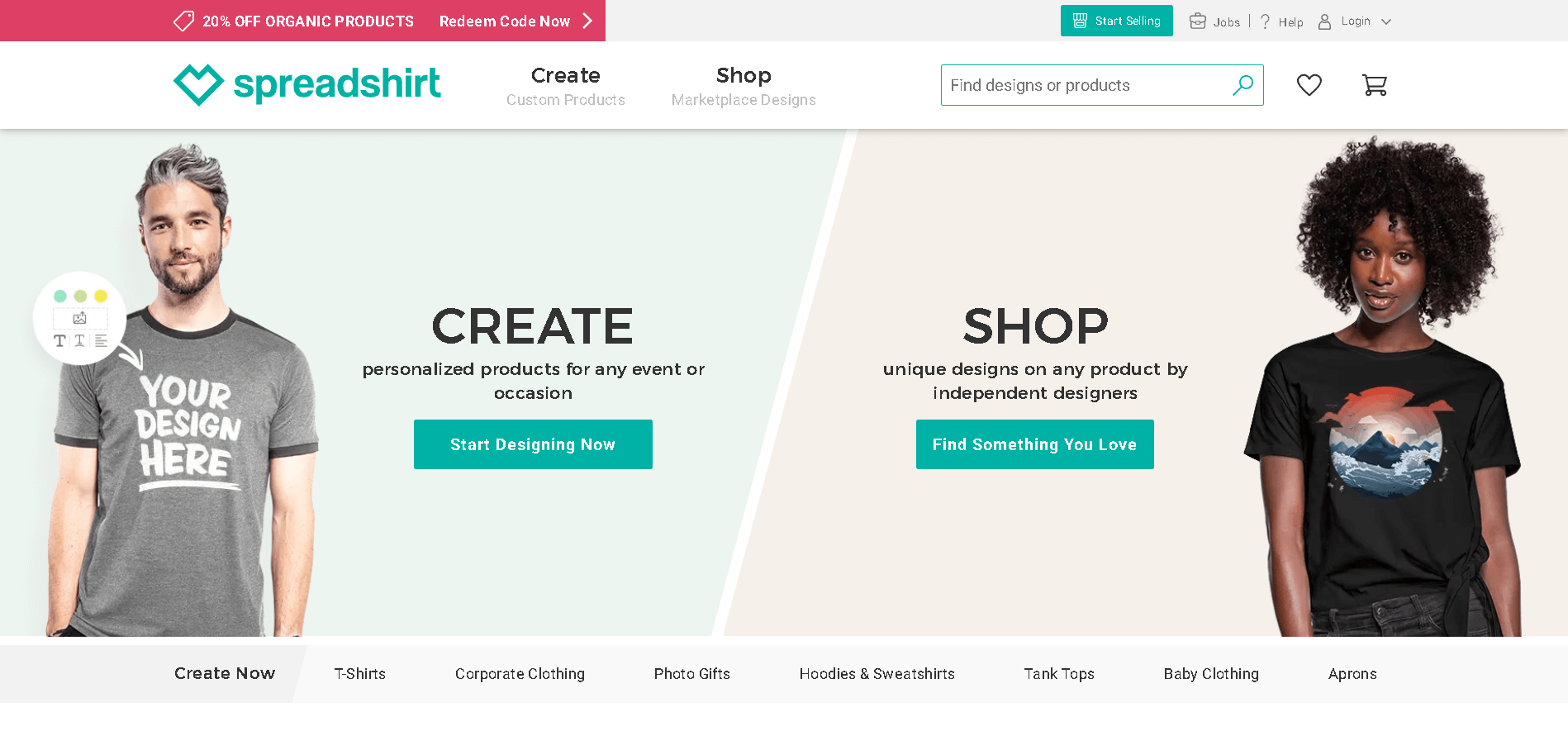
10. Keep Track of your Customers’ Lexicons’
Menu navigation language and labeling are also important considerations. With so much online competition, it’s no surprise that we try to be creative with our copywriting, but this can sometimes come at the expense of clarity. Although your site may be industry-specific, don’t forget about the user and how they might interpret or understand what you’re doing.
If you want to see which wording performs better for your primary navigation, you can conduct A/B testing. Most of the time, it’s best to keep your primary navigation simple and easy to understand, and if you want to add personalization, pop-ups and notifications are a great way to do so.
SpreadShirt exemplifies clever copywriting to encourage users to provide feedback.
11. Don’t Forget- The Essential Internal Search Paradigm
Search bars are an important part of your navigation strategy, but they’re often overlooked. In fact, site searches will be used by up to 30% of users. Visitors who used the search feature were 1.8 times more likely to convert than ordinary visitors, as per a study by eConsultancy.
Accessibility
Ensure that your search feature is readily available and consumers by placing the search tool in the very same location on each page.
A straightforward loupe glass icon box can be used to help consumers locate the search area. Individuals who conduct a website’s search conversions 2 times more frequently than those that don’t.
Yes, it makes perfect sense: people who use search engines are usually looking to buy or do something. They’ll also have a better chance of finding what they’re looking for.
IKEA is an example of a company that heavily relies on its site search functionality. Stores with multitudes of SKUs across a wide range of product categories require a displayed prominently search function to assist clients to find the exact what they’re going to look for.
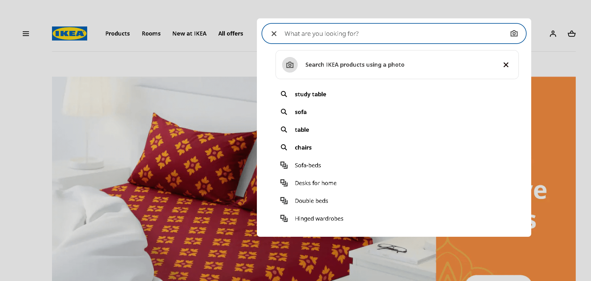
On the mobile version of their website, you’ll notice that they’ve kept things simple: a hamburger menu button, a shopping cart button, and a search bar.
What Would Be the Advanced Website Navigation Options Available in the Future?
Check out the list of developmental aesthetics that might cover the future of website navigation trends, some are still into it. Let’s check that out-
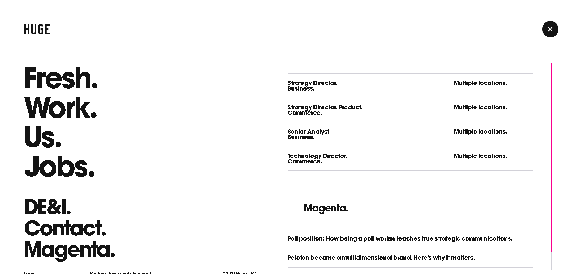
Expandable Categories in Full-Screen Mobile Menus
The fullscreen menu is, in its most basic form, an overlay that covers the entire screen, giving you plenty of room for your menu items. It is activated by a hamburger button. It’s commonly used by, but not limited to, sites with limited space as a viable alternative to the mega-menu.
You can check out the example from- Huge
AR-VR Effects and Animations
This technology is nothing new, we have known about this very late. it’s increasingly being used as a standout feature in a variety of applications (especially in e-commerce projects). In its most basic form, Augmented Reality is the effect of superimposing imaginary objects onto the real world.
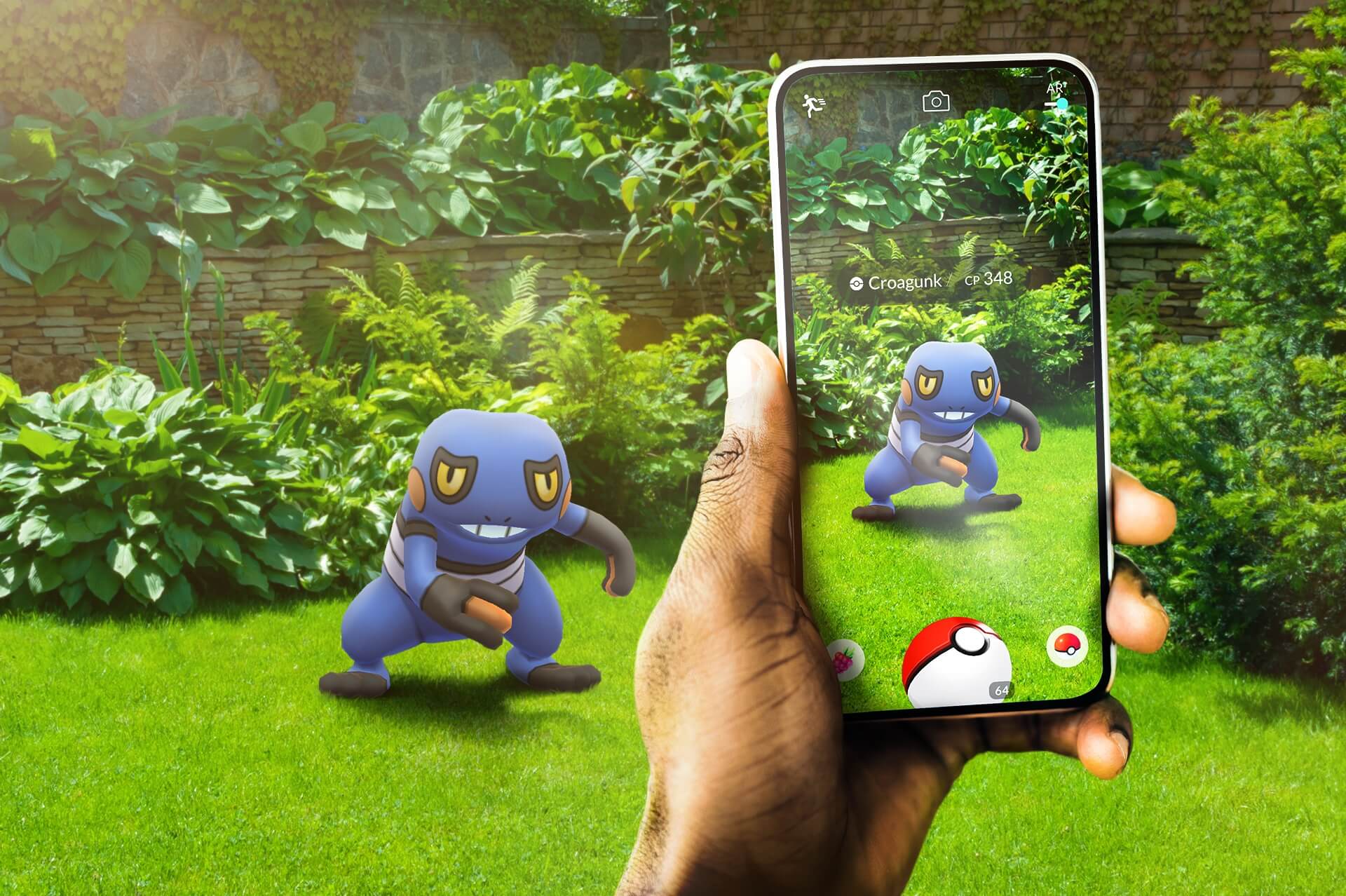
The Pokémon Go game is the most well-known and eye-catching example. When the user looked around through the smartphone’s camera while playing it, he could see Pokémons.
Virtual reality experiences on websites will continue to grow in popularity in the coming years. Consider sites like Airbnb, which allow you to tour a rental before making a reservation. Or the ability of IKEA‘s furniture site to show how a sofa would look in your room.
Animation
With the advancement in technology and design, in the near future, there can be different techniques available for ease of navigation also. AR i.e. augmented reality and VR i.e. virtual reality-based animations would definitely overlap the design ailments we’re preferring nowadays.
Personalization
For eCommerce website owners, personalized content is probably more important. Increased conversions can be achieved by displaying recently viewed, saved, or liked products for online shoppers. Returning customers should be reminded of the contents of their abandoned carts in order to maintain a higher conversion rate.
Users have come to expect personalized website content without even realizing it, and it will become an even more dominant focus for a successful web presence in the future.
Bot Supports
We can expect bots to become the standard for simple customer queries and “personal shopping” as machine learning and artificial intelligence are becoming more advanced.
For instance, if a consumer comes to your website looking for phone service and the chatbot recognizes that they are eligible for a free phone upgrade, the customer will be directed to the bots.
They will be informed about the update by the chatbot. This can provide a positive customer experience while also saving the company money on customer support expenses involved with speaking with a live person.
Use of AI Advancements
With the process of real-time changes and thereby assisting people to find relevant information more quickly and effectively, innovative websites are increasingly attempting to automatically personalize websites based on a user’s browsing pattern.
The use of adaptive technologies in web navigation has the benefit of reducing the time and effort required for users to find information. Users may become disoriented as a result of global and local navigational changes from page to page, which is a potential disadvantage.
Summing Up…
Your visitors won’t be able to find your blog, email signup page, product listings, pricing, contact information, or help docs if your website lacks navigation.
Start with this rule of thumb: a visitor should be able to land on any page on your site and find what they’re looking for in three clicks.
In an ideal world, every visitor would begin on your homepage and proceed through your website in the same manner. That, however, is not the case. Visitors to the website move around a lot.
Source: Google
Keep in mind that you want people to stay on your website and explore more. Inspire curiosity and entice them with great offers to get them to click on links.
So, when it comes to website navigation, do you prefer the traditional or the cutting-edge?
Before you try a technique, figure out why you’re trying it in the first place, just like you would with any other trend. Is it the best option for the project you’re working on?
Make it simple for users to understand where they should go and what they should do on your website.
If you need support or require any assistance on the same, please do not hesitate to connect with us directly or join our Twitter community to get a more detailed discussion over the community.
Happy Navigating!!!