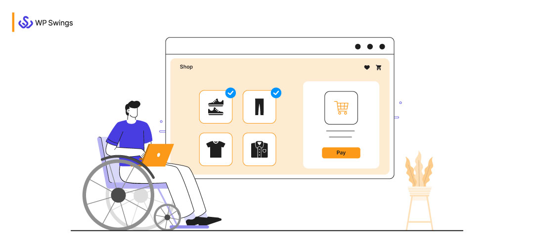
Today, almost everyone is shopping online. But is every shopper the same?
Every shopper is different and performs online shopping differently. Each one has its own pace and limitation and thus, they interact with online stores in ways they are most comfortable.
Therefore, there’s a need to consider the least talked about aspect of an online store setup, website accessibility.
Accessibility, in general, refers to the ability to access the benefits and functionality of an ecosystem by everyone despite their limitations i.e. physical disabilities, improper tools, or anything for that matter.
An accessible website is one that can be accessed by:
- Users of every age.
- Having any skill.
- With any disability
- Living anywhere with an active internet connection.
It is basically an act of morality and an opportunity to target a huge untapped audience.
Let me show you some eye-opening stats:
- As per The World Bank, 15% of the Earth’s population experience some form of disability.
- According to the U.S. Census Bureau, 40.6 million are the total civilian noninstitutionalized population with a disability in the United States.
Now you can see yourself targeting individuals that fall in the above stats can add up to a substantial amount of visitors.
In this blog, I’ll be sharing some really simple tips on how to create an online store keeping eCommerce website accessibility in mind.
Table of Contents
What Is eCommerce Website Accessibility?
“Spoiler Alert: It’s also for everyone.”
eCommerce website accessibility is defined as an inclusive practice. I mean to say, it is ensuring that there are no barriers for a customer while online shopping.
As a result, an individual:
- with or without physical disabilities
- conditional or situational disabilities or
- socio-economic restriction
can access your website.
According to the World Wide Web Consortium (W3C):
Web accessibility means that websites, tools, and technologies are designed and developed so that people with disabilities can use them.
Specifically speaking, the website accessibility checklist should include these 4 principles:
- Perceivable: To make your online store content perceivable, you can perform activities like providing alternate text to your non-text content.
- Operable: This means you should ensure that your website can be effectively used by all users. For instance, a person should reasonably be able to navigate your website using just the keyboard (without a mouse).
- Understandable: According to this principle, the information and user interface should be very clear to the user. Thus, whenever a user interacts with your online store, he/she should be able to comprehend the content and operate the user interface.
- Robust: To make your website robust, consider using valid code markup while implementing your website. As a result, your website should be easily and effectively interpreted by assistive technologies.
Thus, eCommerce website accessibility encompasses every shopper that is:
- Surfing the internet
- Is of all age groups
- Has varying degrees of dexterity
In short, your web design should be made keeping an inclusive shopping experience in consideration.
Before that, let’s see some various cases of shopper limitations. These challenges need to be addressed in your web design.
Various Shopper Limitations And Their Solution With eCommerce Web Accessibility
Now that we know the importance of web accessibility and its need to prevent substantial loss for a site’s bottom line design, let’s see user challenges. Knowing the limitations firsthand will help in creating an inclusive website design.
Let’s begin.
1. Visually Impaired And Blind Shoppers
According to WHO, globally 1 billion people suffer from partial or severe vision impairment or blindness. As you can see, there are so many shoppers with partial or complete blindness. Therefore, it is needless to say that your eCommerce store design should consider web accessibility.

Now here are some common challenges faced by people who are blind when surfing the internet. Also, let’s see some possible eCommerce web accessibility solutions.
- People with complete blindness use screen readers to access web content. Screen readers are software that allows people with blindness to read the web content either with a Braille display or a sound synthesizer.Now it often happens that the screen readers don’t work properly due to browser compatibility issues.Solution: Ensure that your site design is compatible with the latest version of the browsers.
- Did you know that there are special browsers for visually impaired users?Browsers like MozBraille, EMACSPEAK, pwWebSpeak are browsers that are used by people with visual impairments. Now the problem with these browsers is that they are not as advanced as the mainstream browsers. Consequently, they may not support some or all the features in a website design.Solution: Try to keep your online store website as simple and minimalistic as possible. In short, try to keep your website less flashy in terms of graphics.
- People with visual impairments find it difficult to differentiate between the foreground and background when they encounter low-contrast color schemes.Solution: Try to use high-contrast color schemes when choosing colors for your online store. You can take the help of tools like Wave and CheckMyColours to figure out which component of your online store is high contrast or low contrast.
2. Colorblind Shoppers
Did you know there are 1 in 12 men and 1 in 200 women that are colorblind across the globe?
Isn’t it worrisome that a huge section of your audience can’t see the colors of your store?
Let’s some accessibility challenges and their solutions for improving the shopping experience.
- For a colorblind shopper, it is very difficult to differentiate in colors with little contrast.Solution: You can take the help of the color wheel and ensure you’re using colors that are at the opposite ends of the wheel. As per the color harmony technique, colors that are opposite to each other are considered complementary colors.
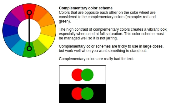
Source: Tiger Color
- Colorblind shoppers also face problems in accessing online store elements such as buttons.Solution: You can add some texture, shapes, or other cues to the page that have different colored elements. Even simple efforts like giving an underline between links can make a huge difference for colorblind shoppers.
3. Shoppers Who Are Deaf Or Suffer Hearing Loss
According to WHO, 466 million people worldwide have disabling hearing loss. This is a very significant number that can be turned into real leads only if you make it accessible for them.

Now you might be wondering what are the shopping challenges that are faced by people with hearing impairment. Let’s see some of them with solutions:
- People that are born deaf have difficulty in reading text because they are used to sign language as their first language.Solution: Actually there’s only one solution and that is to create sign-language videos for each part of your website. I know this could be a burden and a huge expense but, this is the only solution to this challenge.
- Though not many sites produce videos, if they do, the audience with visual impairments will face difficulty in accessing them. Also, it is very rare that sites produce videos with sign language.Solution: The best practice to resolve this challenge is that you can add captions to your videos. Also, you can add transcripts that the user can print and read later.
4. Elderly Shoppers
Did you know that approximately 7% of the global internet users are aged 65 and above?
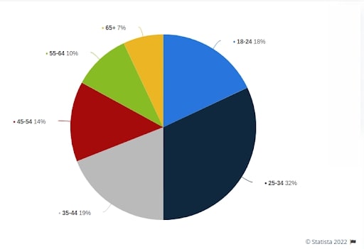
From this, we can conclude that a significant portion of the online shopping audience is made of elderly people. There are many challenges that an elderly shopper may face. Irrespective of the fact, if an elderly shopper isn’t dear or impaired visually
Let me shed some light on this:
- Due to weak motor skills, they have a hard time interacting with various page elements.Solution: Design your web pages in a way that the elements like form fields are not too close. In short, focus on keeping your elements less clumsy.
- Another big problem that elderly online shoppers face is that their short-term, episodic, and prospective memory declines. This makes it challenging for them to memorize various aspects of your website.Solution: To beat this challenge, what you can do is offer frequent alerts and reminders that have actionable cues. Also, try to avoid spreading tasks over multiple screens consequently, declining the chances of cognitive overload.
5. Shoppers Living In Developing Countries And Regions
The Internet is now no longer a luxury, it is a basic need required by individuals for accessing information over the World Wide Web. However, in many developing countries, a fast and stable internet connection is still a long way.
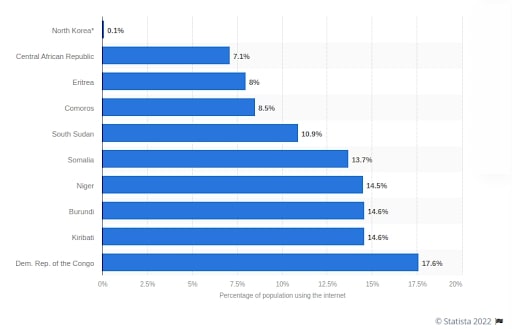
As per a survey, it was North Korea has an internet penetration of virtually zero percent
Thus, making it challenging for the users in such regions to interact with online stores with slick web design and JavaScript-powered web applications. So, what can be the solution?
Let’s see.
- You can consider using a Content Delivery Network (CDN) to optimize the delivery requests of your media files. A CDN can be of great help even if your online store is being accessed by customers with fast internet connections. With help of a CDN, you can reduce the latency for visitors that are far away from your server location.
- Create a cache for elements of your website that don’t change more often like the footer and navbar.
- Another great solution is to create a lightweight version of your website that can be easily accessed by users with low bandwidth. Brands like Facebook used this strategy back in September 2009. They created a lightweight version, Facebook Lite. Consequently, creating an inclusive experience for their audience.
So these were some of the various shopper limitations and their solutions with eCommerce website accessibility. By considering all these challenges and their solutions, you can very easily design an accessible eCommerce website that can cater to audiences with or without disabilities.
Now let’s see some steps that can enhance the accessibility of your online store to increase its reach and boost online traffic.
We recommend All in One Accessibility tool which support all people with disability profiles including blind, hearing or vision impaired, motor impaired, color blind, dyslexia, cognitive & learning impaired, seizure and epileptic, ADHD problems, and elderly. Moreover, it supports 140+ global languages, allows businesses to reach a global audience.
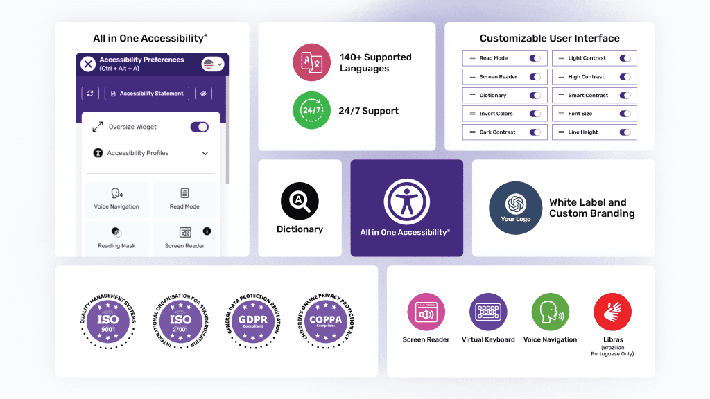
All in One Accessibility by Skynet Technologies is an AI-powered solution designed to enhance website accessibility and usability. With over 70 features, this tool ensures an improved experience for all users. It supports ADA, WCAG 2.0, 2.1 & 2.2, Section 508, the California Unruh Act, and other international accessibility standards. So, it can be the best fit for the above requirements. It is compatible with over 300 platforms including CMS, LMS, CRM, and ecommerce platforms. This solution is ideal for businesses aiming to make their websites more accessible and user-friendly.
Screen Reader, Talk & Type, Voice Navigation, Dictionary, Virtual Keyboard, Accessibility Profiles, Sign Language Libras (Brazilian Portuguese), Custom Widget Color, Icon Size, Position, GA4 Tracking, and a Custom Accessibility Statement Link are some of the top features.
Start 10 days free trial or download WordPress Accessibility plugin – All in One Accessibility from here.
3 Simple Steps To Enhance The Accessibility Of Your Online Store
1. Put Yourself In The Shoes Of Your Customer
The first question that might come to your mind is, “How do I check if my store is accessible?”
In the first step, you have to put yourself in the shoes of your customers. You need to be a user yourself to know the plight of your users. You gotta put yourself in the shoes of a shopper with color-blindness, visual impairment, inability to use a mouse, or hearing loss.
Here are some manual checks that you can perform to get a basic idea of the accessibility of your eCommerce store:
- Start using your store yourself while keeping the shoppers with limitations in mind.
- While browsing your online store, look for images, buttons, and other elements that might appear weird if colors are taken out of perception.
- Are there any processes on your site that are tedious to perform even with a mouse or keyboard?
- If you’re using media files on your online store, check if they can be accessed by people with disabilities. For example, check if you’re using correct alternate texts to describe yourself appropriately to a visually impaired user. If you’ve used video, check if the subtitles are clear enough for a shopper with hearing impairments.
With the help of these simple yet effective steps, you can find the weak points on your online by yourself and start working on them right away. You just have to slow down and search for spots that have to be optimized.
2. Take Help Of To Know How You’re Challenging Your Users
Now checking everything manually is not possible. So as to say, you need some automated tools to check which aspect of your online store is challenging the inclusive shopping experience.
Here are some website accessibility testing tools for your online store:
WAVE, the web accessibility evaluation tool
WAVE can be very helpful in knowing which element on your website is lacking accessibility. Just plug a URL in this tool and you’ll have a list of errors and alerts that are actually hampering the shopping experience.
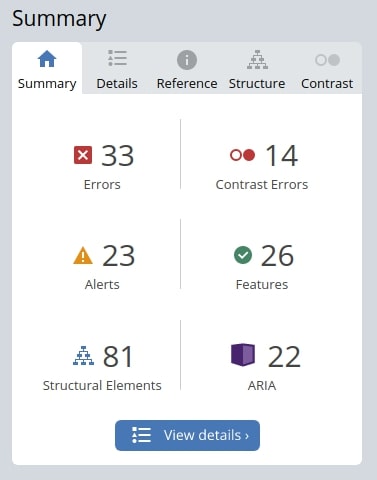
With WAVE, you also get documentation for each error and alert, so that you know how to address it.
ACTF aDesigner
Another great tool, ACTF aDesigner is a disability simulator that lets you ensure that your content and design can be accessed by a visually impaired shopper.
We all know users with visual impairments use screen readers and special browsers to interact with a website. However, before implementing screen readers on your online store you need to ensure that they are compatible with your website’s content.
aDesigner lets you test the accessibility and usability of your website for people with visual impairments.
Pingdom
Slow internet connection is among the biggest challenges faced by users in developing countries. Thus, I recommend using Pingdom to perform speed tests of your online store.
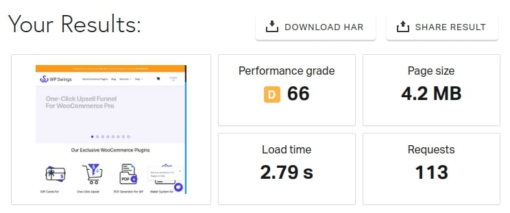
Pingdom also gives you detailed recommendations on how to improve your page speed and provide an inclusive experience for your users in developing countries and regions.
3. Start Thinking Beyond Pages On Your Store
Now I know building an accessible web design is a tough job but if you really want to win the game, you need to start thinking beyond your web pages. eCommerce web accessibility encompasses your entire online presence.
Whether you’re sending emails or replying to social posts, you’re interacting with customers who are interacting on the internet in very different ways.
Let’s see some ways in which your customers interact with you on various platforms apart from your online store:
Emails:
Every eCommerce store owner uses emails to interact with their customers and keep them updated. Make sure you’re including a plain text version of the emails.
Make your customer support more accessible:
Often people ask for screenshots or videos from their customers of the issues. But this can be practically impossible for people with disabilities. You can offer on-call support or create a temporary login so that you can check the issue yourself.
Make processes easier:
Making small amendments in your working process can make a big difference. Here are some examples:
If possible, start accepting calls instead of emails or chat support.
These were some of the ways in which you can build an accessible online presence and build an online store with an inclusive shopping experience.
AudioEye – The Website Accessibility Toolbar
If you implement all the above-mentioned tips, you can definitely build an accessible eCommerce store. But if you’re looking for a solution with which you can enhance the accessibility of your present eCommerce website, I’ll recommend AudioEye.
AudioEye is a software that provides websites with digital accessibility using advanced AI technology. Also, to add the cherry on top of the cake, AudioEye is supported by IAAP-certified experts.

AudioEye provides an accessibility toolbar on your website by just adding a single JavaScript line code on each webpage. Many agencies like Neil Patel Digital use AudioEye to make their web content digitally accessible to everyone.
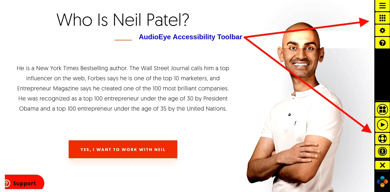
Here are some features with which AudioEye makes your website accessible:
- A Visual Toolkit that enables the end-user to customize the look of your website.
- A Player that acts as a screen-reader and reads out the content of the page to the user.
- It also provides a Page Elements function that provides keyboard users with options to quickly navigate to different areas of the webpage.
- A Skip to the Main button to quickly bypass cumbersome navigation for keyboard users.
AudioEye is a great software that understands the importance of eCommerce web accessibility and provides a hassle-free installation. With a single software, you can make your online store accessible to both mobile and desktop users.
Some Accessibility Tools For WordPress Users
Although this is an article that covers the overall concept of eCommerce accessibility. So, we decided to share something for WP Swing’s exclusive audience.
Here are some tools that you can create a highly accessible WordPress website:
1. WP Accessibility

The WP Accessibility tool offers solutions for almost all accessibility problems that a website can face. However, this tool is not intended to make your site compatible with any accessibility guidelines.
It offers features like:
- Add skip links with user-defined targets.
- Implement language and text direction attributes to your HTML
- Enforcement for alt attributes on images.
- Identify images without alt attributes in the Media Library
- Remove user-scalable=no to allow resizing.
Okay coming up next – One Click Accessibility
2. One Click Accessibility

The One Click Accessibility is probably the fastest accessibility solution for WordPress.
The plugin was originally developed using the Pojo Framework. Later it was made compatible with WordPress.
While most accessibility issues can’t be addressed without directly changing your content, One Click Accessibility adds a number of helpful accessibility features with the minimum amount of setup.
3. Accessibility Widget

Accessibility Widget plugin offers the quickest solution for adding accessibility widgets to a WordPress website.
The WordPress extension adds a sidebar to your website that allows the user to change the size of text on the screen. Accessibility Widget is a minimalistic plugin that functions perfectly for both the desktop and mobile versions of the website.
So, these were some WordPress plugins that can help in making your website highly accessible. But remember in addition to these tools you need empathy and a very clear understanding of web accessibility.
eCommerce Website Accessibility – A Goal To Achieve Overall Customer Happiness
eCommerce website accessibility is a very vast topic to cover and I tried my best to give you some food for thought by covering most of it.
Many websites (whether eCommerce or otherwise) do not consider accessibility features for users that are differently abled. I understand that some features like creating special videos can be tough and expensive at the same time. However, others are easy to be implemented with just know-how.
The goal of eCommerce website accessibility is to encompass different kinds of shoppers and, make online shopping easy for everyone including differently-abled users. After all, disability only exists when someone cannot see human potential.
Do let us know in the comment section how you find this read. Also, share your feedback on this subject. Together let’s take an oath to make online shopping an inclusive experience.






Thank you for your comprehensive article about accessibility.
I am wondering: Do you have additional information to share about how WP Swings incorporates accessibility into the design and testing of its own products?
Welcome anytime. Please do check out our other articles. We try to maximize accessibility in our WordPress/WooCommerce product using appropriate icons, explanatory texts around every setting, and embedded videos to help users configure settings, using shades of sky color to induce a calming effect and division into sub-settings to cut the clutter.